Your landing page can be the first glimpse your customers get into your business. In many circumstances, it’s your chance to introduce yourself, and make a great first impression. And like a firm handshake or a show stopping smile, your landing page should be welcoming, memorable, and specific to you.
There’s no right or wrong way to build a website or a landing page. We’re not here to tell you what font to use, or which colors are objectively the most appealing. Telling you how to design your own landing page would be like telling you what your favorite movie is. Only you know that. And you can hide your Paddington Bear T-shirt as long as you need.
Instead, let’s get into 8 best practices you can use to build the best landing page for your business, no matter what it is you do. These specific tactics will help turn your unique landing pages into beautiful, effective high-conversion machines.
What Is A Landing Page?
Before you get started making your landing page extraordinary, you’ll need to know what they are. Your landing page is a simple website for your business that has a specific call to action. It’s where your customers first “land” after searching for your business, or clicking a hyperlink in an advertisement.
While your landing page can be the homepage of your website, they aren't always. While you can only have one homepage, you might have more than one landing page, each with a different call to action.
A landing page is a standalone web page, usually created with a specific marketing intent in mind. Whereas your business website as a whole should offer plenty of information, sub categories, and options to explore, a landing page should be pointed and specific.
[TEMPLATE: flowers-delivery-order-form]
It's easier to understand using an example. Let’s say your online store sells candles, and you’ve just launched an advertisement campaign for a new scented candle you’re releasing. The hyperlink you list on your online ads should lead to a landing page dedicated specifically to that new scent. From there, your customers can easily view and purchase the new product, all in just a few clicks.
8 Ways To Use Landing Page Design To Maximize Conversions
A landing page welcomes your customer to the new product or feature you want to share with them. In order to be effective, they should be brand specific, easy to navigate, and concise. Luckily, Paperform can help you make landing pages that do just that.
Let’s go over 8 best practices that can help you make landing pages that actually lead to conversions.
1. Develop Your Conversion Strategy

In order to create the best landing page for your business, you’ll need to know what it is you want them to do. Whether it's signing up for a subscription, or buying a new product, you need to know what the call to action is, and what stands between your customers and conversion.
Once you know that, you’ll need to figure out how you’re going to communicate your conversion goals to your visitor in a clear, entertaining way. These processes make up your landing page conversion strategy.
Is it going to be a video? Graphics? Plain copy? In order to decide, try to figure out what the barriers are going to be for your potential customers, and how you can best address them on the page.
Once you know what your goals are for your landing page, and what your potential roadblocks will be, you can get started with your landing page design. While in this stage of the process, try not to get overwhelmed with all the design elements just yet. Instead, keep your eyes on the prize by creating a clear, specific conversion goal.
The clearer the path to conversion, the more likely customers are to follow it.
2. Test Your Designs
However you decide to design your landing page, keep in mind that the initial plans are just your best guess. It’s ok if they don’t work exactly as planned.
The only way to prove or disprove the effectiveness of these decisions is by testing every change to ensure an optimal conversion rate. If your hypothesis is that a video will convert better than an image on your landing page, then make sure you A/B test this first to gain the data to support your decision.
Another way to tackle this is by designing a few different versions of your landing page and testing them. Design each variation with a different customer segment or strategy in mind, and then A/B test these against each other to find a winner.
[NEWSLETTER]
3. Optimize the Length of Your Landing Page
Frustrating as it may be, there’s no conclusive data that short landing pages are inherently better than long ones, and no conclusive data to suggest the opposite is true. So how can you know how long your landing page should be? The research at Unbounce seems to suggest that it depends on your specific goals.
Some businesses have found success using long landing pages that give the customer plenty of information to explore. Others have found that a more concise page is more effective. Let's jump into a couple examples of both.
 (Image Source: Coadecademy)
This colorful codecademy landing page, for example, is packed with sign up forms, customer stories, and graphics. It creates a whirlwind that the customer can be happily swept away in.
 (Image Source: Uber)
Uber, on the other hand, has an understated approach. This landing page is short and to the point, with just one clear call to action, and very little bells and whistles.Both landing pages work, and they work for different reasons.
The optimal length for your landing page has less to do with industry trends and more to do with the stage of your business, the intention of the landing page, and the behavior of your users.
Here are some key factors to consider when deciding on the length of your copy.
The conversion goals of your landing page
If your landing page exists to introduce new people to your product or service, it might be wise to have a longer and more informative landing page. People who are not familiar with your business, or with this new service, generally need a little bit more information before they give you the green light.
On the other hand, if you’re running a more established business, or if you’re creating a landing page specifically for warm leads (leads from pre-existing customers), you may be better off keeping it short.
You can cut down your landing page copy when your target audience already knows what kind of services your business usually offers.
The cost of converting
If your product is expensive or requires customers to put in a lot of time or effort to convert, you may be better off with more copy. In order to increase conversions for these more complex products or services, your customers need more information upfront.
For example, let’s say you're designing a landing page to encourage pre-existing customers on a basic plan to upgrade to a more advanced plan. Because this conversion likely means an increase in pricing, your customers will likely want to know exactly how and why the new plan is better than the one they already have.
💡 Tip: Inexpensive products or services generally require less copywriting, since the call to action requires less of a financial commitment.
To use the subscription model example again, if you were creating a landing page to advertise your free trial, you probably don’t need blocks of text about the intricacies between your different plans. A grabby headline and some form fields for gathering contact information may be enough.
[TEMPLATE: product-order-form]
How visitors are currently interacting with your landing page
The best way to see if your landing page is the right length is by analyzing how customers are actually interacting with it.
You can set up a heatmap and scrollmap for your landing page to collect data on how users are currently interacting with your landing pages. This will equip you with actionable analytics insights about how long visitors are spending on a page, how far down the page they travel before bouncing, which elements they interact with the most, and which ones they generally ignore.
For example, if users are only reading the top 25% of your landing page before bouncing, you could conclude that the bulk of the information they need is at the beginning. This means you can cut down on some of your copy.
On the other hand, If your landing page conversion rates are particularly low, you may look into whether or not you’re providing enough information on your call to action. In that case, it might be a good idea to add a bit of copy on what the call to action is, and how it can benefit your customer.
4. Break Up Your Copy
In order to keep your bounce rate low and your conversion rate high, you’ll want to design a landing page that’s easy on the eyes. The most important part of any landing page is the call to action: the action you want customers to take when visiting the page.
If the purpose of the site is to get people to sign up for your email list, the call to action should be a beautiful, easy to use contact information field, placed front and center. If the call to action is to buy your new handmade sweater on Shopify, the product should be visible, and the checkout process should be as simple as possible to avoid shopping cart abandonment.
In order to keep your call to action clear, you’ll want to avoid long blocks of text that muddy your messaging. You can break up your copy by segmenting your text using headers, bullet points, and inserting images or graphics strategically. You can use Paperform's brand new image editor to make the images you choose to include even more gorgeous, easily.
💡 Tip: When writing the copy for your landing page, you may also want to consider using SEO principles to boost your ranking in search engines like Google or Bing.
To further break up your copy and keep your messaging clear, you could add a thank you page for those customers who complete your call to action. You can create a separate, entirely customized thank you page using Paperform. These pages make your customers feel recognized and appreciated, without crowding the messaging of your landing page.
[TEMPLATE: resort-booking-form]
5. CTA placement: The Case for Above The Fold
When deciding where to place your call to action, many people consider whether they want it to live above or below “the fold.” For those unfamiliar with the term, the fold refers to the bottom border of landing pages and web forms. Content that is "above the fold" is visible above this border when the page first loads, and content below it requires you to scroll down.
Once upon a time, the general consensus on call-to-action (CTA) buttons was to place them all above the fold to make sure they're instantly viewed by the visitor. However, the optimal placement for your CTA button, much like the length of your page, depends heavily on the nature of your product and the stage of your business.
More established companies and brands have the luxury of attracting visitors who have largely decided to convert before even visiting the landing page. In these cases, it makes sense for the call to action button to be placed above the fold to make it easier for the visitor to convert as fast as possible.
This also applies to landing pages designed for warm leads or visitors already acquainted with your business. Placing CTA buttons above the fold for such landing pages is generally best practice, provided it is accompanied with a compelling headline and some helpful information about the business and its potential value to the visitor.
6. CTA Placement: The Case for Below The Fold
Conversely, if your product or service is new to the visitor, or requires them to make a larger investment of money or time, it might make sense for the CTA button to be further down the landing page. This is because the user will likely need more convincing information before making a decision to convert.
Pricing and effort required to complete the CTA should inform your landing page design. You can think of your CTA like a sample at an ice cream shop. If the shop is offering free samples of strawberry ice cream to anyone who walks in, many customers will take it, even if they aren’t the biggest fans of strawberry. Why turn down free ice cream?
But, when it comes time to make the pick and pay for the big scoop (or double scoop, we’re not here to judge) they’ll likely spend a bit more time considering which flavor to take.
Once the call to action means grabbing the wallet, your customers are naturally going to need a bit more time and information to decide.
7. Use Media To Your Advantage
Adding media elements to your landing page can prove to be a quick win for improved conversions. Videos, gifs, and graphics break up the page, and can help catch customers' eyes by using contrasting colors and balancing white space. These media elements can also be used as directional cues that guide the customer toward the CTA naturally.
A study by Eyeview Digital found that using videos on landing pages can boost conversions by up to 80%. Captivating images, infographics, animations or logos can help break up the copy on your landing page.
Not only can these elements garner visitor’s attention, but it can also make scrolling through your landing page easier, especially for those customers visiting the page on their mobile devices or via social media.
Lucky for you, Paperform makes adding media to your landing pages a breeze. With our native integration with Unsplash and Giphy, you can add images, videos, or gifs anywhere on your landing page by using our super easy to use slash commands.
Plus, all of our templates are mobile optimized. So whether you’re making a landing page for your ecommerce site or to advertise a webinar you’re hosting, you can be sure it’ll look great on any device.
Perhaps it goes without saying, but if you are going to add a video to your landing page, make sure it is relevant to your call to action and your marketing strategy. If your goal is to make a high converting landing page to get customers to join your online fitness business, a video of a baby trying a lemon probably isn’t relevant—cute as it may be.
💡 Tip: Videos that explain how to use a product or service are particularly helpful, especially if the product or service you’re selling is complicated for beginners to understand.
Even with the evidence that suggests conversion rates and lead captures go up when good-quality video is involved, surprisingly few landing pages use videos. This might be great news for your business, though, since there may not be as much competition.

8. Build Trust with Social Proof
A good landing page is clear, relevant, and reliable. Nobody likes a surprising pop-up loaded with bells and whistles and lacking a clear call to action. Your landing page optimization process should go beyond just making your site look great. To boost lead generation, you’ll have to make your customers trust that your product or service is worth their time.
According to the folks at CrazyEgg, undecided visitors are more likely to convert if they see trustworthy testimonials on your landing page. These testimonials can be from case studies, reviews on the user experience, or even interviews with active customers.
[TEMPLATE: product-evaluation-form]
Anything that helps your customers identify reviewers as real people can help your testimonials become more trustworthy. Videos are a great way to do this, if you can swing it. If not, try to include their full name and a headshot. If you can, avoid using paid reviewers. We’ve all seen those sponsored ads on Instagram—nobody’s buying that Jamie Lee Curtis loves Dannon yogurt that much.
There are loads of ways to boost trust in your brand. Here are just a few to get your wheels turning:
- Share social media mentions and unsolicited reviews
- Quantifying your customer base. If you've seen a significant amount of adoption for your product or services, brag a little by adding the impressive number to your landing pages. You’ve earned it.
- Showcase your customers by embedding a social feed on your landing page. Your customers can often be your biggest advocates, so let them speak for your excellence and attract more conversions for your business.
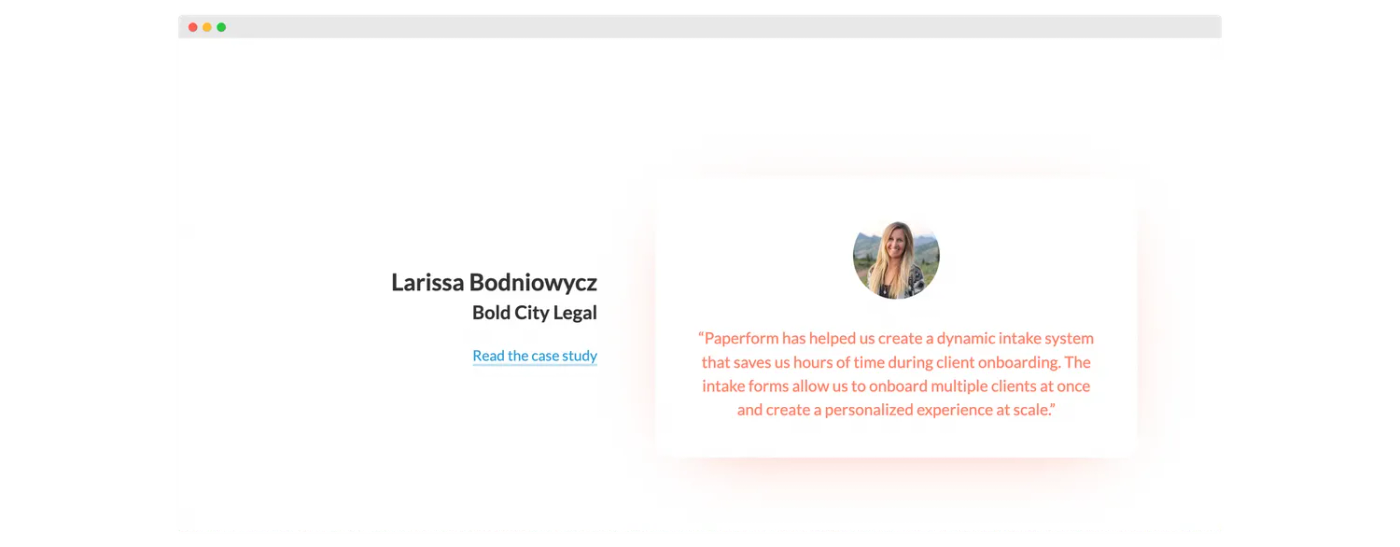 (Image Source: Paperform)
Over to You
Now that you have some best practices under your belt, you’re well on your way to designing a high converting landing page for your business. No matter what the purpose of your landing page, Paperform can help you build it quickly and easily, so you can get back to the million other things on your plate.
But we get it—we’re a little biased. That’s why you should try it yourself with our 7 day free trial. You can customize your landing page as needed, create powerful payment forms and fully automate your business workflows with 1000+ in-app integrations.
We’re confident you'll see why it's the landing page builder of choice for more than 5,000 companies. And if you get lost along the way, you can reach out to our live in house experts, any time of day.