Paperform launched in 2016 with the goal of transforming the way small businesses do work. Our founders, Dean and Diony, wanted to help people like them automate busywork and free up time to do things that matter.
With such a lofty vision, what logo represented the business wasn’t exactly high up on the to-do list. That’s not to say our visual identity didn’t matter, but rather that our founders were more interested in building a killer product, and setting the biz up for sustained success, than they were picking the precise shade of blue (Cerulean? Aegean?) for a logo.
Since those halcyon days a lot has changed. Paperform has evolved from a form builder into a digital Swiss Army Knife that our community uses to build everything from appointment forms, registration pages, and quizzes, to custom software for managing yoga studios, and flower shops.
We’ve also grown from a two-person business run from the rickety kitchen table of our founders, to a global company with more than 20 team members spread across a handful of countries.
Along the way we’ve always known who we are as a company—what we stand for and what we want to achieve. But, to be frank, we haven’t always been sure how to best share that with the world. This is the story of how we figured it out. Along the way, we’ve built a new look that better represents our values, our product, and our beloved community.
We’re still the same Paperform. Just better dressed.
So, why bother with a rebrand at all?
The need for distinct brand guidelines became clear as soon as we started to expand the company. Paperform’s brand presence had grown organically just by Dean and Diony being themselves, but as they grew the team, they had to articulate that brand into something concrete and scalable.
Over time—and with each additional team member—this need only grew. Our Product team needed guidance on design; our Support team needed to know how to talk to users in a Paperformy way, and our Marketing team desperately needed a single source of truth for their campaigns.
Our sticky-taped solution was to run questions and assets past our co-founder, Diony. As you might imagine, consulting one of our founders on every minute detail wasn’t exactly the brightest idea. On top of that, this type of convoluted workflow was completely at odds with "cutting down on busywork", one of the central goals of the business.
With a bunch more hires on the horizon, we realised we had to find a solution (preferably one that didn’t involve Diony as the team design guru) before things snowballed out of control. We needed to build a strong foundation to define our brand, and keep it consistent in-app, in our content, and anywhere else Paperform appeared online or in the real world.
It was time to bring in some help. Looking back, none of us quite imagined that we would be making such a drastic change to our existing look. Now we couldn’t envision it any other way.
What goes into a rebrand, anyway?
Part 1: Putting together the squad
The rebrand was too big a job to do solo. We needed an external agency, but we weren’t sure we’d be able to find one that understood our personality and shared our no nonsense mentality. Oh, how wrong we were. It was love at first video call with Aussie branding agency CUT THRU.
We were two peas in a pod; two meat pies in an air fryer. They immediately “got” us. They saw the problems we were trying to solve and how much potential we were missing out on. We signed on the dotted line and put ourselves in their capable hands.
Part 2: Trusting the Process
CUT THRU started by interviewing our customers and team members to get an idea of what the folks who use the product most, and know Paperform best, thought about the company. They spent countless hours conducting interviews, trawling through our internal stats, and combing through hundreds of pages of surveys from our community.
The next step was to turn this research into a concrete strategy. The bulk of this took place during our marathon branding workshop. Jono from CUT THRU, our branding Sherpa, locked our leadership team in a room for between 5 hours to brainstorm ideas, share hard truths, and dive into the deep questions about Paperform as a brand. Picture an Agatha Christie novel, without the murders and with a lot more coffee.
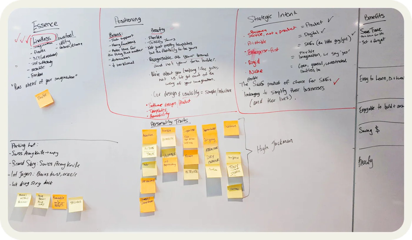
Thankfully, the big questions, like our values and mission, were established by Dean and Diony from day one, so we had those covered. But Jono guided us through an array of exercises designed to really nail down our brand attributes, positioning, and narrative in a level of detail we’d never quite managed.
We won’t give away too many specifics here—after all, a magician never reveals their tricks, and Jono is certainly a magician—but by the end of the day we had some Colosseum-level foundations for us to lean on when required to make decisions.
And, most importantly, we now felt that whether implementing a feature, tweaking a design, or writing a post announcing our rebrand, we could do so with greater confidence, integrity and understanding of what our users want.
I. Our brand positioning
First was defining our brand positioning (how people think of a brand in relation to its competition). Now, to tell the truth, we've never been too worried about our competition. We block out the noise and operate in our own space.
But through conversations with CUT THRU, and our customers, our positioning became patently obvious. Most form builders either (a) look pretty, and have weak functionality, or (b) have powerful features, but look like something that belongs in a bootleg version of Windows '98.
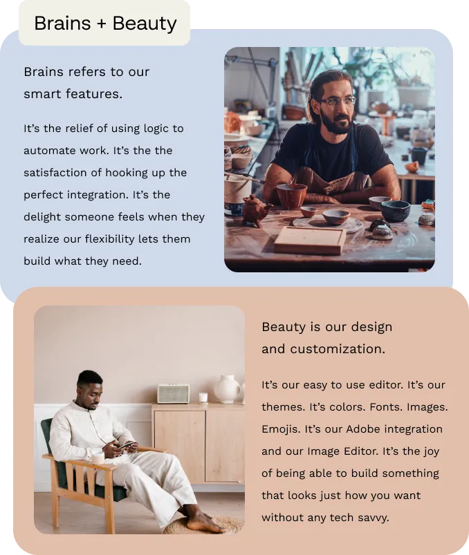
Except Paperform. We're the exception to the rule. We combine beauty and brains_._ It's a perfect marriage, like Goldie Hawn and Kurt Russell, or the biscuit and choc coating on Maxibons.
Where other tools limit their offerings to one or the other, we care just as much about both. Customization, theming, logic and payments are all slices of the same cake—and it's this combination that makes us stand out.
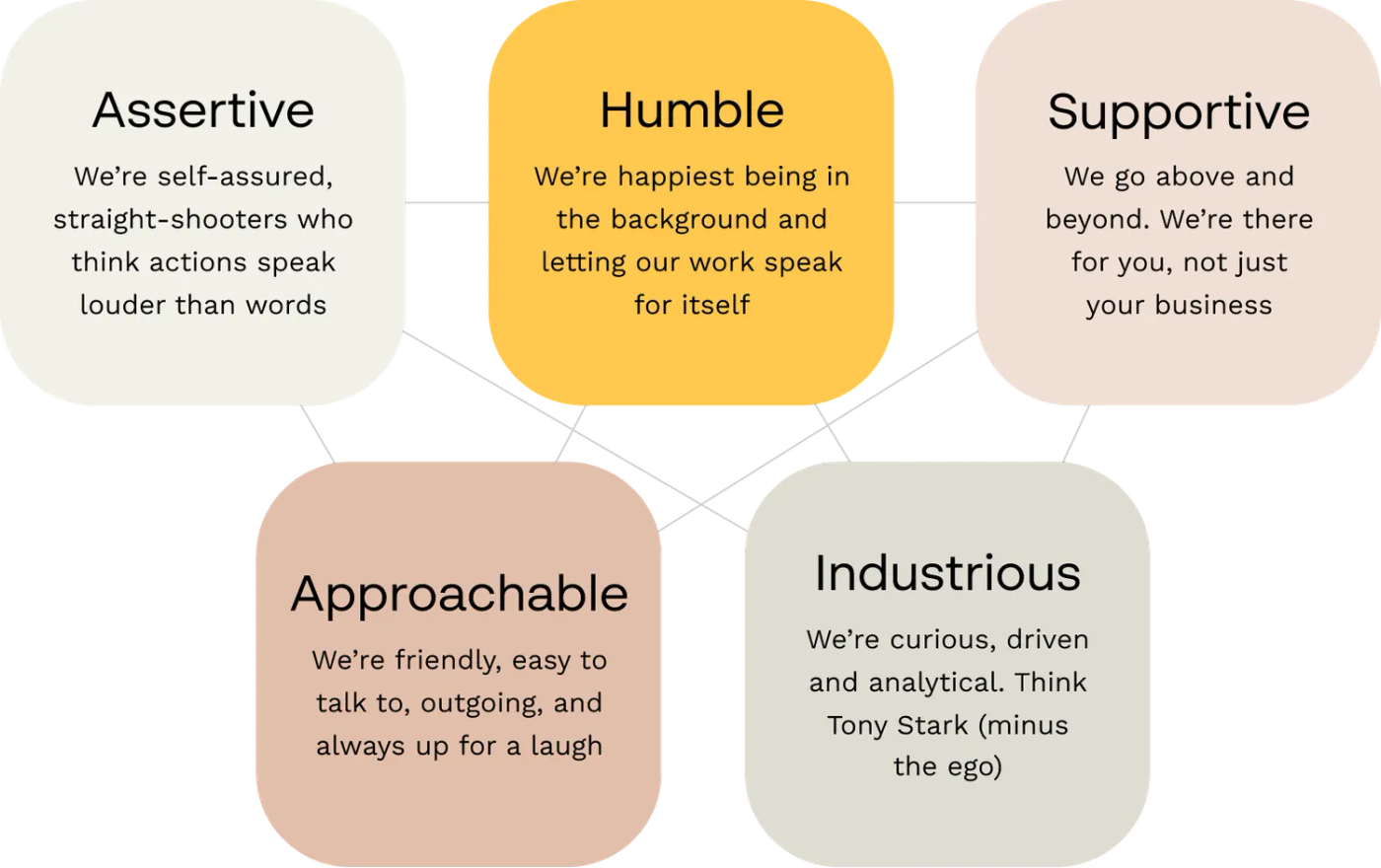
II. Our brand traits
With our positioning in the bag, it was time to settle on the key traits of our brand. This was based on the question that we had a lot of fun figuring out: “If Paperform was a person, how would you like people to describe you?” (Naturally, we chose a combination of Hugh Jackman and Tony Stark, minus the ego.)
Many of these terms were intrinsic to our mission and values, but it took lots of talking and lots of post-it notes to settle on a handful. We knew we were on the right track as these terms also popped up in user interviews and surveys. Thankfully, the way we thought of our brand lined up with the way you thought of us, too.
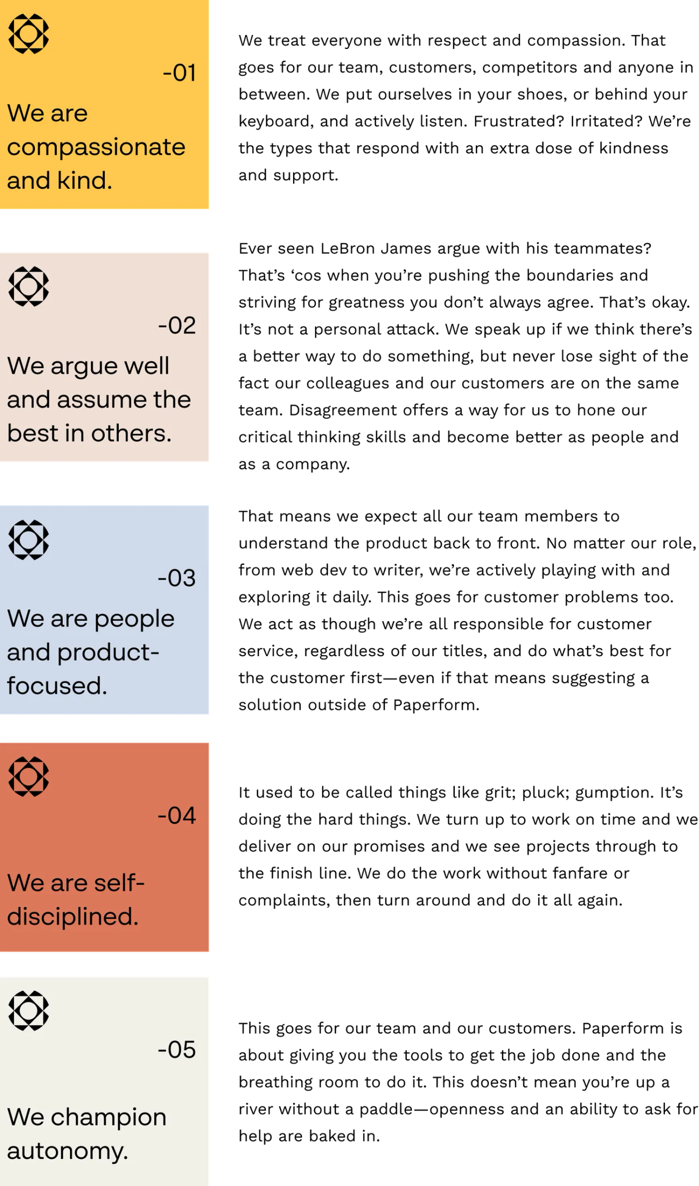
III. Our core values
Next came the sprucing up of our core values. It was essential to us that we backed these up with behaviours to make sure we weren’t paying lip service to vague ideas. Anyone can say they're something. It takes real guts to show it.
These values are our guiding stars, what we have blutaked above our desks and front-and-centre in our Notion hub. They influence everything we do as a company and as individuals working within it. This is what we ended up with:
Part 3: Redefining our visual identity
A new look was always part of the plan. We knew that we’d outgrown our old look, and needed a visual overhaul to take us through to the next step of our brand.
However, we didn’t quite foresee that it would include our logo. It had been with us throughout our entire journey as a company, and we didn’t take the idea of saying goodbye to it lightly.
But, as we reflected upon the design philosophies and moral principles our brand was built upon, as well as the pain points it was built to address, it dawned on us—with a gentle nudge from Jono—that it wasn’t just our existing visuals that needed to change. It was time for our logo to grow up too.
By then we had complete trust in the team at CUT THRU. They went away, and over a couple of months, collaborated directly with Dean and Diony to work on our new aesthetic.
Along the way there were a few different logos and iterations. But throughout the process we had put together a bubbling gumbo pot of ideas that offered plenty of inspiration, and inevitably led to the new-look Paperform we’re showing off today.
IV. Our logo
First: the logo. One phrase that we kept hearing from customers was how Paperform was a kind of digital Swiss Army Knife for small businesses—an all-in-one multitool that came in handy in almost any situation.
We loved this description(!), and were instantly keen to work this concept into our branding in some way, without including a literal knife in our imagery. After a few stabs at it, CUT THRU came up with the winner.

CUT THRU took the essence of the Swiss Army Knife concept (a flexible tool that offers many solutions to your problems) and brought it closer to the product.
What they came up with is our new kaleidoscopic badge, which represents the diversity of our digital tools to create an infinite number of beautiful solutions. We’ve doubled down on this idea of transformation by using unique configurations of the badge wherever the logo appears.
As for the wordmark, we settled on a simple typeface. We wanted something that strikes a balance between digital and warmth and think we’ve achieved it. The only real flourish is a slight bend in the ‘a’—a sly nod to our transformative abilities.
Overall, we’re thrilled with the new logo. It feels like a natural progression of our brand, as if it was hidden just beneath the surface, waiting to come out. We think about it like that classic (see: shallow) trope from rom coms, where the nerdy girl takes off her glasses to reveal—would ya believe it!—she’s beautiful after all. We were always beautiful, goddamnit.
It was crucial to get the logo right before we made any other changes. It's the first building block in the creation of a visual brand. Once that was signed off on, CUT THRU was able to extrapolate from the logo, and build an entirely new design language, including colors, fonts, photography and graphic devices.
V. Our color palette
At every step along the way, we were looking for unique ways to visually reflect the idea of bringing people away from work, and back to life.
Yellow seemed like the perfect option, thanks to its deep associations with happiness, joy and energy—the type of sensations people tend to feel when they cut down on work. As an added bonus, it would help us stand out in a sea of blue and green and black SaaS logos.
The secondary white and pink have been replaced by shades like “Midnight”, “Dusk” and “Cloud”. We didn’t just select them because they sounded fancy. We wanted to bring a more relaxed, earthy vibe to the product.

The soft, muted colour scheme creates a sense of lightness and ease. These are feelings we want you to have any time you use Paperform, interact with our website, or scroll through our social media profiles.
Alongside our new colours, we’ve transitioned to Swiss style fonts for headings and body copy. We chose these to project a sense of fine detail, quality, and reliability.
VI. Our design system
And… When you slot the pieces of our new design system together, it looks like this:
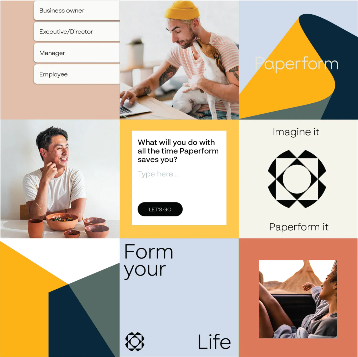
One of the most drastic changes is a simple one: photos of real people, doing real things. Things they couldn't be doing if they were buried in busywork: playing with their kids, going on a road trip, juggling a dog while working from home.
We pair "work" and "life" imagery to portray moments of true joy that come when work is under control. These are solopreneurs and small business owners taking pleasure in the simple things life has to offer.
This new imagery is also a way for us to showcase and promote the diverse range of people working (and enjoying) Paperform. They're empowered, in control and creative. As basic as it sounds, it's not something you often see in the tech world, where stylised graphics and illustrations rule.
How does this affect using Paperform?
If you’re reading this post then you’ll have already noticed things look a lil’ different around these parts. With our flash new branding now rolled out across our website, blog, and social pages, we understand you might be a bit nervous about how these changes will affect using the product.
The next time you open up Paperform, you’ll notice some visual changes too. Everything still functions the same— we’re still the same product you know and love. But we have made a few quality of life UI tweaks to improve the overall experience.
Most of these are cosmetic changes, and subtle upgrades based on your feedback that we’ve been waiting to implement. As the year progresses, you might notice the occasional update every now and then as we continue to refine the product and roll out the rebrand. But, rest assured, the Paperform you know and love will remain. We’ll just be a bit better looking.
Where imagination takes form
While the team’s been excited to share this rebrand with you, we’ve also been nervous. Change is never easy, and, if there’s one thing the internet has in droves, it’s opinions. Just know that we didn’t do this for a fancy colour scheme or a hip new logo.
Ultimately, we believe this refreshed brand better reflects us as a company and you as the community we serve. We’re proud of it, and we hope you are too.
We’d love to hear what you think. Good. Bad. Impressed. Disappointed. So happy you want to grab an umbrella and float around the streets of London like Mary Poppins.
Whatever the case, shoot us a tweet @paperformco, hit the live chat button on the bottom of the page, or email us directly to let us know at support@paperform.co. There’s more to come in 2022, and we’re excited to continue this journey with you.