
All Solutions
Explore all the solutions you can create with Paperform: surveys, quizzes, tests, payment forms, scheduling forms, and a whole lot more.
See all solutions


Connect with over 2,000 popular apps and software to improve productivity and automate workflows
See all integrationsProducts
Solutions
All Solutions

Explore all the solutions you can create with Paperform: surveys, quizzes, tests, payment forms, scheduling forms, and a whole lot more.
See all solutionsIntegrations

Connect with over 2,000 popular apps and software to improve productivity and automate workflows
See all integrationsResources
Real Estate Landing Pages in 2023: The Ultimate Guide For High Conversion

Thanks to TV shows like Million Dollar Listing, people think the real estate industry is all about champagne, cocktail parties and glow-in-the-dark veneers. However, contrary to popular belief, the real estate game is a tough racket.
Not only do you have to look after existing customers, you have to constantly be on the lookout for new ones. What do you do? Hand out business cards? Put up a billboard? Take out Facebook ads?
While these options work, they’re a bit like fishing. You might catch something worthwhile, but the chances are you’ll end up with a wet garbage bag and a dirty old boot. There’s a better form of real estate marketing - online landing pages.
Landing pages offer a way to target specific audiences and deliver messages that are tailored to their needs. They connect the right people to you, making it much easier to collect lead data and grow that all-important client list.
In this guide we’ll take you through how to create a real estate landing page that converts. let's dive in.
What is a real estate landing page?
A landing page is a single web page built with the goal of converting traffic into leads. It’s where a visitor “lands” after they click on a link or advertisement, and is one of the most effective forms of inbound marketing (bringing potential clients to you).
You can attract traffic from a number of sources, from organic search and social media to an email list. Where your website has multiple goals, landing pages are hyper-focused on one single thing: getting visitors to complete an action.
In marketing lingo this is referred to as a call-to-action. Basically you’re encouraging visitors to do something. It could be signing up to your mailing list, buying a product, scheduling a booking or sharing their contact information.
Landing pages are a great marketing strategy for real estate businesses because they allow you to target specific segments with relevant information. You can create unique pages aimed at the type of client you want to attract, from first time home buyers to current homeowners.
real estate lead generation form
Who uses real estate landing pages?
Landing pages aren’t just for marketers. All sorts of real estate professionals can utilize them to reach new clients (or existing ones). Here’s a quick idea of who can use landing pages:
- Realtors
- Buying agents
- Selling/listing agents
- Brokerage companies
- Vacation rental platforms
Why are real estate landing pages important?
It’s simple: high-quality landing pages drive conversions. They are a lead generation machine; a magnet that draws relevant traffic and helps turn leads into customers. Without doubt they’re one of the best real estate marketing ideas you can implement for your business.
Let’s say you run an ad campaign to send referrals to your real estate website homepage. On your site there’ll be a bunch of pages with different goals - it invites exploration rather than giving visitors the content they need at that moment.
People have short attention spans. They don’t want to have to scroll and click through pages to find what they need. In the age of convenience, they want it to find them.
real estate client intake form
Landing pages let you achieve this. You can make sure there’s a page made exactly for your target audience (and you can do it for several at once). The more specific your messages are, the higher your conversion rate will be.
Trying to collect feedback from home sellers? Running a listing for a new home? Hiring a team of realtors? Growing your mailing list for an email marketing campaign? No matter your goals, dedicated landing pages can help.
The 3 main types of real estate landing pages
As we’ve touched on, landing pages are versatile tools with a diverse array of use cases. Below we’ll take a look at some of the most common for lead capture of all sorts.
Home valuation landing pages
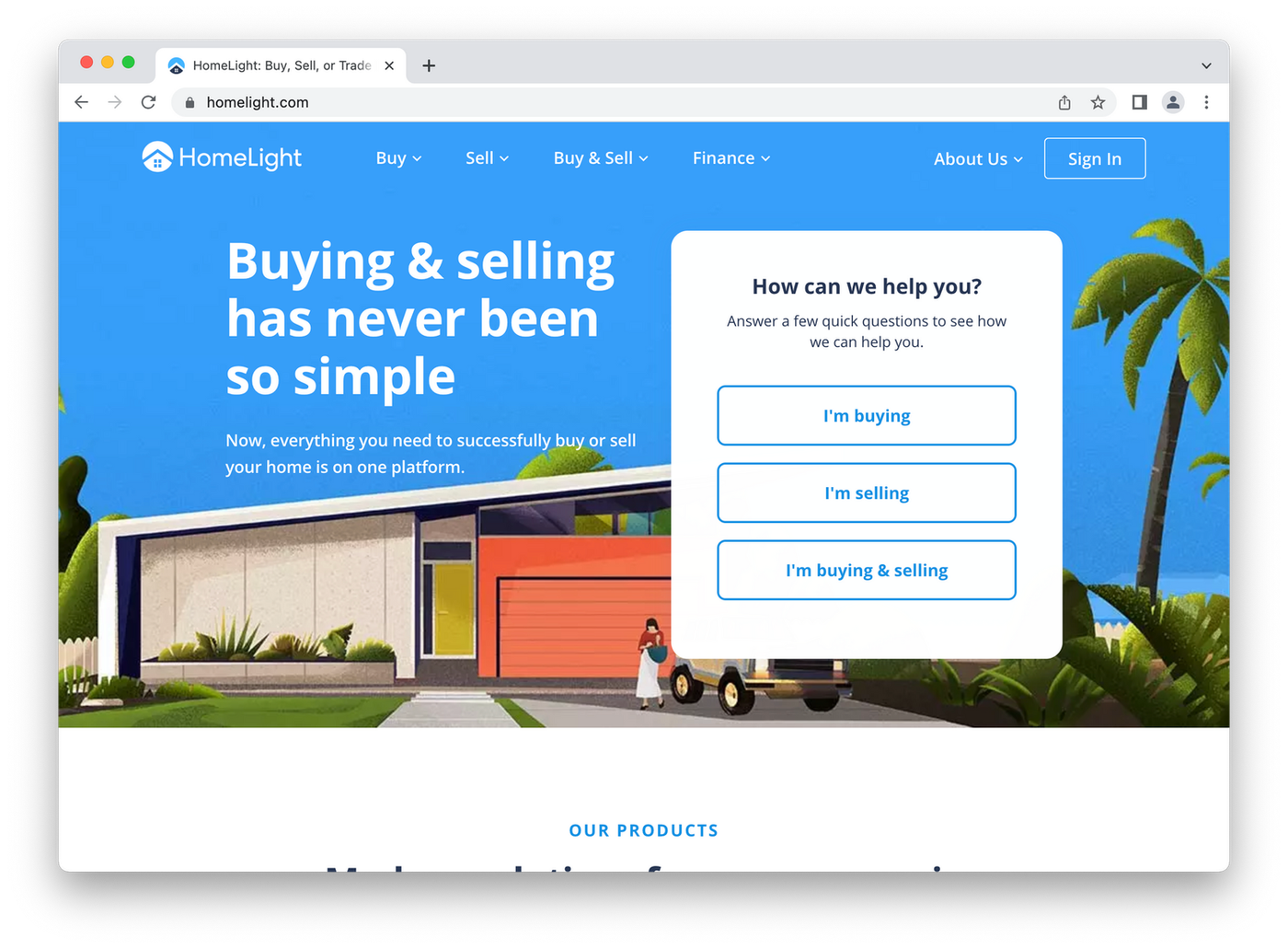 (Image Source: HomeLight)
Before someone thinks about selling their house they want to know what it’s worth. To help your potential clients do this you can build a home value landing page. It allows prospective sellers to enter information about their home and calculates an estimated value for them.
But to see the estimate they need to enter their contact information. And that, ladies and gentlemen, is a lead. It’s a simple reciprocal relationship: you give visitors value by fulfilling their needs, and they return the favour by completing your CTA.
Check out Homelight’s home value landing page above. It has a simple heading inviting you to find out what your home is worth and an even simpler call-to-action. There are no distractions - the page draws your eyes directly to the address field.
Home search landing page
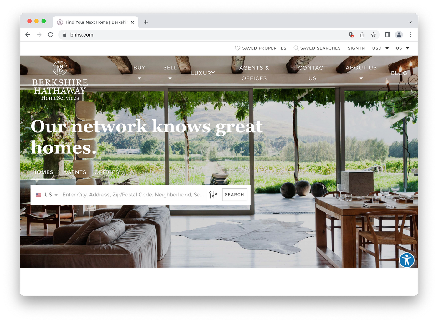 (Image Source: Berkshire Hathaway)
A home search landing page allows people to search your site for homes in a specific area. You know the type - let’s say someone’s looking for their dream home in San Francisco. They type in a specific post code and are given a page of property listings in the Bay area.
If customers want more information about a listing, or to access a realtor’s phone number, they have to enter contact information. Boom. Lead.
"The value proposition is clear: we’ll help you find a house if you give us some details. Berkshire Hathaway have a classic example on their company website. They use an elegant image and a serif font to reflect their brand, followed with an unobtrusive CTA button."
real estate listing
If visitors scroll down they’ll find information about buying a home, and eye-catching testimonials from previous happy clients. This not only adds social proof, it helps the page rank higher in search engine results, one of the most important elements of any landing page.
Free content landing page
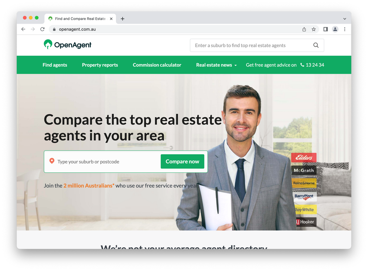 (Image Source: OpenAgent)
Another effective way to generate both buyer and seller leads is to offer content in exchange for contact information. For example, you could give away a free eBook that helps folks prepare to sell their homes, or offer a series of videos providing home buying tips for millennials.
OpenAgent has a standalone landing page giving visitors a free property report. If they want to learn more about properties in the area, see how much houses tend to sell for in the area and get suburb statistics and trends, they have to enter their contact information.
This is one of the most classic examples of a real estate landing page. Notice the bright CTAs placed at the top of the page, a reminder that it’s “free” and an image that shows the content you’ll receive once you click through.
How to create real estate landing pages that convert
While landing pages are excellent tools for collecting leads, it’s not enough to simply slap one together and assume people will come running.
Great landing pages that convert take work. With that in mind, here are a few landing page best practices you can adopt to help supercharge your conversion rate.
1. Keep it simple
The best landing pages are simple and to the point. You should always use short, punchy copy and compelling visuals that aren’t too busy. Use tools like Canva to make it easy on yourself, and when in doubt, repeat the mantra: “keep it simple, stupid.”
Your goal when visitors land on your page is for them to be able to sum it up instantly. The more people feel overloaded with information and options, the more likely they’ll be to leave without completing your call to action.
appraisal form
It’s like when you’re scrolling through Netflix. There are so many options that you spend more time looking for a movie than actually watching one. You want to avoid that by giving visitors a goal that’s immediately clear and easy to complete.
2. Create a compelling headline
In our current digital age, our attention is split in a million different directions at any given moment: that new instagram post, a funny tweet, your work, the ping of a text or email. Because we're all so plugged in, there's an extremely limited window to capture someone’s attention.
This means if you want people to read the content of your landing page, you need to have a strong headline. A headline is the first (and often, only) thing visitors will read all the way through, so it has to capture attention and express your message clearly.
Here are some quick tips for writing landing page headlines that convert:
Be clear: Get straight to the point and avoid being vague or ambigous. Aim for an immediate connection with your reader.
Keep it relevant: Try to align your headline with any relevant keywords and ad campaigns. Think about what visitors want to hear, and what your call to action is.
Be empathetic: Consider what is prompting your reader's visits, and express how you can help solve their problem. Write solution oriented copy.
3. Emphasise benefits over features
People don’t buy products or sign up to services for the sake of spending money. They want to solve their problems. Focusing on benefits allows you to show potential leads how you can bring value to their lives.
A good example is how Apple marketed the iPod. Most MP3 players at the time advertised how many gigabytes of storage they had. They were concentrating on features. Apple switched this up by instead advertising it as '1,000 songs in your pocket'.
You can take this philosophy into your real estate landing page. Your page features a home value calculator? Talk about how the seller can get more cash once they know what their home is worth. Giving away a free eBook? Explain it will help sell their home faster.
Your goal is to help your potential leads envision all the incredible value you’ll give them. All you need in return is their contact information.
4. Use high-quality visuals
Put yourself in the shoes of a prospective buyer. Would you use a realty firm if their website had a grainy image of a house that looked like it belonged in a Tim Burton movie? No way. A picture says a thousand words, especially in the real estate biz.
More than any other industry outside professional photography, real estate is highly visual. No one buys a house for their personality. It’s all about the looks. Use images that display your brand, aid the message you’re trying to send and look vibrant on the page.
real estate listing form
Let’s say you’re a real estate agent in Sydney. You might use an image of the harbour, a shot of a mansion overlooking Bondi Beach, a picture of a trendy Surry Hills townhouse, or the hip interior of a local café.
The key is to choose an image that captures the feeling you’re trying to produce without taking away from your page’s purpose. If you aren’t sure which image to choose, try A/B testing two versions of the same page with different images to see which converts better.
5. Create intent-specific landing pages
There’s no one-size-fits all landing page template. A page that is trying to resonate with renters will look completely different from one targeting folks looking to expand their housing portfolios.
The beauty is that digital marketing lets you target the right people with the right pages. Google AdWords and even social media platforms like Facebook and Twitter have powerful tools that allow you to get super specific with who sees your ad (and when they see it).
mortgage application form
You can make sure each page is optimized to convert a specific visitor in a specific situation. It might sound time consuming, but creating separate landing pages for each customer intent is one of the best lead generation strategies you can adopt for your real estate business.
There are plenty of landing page builders that take the hassle out of this process, but you’ll be hard pressed to find one with the right balance of beauty and brains that Paperform has. Use one of our pre-built templates, customize it to fit your brand, and add any advanced features you need, all in from our easy to use editor. Capture leads, take payments, and automate your marketing— all in the one place.
15 great real estate landing page examples
Now we’ve outlined just about everything you need to know about crafting a spectacular landing page for your real estate business, let’s take a look at some real-world examples.
Domain
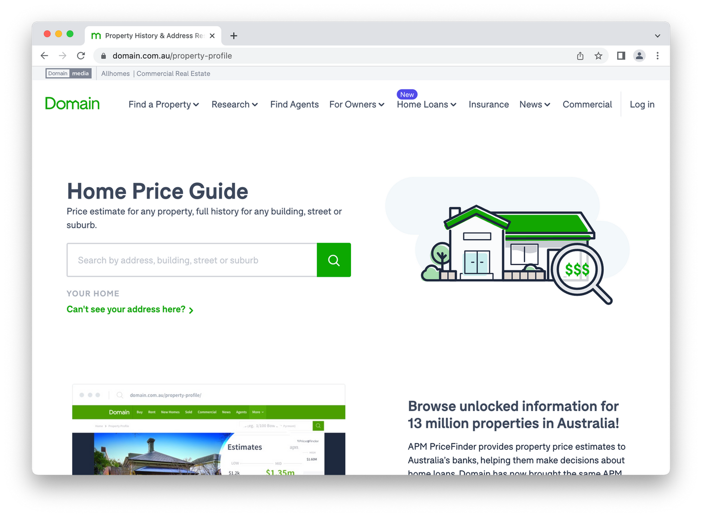 (Image Source: Domain)
Domain is one of the largest real estate websites in the world, so it’s no surprise their landing pages are excellent. Notice how the white space keep the page uncluttered and also fits in with their brand colors.
Your eyes are drawn to the heading and naturally flow down to the simple search field. There’s no need to look around or navigate - everything you need is in reach.
LJ Hooker
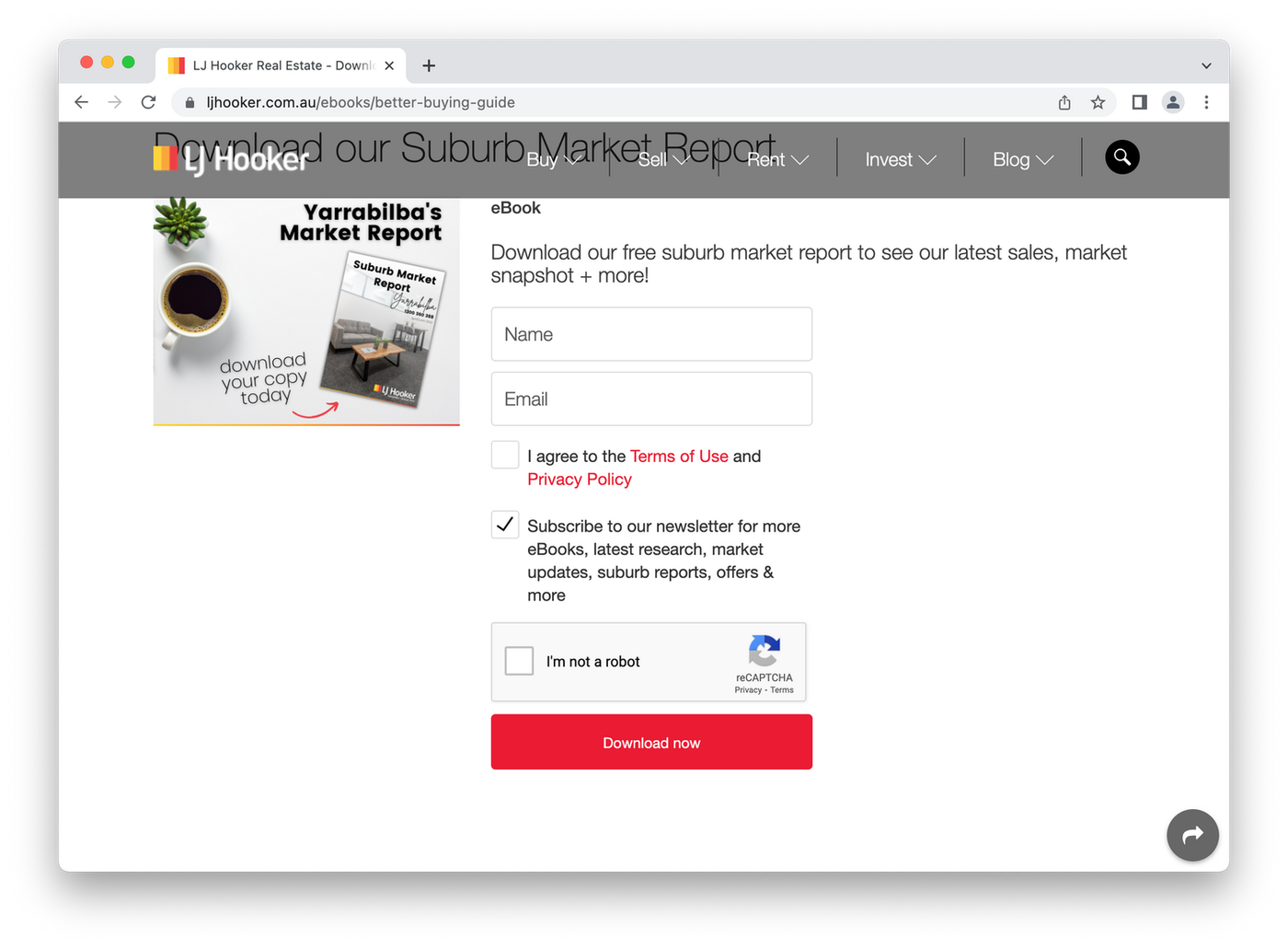 (Image Source: LJ Hooker)
This is a fairly standard, albeit effective example of a free content landing page. LJ Hooker uses this page to generate leads by offering a free eBook - assuming visitors provide their name and email.
It’s pretty much the go-to template for this kind of page. There’s a basic thumbnail of the eBook, alongside some well-written copy explaining the benefits of the book. It's a bit barebones, but it definitely works.
Flyhomes
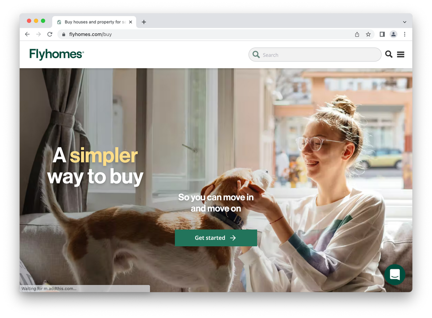 (Image Source: Flyhomes)
Flyhomes has a bunch of great landing pages, but this buying page pretty much sums up their philosophy - “Buy a home with less stress”. Who wouldn’t want that?
The image is super important too. It uses earthy tones and a relaxed vibe to project the idea of a stress-free home buying process. It's an excellent example of synergy between brand, headline and landing page.
Sundae
 (Image Source: Sundae)
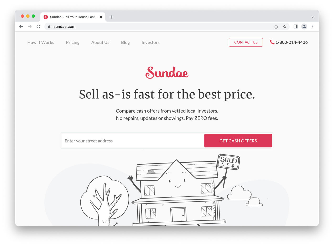
A beautiful minimalist design, punchy copy and unique visuals. Not bad, right? On top of that Sundae expresses their brand identity well, showcasing their company as a helpful, supportive company.
Leads are captured through the street address field, which is standard practice. The CTA is also a unique one, with “Get Cash Offer” encouraging visitors to click through for immediate results.
Destination Homes
 (Image Source: Destination Homes)
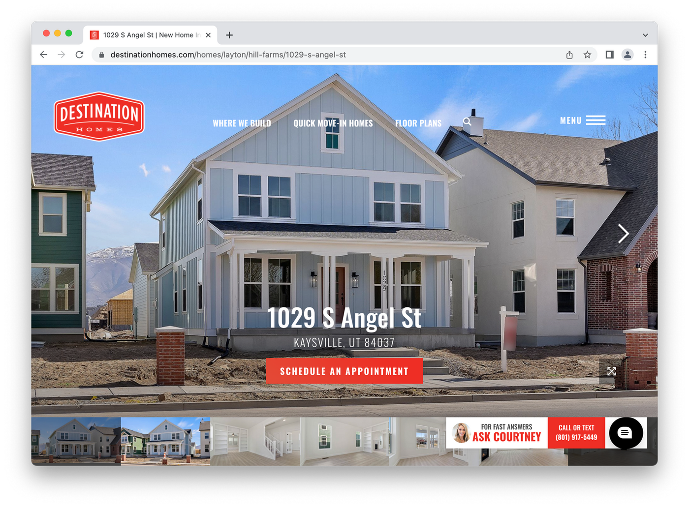
Destination Homes makes specific landing pages for each of its properties. The pages are supplemented with photographs of house and land, and a CTA to schedule a visit. As visitors scroll they can even get a map and video tour.
Potential buyers get all the information they need, from renderings of the floor plan to a bird’s eye view of the location. At the bottom of the page there’s also a direct link of communication with the realtor, a nice touch.
Compass
 (Image Source: Compass)
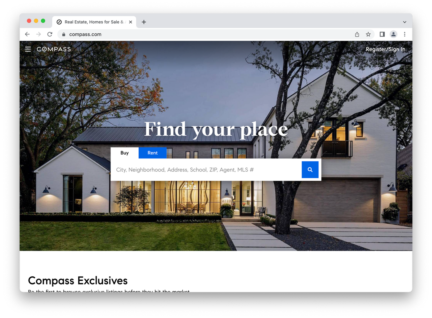
Compass has a premium, minimal aesthetic that’s apparent as soon as you land on the website. The heading has a dual purpose as a CTA, inviting visitors to find their place (making the process feel personalized is a popular strategy).
The search bar stands out against the image of a luxury home with warm lighting. Visitors are also given a glimpse of the lower section of the page, offering properties that are exclusive to Compass for them to browse.
Corcoran
 (Image Source: Corcoran)
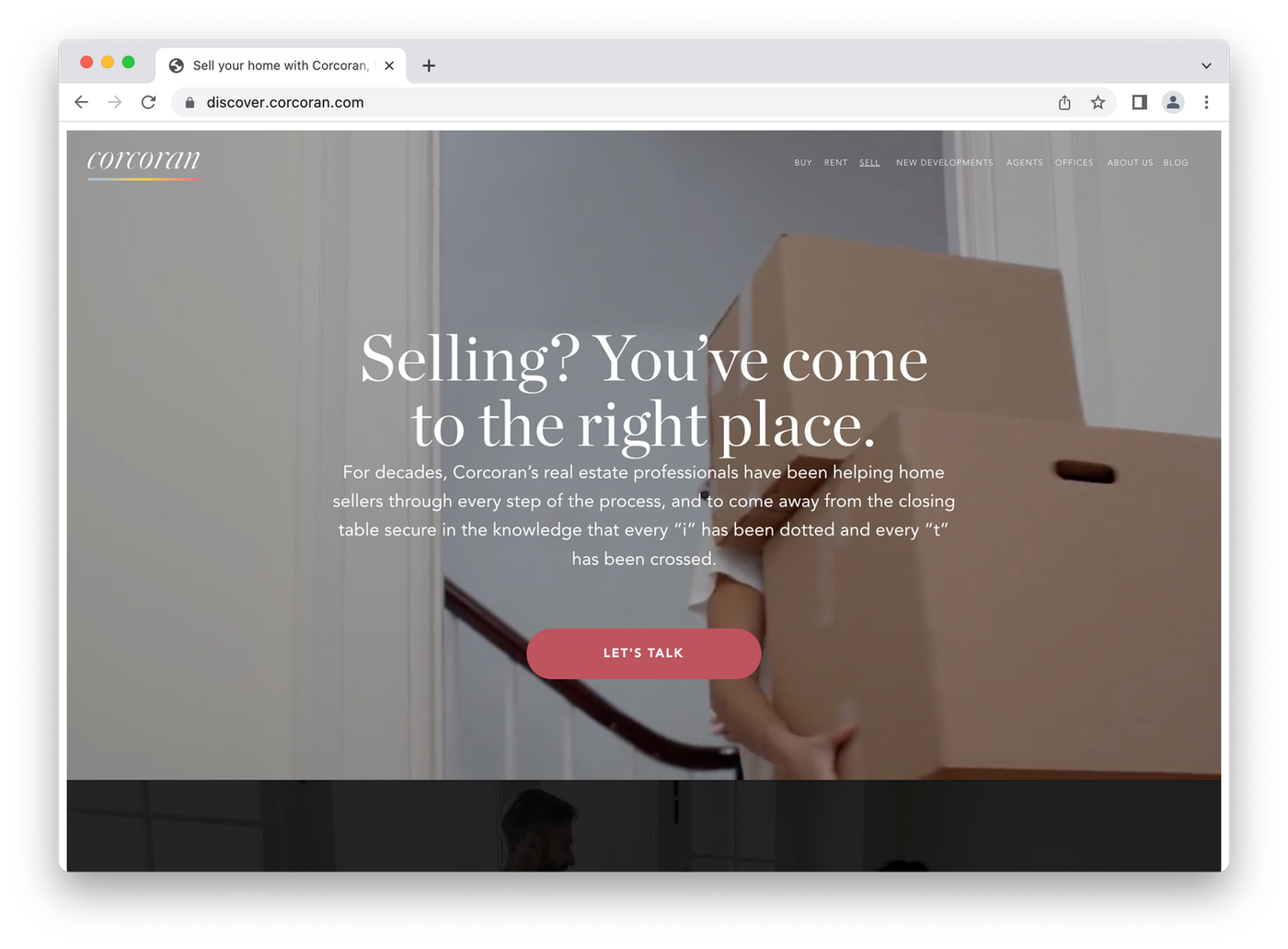
Real estate giant Corcoran goes all in on that idea that visuals matter by using a video landing page to welcome prospective clients to their page targeting people looking to sell their homes.
The video shows a compilation of moving into an apartment - from lugging in boxes to popping champers. It seems odd at first, but it makes sense. Wouldn't you want to sell your home to people who love it?
NestAway
 (Image Source: NestAway)
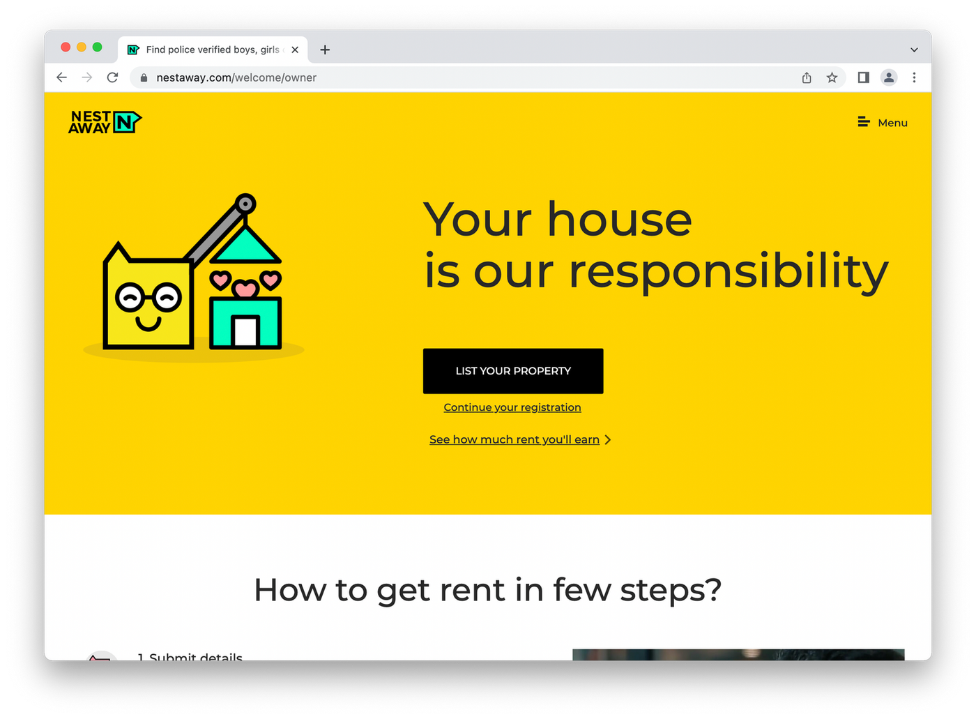
NestAway realised that when someone sells a house they want to feel like it’s going to be cared for. So they double down on projecting an image of being careful custodians of their properties.
The headline copy is great, the yellow background is visually engaging and the cute icon on the left of page helps add to their caring brand identity.
LA Home Girl
 (Image Source: LA Home Girl)
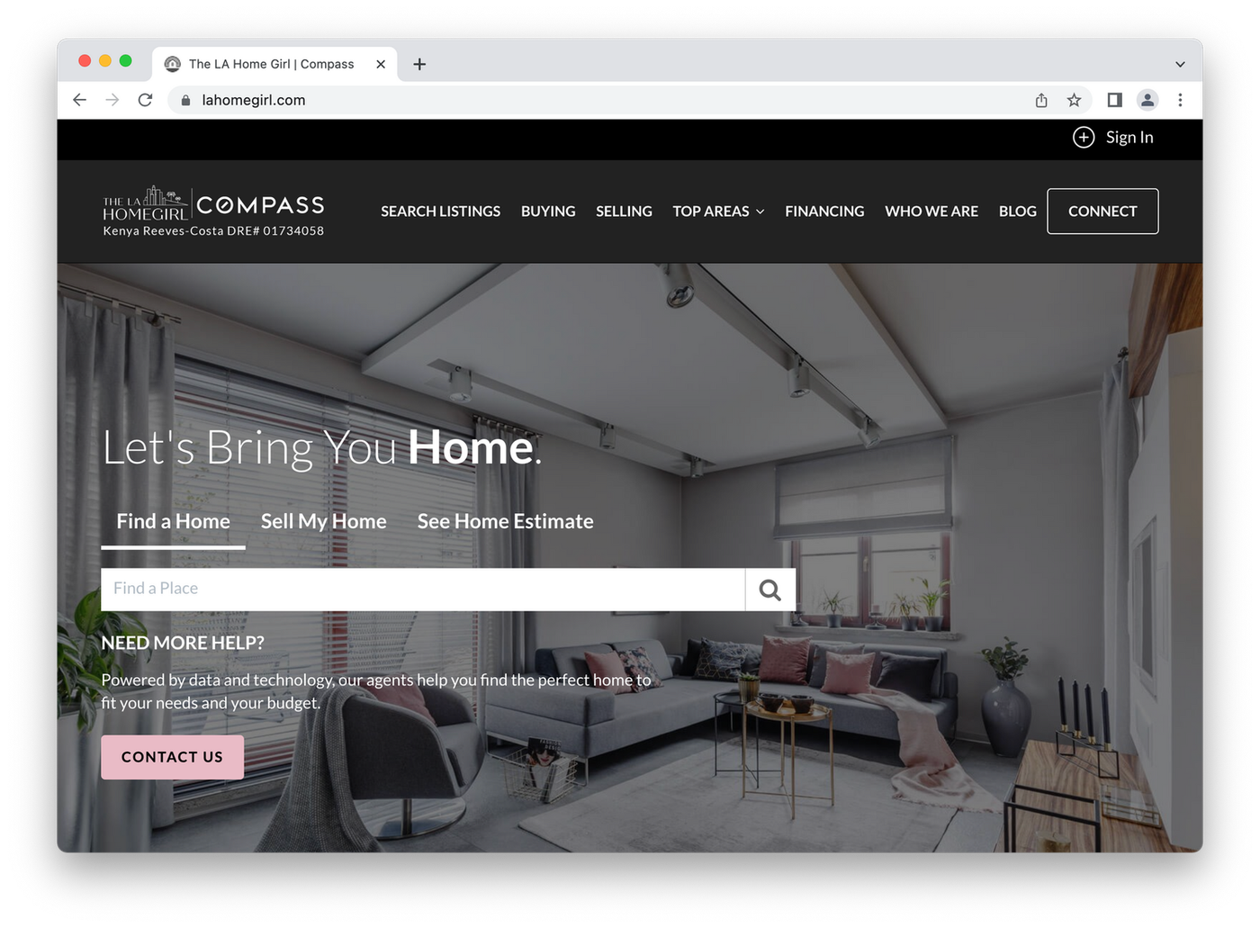
LA Home girl has a unique pop-up landing page that gives an instant view of properties in the area. The catch? Visitors have to add their name, email and phone number to view the listings properly - absolute gold for lead generation.
The entire site is actually hidden behind a kind of paywall until contact information is provided. We wouldn’t suggest following that tactic, but it’s certainly one way to make sure you get leads.
Zillow
 (Image Source: Zillow)
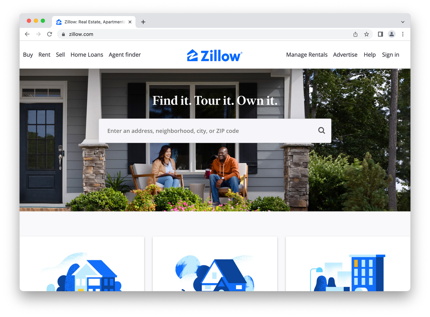
Zillow has a bunch of individual landing pages for different uses, but their homepage is really well put together. A bright feature image shows the variety of properties they handle, from ultra-modern mansions to entire apartment buildings.
It’s bright, fun and brings to mind the kind of idyllic neighbourhood everyone would love to live in. It’s supported by outstanding copy and clean formatting.
Redfin
 (Image Source: Redfin)
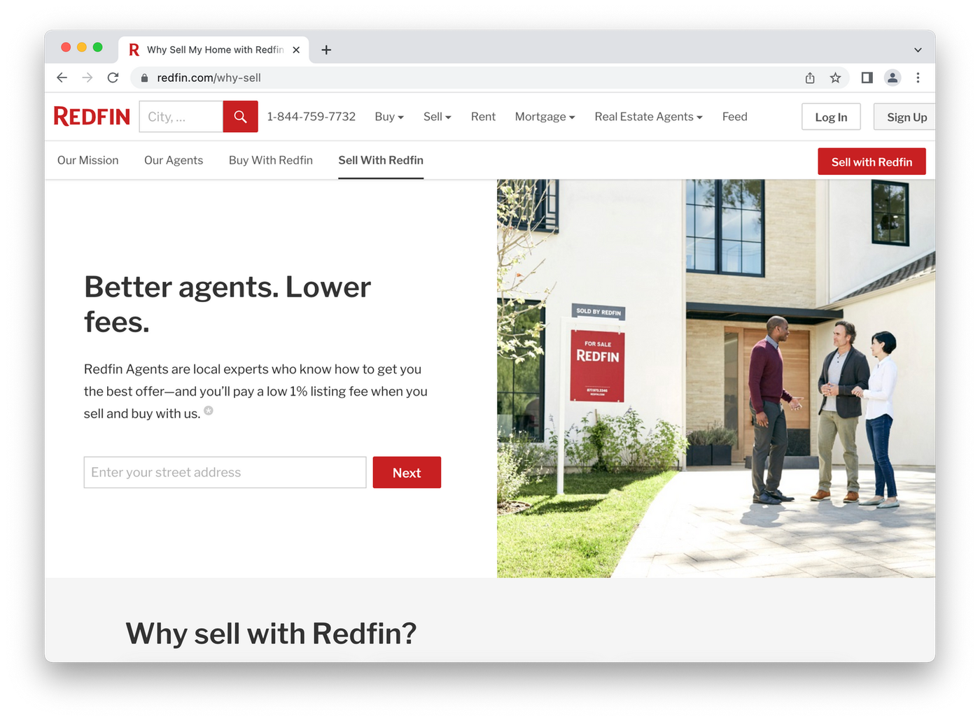
Redfin’s selling page is a classic. There’s a strong headline followed by a bit of copy about the benefits you get by choosing them (the best offer on your house and only a 1% listing fee).
The page uses plenty of white space, and the visual shows a happy couple inspecting a property. Overall it's a fluid and intuitive page that flows into a well-integrated lead capture form.
Rightmove
 (Image Source: Rightmove)
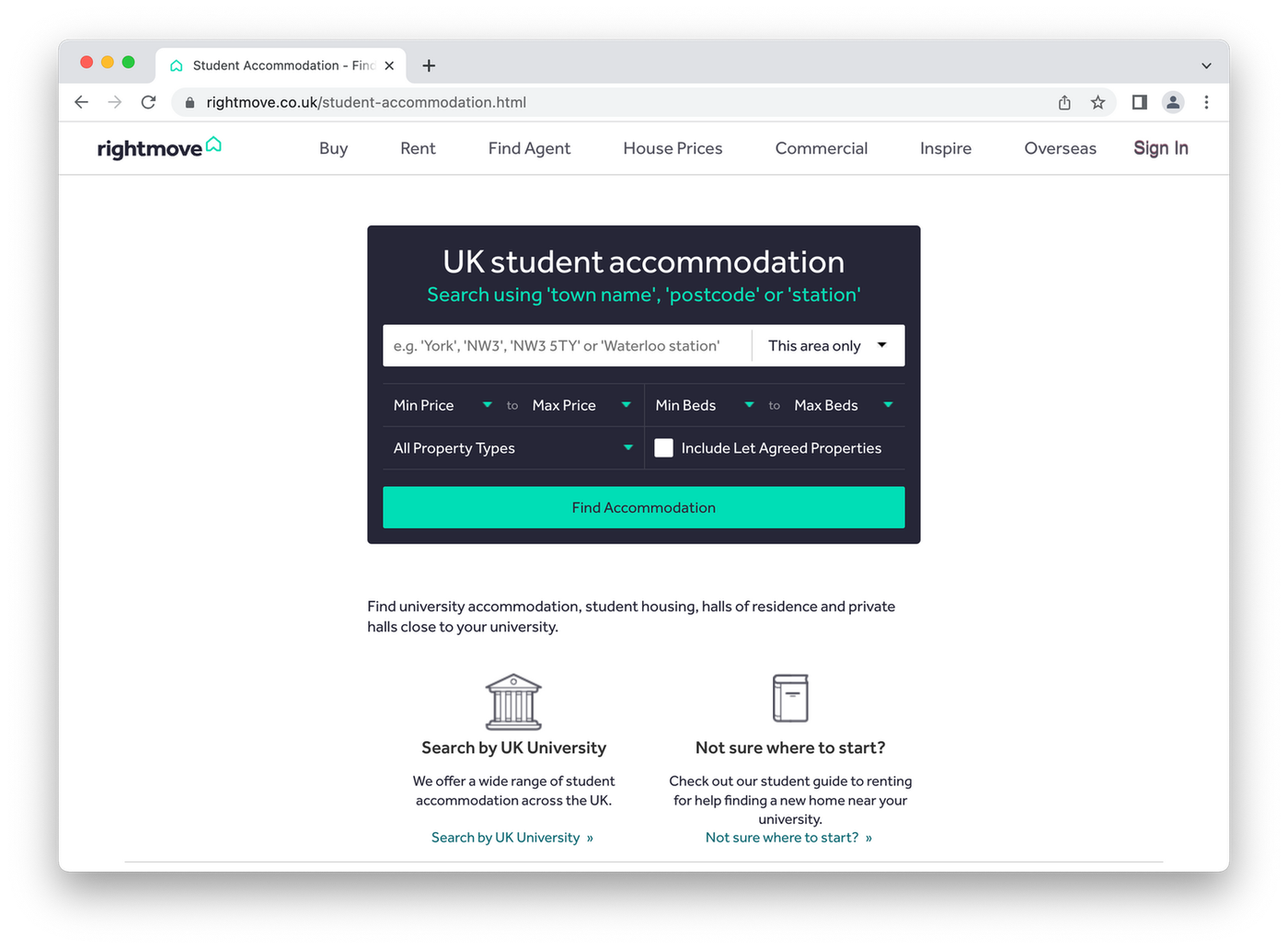
Remember how we were saying it’s important to create landing pages that are aimed at a specific audience? Rightmove does this perfectly with their page aimed at UK students.
From one page you can search by area, university or click through to their student property guide.They get that students don’t want any fancy bells and whistles— they just want to get the process over and done with so they can get back to drinking chai lattes and binge-watching Netflix.
Momentum Wealth
 (Image Source: Momentum Wealth)
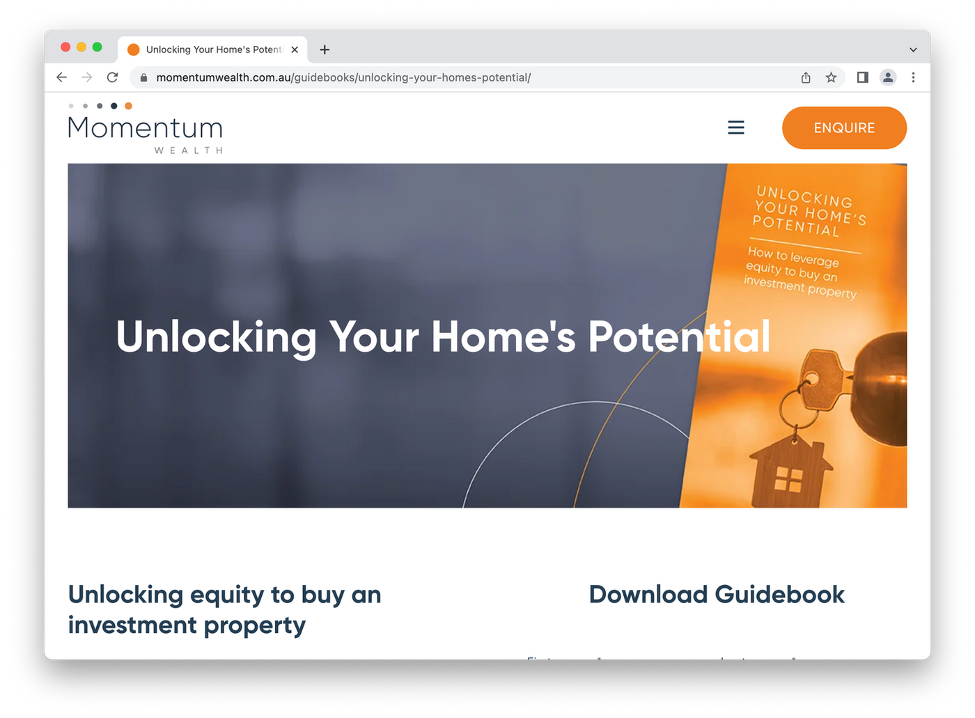
Free content pages only work if the value you’re giving is clear. Momentum Wealth achieves this with a page layout full of benefit-driven copy explaining how their free eBook will help potential investors.
The lead capture form (where it says "download guidebook") isn’t too in your face. All the fields are visible at once, but it's off to the side so you can get to it once you've learned about the eBook.
leasing application form
Over to you
Now you know just about everything there is to know about real estate landing pages, it's time to spread your wings, don your creative cap and start creating one of your own.
Should you risk a mental breakdown trying to build your site on WordPress? Or fork out hundreds (thousands) of dollars for a web developer to do it for you?
Those aren't the most attractive options. The good news is you don’t need to do either. With Paperform you can create a beautiful, feature-rich and on-brand landing page in just a few minutes.
Don’t believe us? Try for free and see for yourself today. No credit card required.
Form a better life now.
Get your 7 day unrestricted trialSmileBox started in a bedroom and scaled to 30,000 orders. Here’s how founder Tom Wrench used Paperf...
When Kathleen Celmins launched her AI-powered app, GlowSocial, she quickly realized that building cu...
Paperform has been recognized as a 2026 G2 Best Software Award winner! It is an honour we are deeply...
Trying to decide between Zapier and Stepper? This in-depth comparison breaks down pricing models, wo...