
Every business needs a website. It's your own special spot on the internet. A place to collect leads, tell your story and sell your products or services. It’s your online home.
But too often even simple companies have complex multi-page websites that are harder to navigate than rush hour traffic in Los Angeles. They’re full of so many pages, headers and sub-menus they feel more like mazes than websites.
Luckily, there’s a new web design trend that is a better fit for folks who don’t need dozens of webpages: one-page websites.
A one-page site shows all of your content - from contact information to your ‘About Us’ section, in one long, scrollable page. Like a Swiss Army Knife, these sites give you all you need in one place. They're fast, sleek and offer an intuitive user experience.
In this article, we'll run you through best practices for creating your own single-page website, and how you can do so effortlessly with Paperform.
Is a one-page website right for you?
The majority of the internet uses classic multi-page sites for one reason: they work. They allow you to split your content into unique pages, giving you plenty of space to organize different parts of your site.
For most businesses this is the right solution. For example, if Paperform tried to fit everything onto one page it would look like a complete mess. People would be scroll for so long they'd fall asleep before signing up.
If you need lots of content on your website then it’s best to stick to a standard web design format - especially when you have lots of services, a blog or an online store.
So when can you use the mythical one pager? Well, it might be the right option for you if you require:
- A landing page
- A simple company website
- A freelance website
- A personal website
- A creative portfolio
- An event page
Single page websites are great for linear experiences. They let you to focus on what’s important - that could be a rundown of your creative agency, a list of your freelance photography services, or a new product you’re releasing.
[TEMPLATE: single-page-website-form]
It’s an excellent option for small business owners or entrepreneurs. Ask anyone who has built a website, putting it together usually takes hours and is more frustrating than treading on a piece of LEGO. Sure, you can pay someone else to do it, but that's pricey.
With a one-page site you don’t have to worry about HTML, CSS, homepages or fancy parallax effects. And Paperform lets you have the whole thing up and running, and looking as beautiful as Beyonce at the Met Gala, in a matter of minutes.
(Okay maybe not that beautiful. It's Beyonce after all.)
6 steps to making a great one-page website
1. Plan your layout
You don’t need a degree in web design to create a beautiful one-page website, but like a Batman villain, you need a plan. You can’t just expect to wing it.
Why? Because the strength of a single page site is how it lets you craft a journey for your visitors. You have complete control over what your visitors see, when they see it, and how the information is displayed to them.
If you make it up as you go along, your site will be inconsistent. You want it to flow as clearly as a great novel or a Bob Dylan verse. To achieve that you’ve got to plan every element, starting with the layout.
Put yourself in your visitors shoes. Think about what information they would want to discover, then envision the customer journey. What do you want them to do? Enquire about your services? Buy a product? Sign up for your newsletter?
Let’s say you’re a freelancer. You might start with a bio, then show your clients, services and links to your work. Then you might add testimonials, and include a contact form at the bottom of the page with an invitation get in touch.
Sure, it doesn’t reinvent the wheel, but it offers a coherent pathway for visitors. By the time users done they know who you are, what you do and how to get in touch with you. Mission accomplished.
You can add or omit things depending on the purpose of your site. But whether you're a personal trainer or a bakery owner, most one-page website designs will require a selection of the different sections below:
- An ‘about section’
- A call-to-action (CTA)
- Products/services
- Testimonials
- Frequently asked questions (FAQs)
- A contact form
- Social media links
No matter how many of the sections you use, remember the key to a great one pager is brevity. Trim the fat and keep things simple.
[CTA]
2. Make your content scrollable
After you’ve settled on a layout and broken your site into sections, it’s time to delve deeper into the overall design. Making your content “scrollable” means making it as easy to read, and scroll through, as possible.
Think about Instagram or Twitter. Users become so captivated by these sites that they mindlessly scroll for hours without even thinking about it. It’s about providing an experience that’s uncomplicated, straightforward and effortless.
Unlike these social media giants, you don’t have a team of thousands of developers to work on your site. Thankfully, single page design is inherently simple. There are just a few best practices you can follow to give visitors the best experience.
We’ve already touched on the importance of sections. Ensure each one has its own heading and that there’s plenty of white space splitting things up. No one wants to visit a page that looks like a particularly dense textbook.
Seriously, look at how terrible the following page looks:
 (Image source: Paperform)
Now, see what some simple formatting can do:
 (Image Source: Paperform)
Much better right? It's about as good a makeover as Julia Roberts's transformation from a lady of the night to a Rodeo Drive fashionista in Pretty Woman.
Don't make the mistake of having huge blocks of text. Split up your content with a few headings and eye-catching images. You can include any relevant photo - from your products to your staff, or graphics that are relevant to each different section.
Not only does it make the site more scrollable and enjoyable to read, it helps when it comes to search engine optimization.
3. Write a strong call-to-action
A call-to-action (CTA) is a short piece of writing that draws a user’s attention to something you want them to do. It could be downloading your ebook, buying a product, or signing up to your email newsletter.
[NEWSLETTER]
See what we did there? Above is a basic CTA asking you to sign up for our newsletter. It doesn't reinvent the wheel, but it doesn't have to. It does its job— in a few words it makes it crystal clear what we're asking you to do.
A CTA can be as simple as a prompt to 'Buy Now'. It helps to think of it like a road sign: it has to be prominent and unmissable. After all, it's the main way to draw in visitors and convert them to clients, so it's kind of important.
Here are a few tips for creating CTAs that convert:
- Use action-oriented verbs like ‘Try’, ‘Get’ and ‘Buy.’
- Be direct
- Keep it short (no more than six words)
- Add a sense of urgency
- Write in your brand voice
Your CTA should be a natural part of your site. For example, on Paperform's main page we have a link to sign up for a free trial. This makes sense because we assume that people visiting our site may be interested in trying our services.
Think about the goal of your business. A freelancer might have a link to enquire via email. A business might have a link to sign up for a free trial (like Paperform), or an event page might have a link to buy tickets.
[TEMPLATE: event-registration-form]
Just remember not to beat your audience over the head. Too much sales talk will turn people off your services or products, no matter how good they are.
4. Include a footer
A footer is the bit at the very end of your website, kind of like the credits at the end of a movie. It helps visitors by adding important information and navigation options in a spot that’s easy to find.
Usually it includes things like contact details, links to social media accounts, and any business hours, as well as boring (essential) legal things like privacy policies or terms and conditions.
Use it as a spot to add another logo, your address or one final CTA. As with any other aspect of your one-page layout, it’s best to keep things basic. A long, ugly list of links will ruin the minimalist beauty of your site.
If you're not sure what to add, at the least put your social media links and contact information. The rest is up to personal preference.
5. Optimise for search engines
Search engine optimization (SEO) is a vital part of any website. There’s a fair bit of mystique surrounding the term online, but contrary to what the internet may have you believe, it doesn’t take any witchcraft or magic potions (okay, maybe a bit).
At its core it’s about helping your site get found online. Optimizing for SEO means you’ll rank higher in the Google search results - bringing more traffic (and potential customers) to your site. So how do you do it?
The good news is a big part of SEO is having a great on-page experience. So if you’ve got a scrollable one-page site with clear headings, plenty of white space and images to break up the text, you’re part of the way there.
But there are a few things you'll want to do to boost your page rankings. First, you'll want to submit your new website to the Google search index. This basically lets our Google overlords know your new site exists.
The next step is to make sure your website is targeting the right keywords. Keywords are an SEO term for the phrases people search on Google. For example, Paperform appears in the results when users search the phrase “best online form builder”.
A lot goes in to good keyword targeting, but it comes down to using words that are relevant to your product or service. It's one of the most effective online marketing strategies you can use.
All that’s left to do (unless you want to hire an expert) is to ensure your site works well on mobile. Mobile-friendliness is a vital SEO-ranking factor, meaning it’s not enough for your site to only perform well on desktop.
6. Keep it mobile-friendly
Since 2019, Google has primarily used the mobile version of websites for indexing and ranking, meaning that your site’s mobile performance is very important.
Unless you're a tech-savvy web developer who can build their own fancy site in HTML, there's not much you can do about it. All you can really do is make sure your content and layout is clear and easy to navigate.
Most of what goes into making a site mobile-friendly happens on the back-end. That means the website builder you use for your site matters. You can't just pick any old WordPress template and magically create a site that will rank well on Google.
Don't worry, you're in the right place. With Paperform you can build a single page site in minutes that’s automatically optimized for desktop and mobile devices. It’s as easy as brewing your morning coffee (and nearly as quick.)
With our tools you can create a site that's unique, aligned with your brand and intuitive for your users without writing a line of code. It takes the stress out of website creation, giving you time to concentrate on other areas of your business, or just kick your feet up, pour a glass of wine and veg out on the couch.
Extra: To learn more about growing your company through SEO here’s a helpful guide on how SEO and PPC can help you.
Make a stunning one-page website with Paperform
You can use our handy one-page website template, or start from scratch. For the purpose of this tutorial, we’re going to make a simple website for a pottery business. The goal is to:
- Introduce the company
- Give important details
- Basic eCommerce
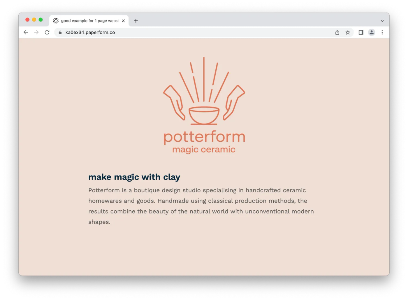
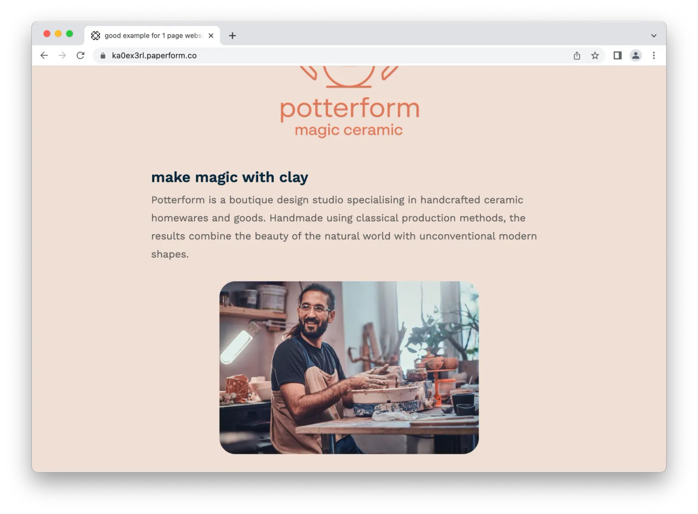
The first step is to add some branding at the top of the page. Add your logo, company name and industry, so visitors know what page they’re on straight away. (If you're a freelancer you could use a photo of yourself instead of a logo).
By default text is in a simple body font, aligned to the left of the page. Highlight the text and a menu will pop up with alignment and customization options. As a rule its best to use "H1" for the main title, and "H2" for any other headings.
You could move on to the next section by hitting enter a few times, or you could create a divider by holding down the "_" button until you've made a line long enough.
So far our page looks like this:
Next, add another section. For creatives this could be a short bio, for an event this could be an outline of what's taking place, and for a business this could be an overview of your services and a mission statement.
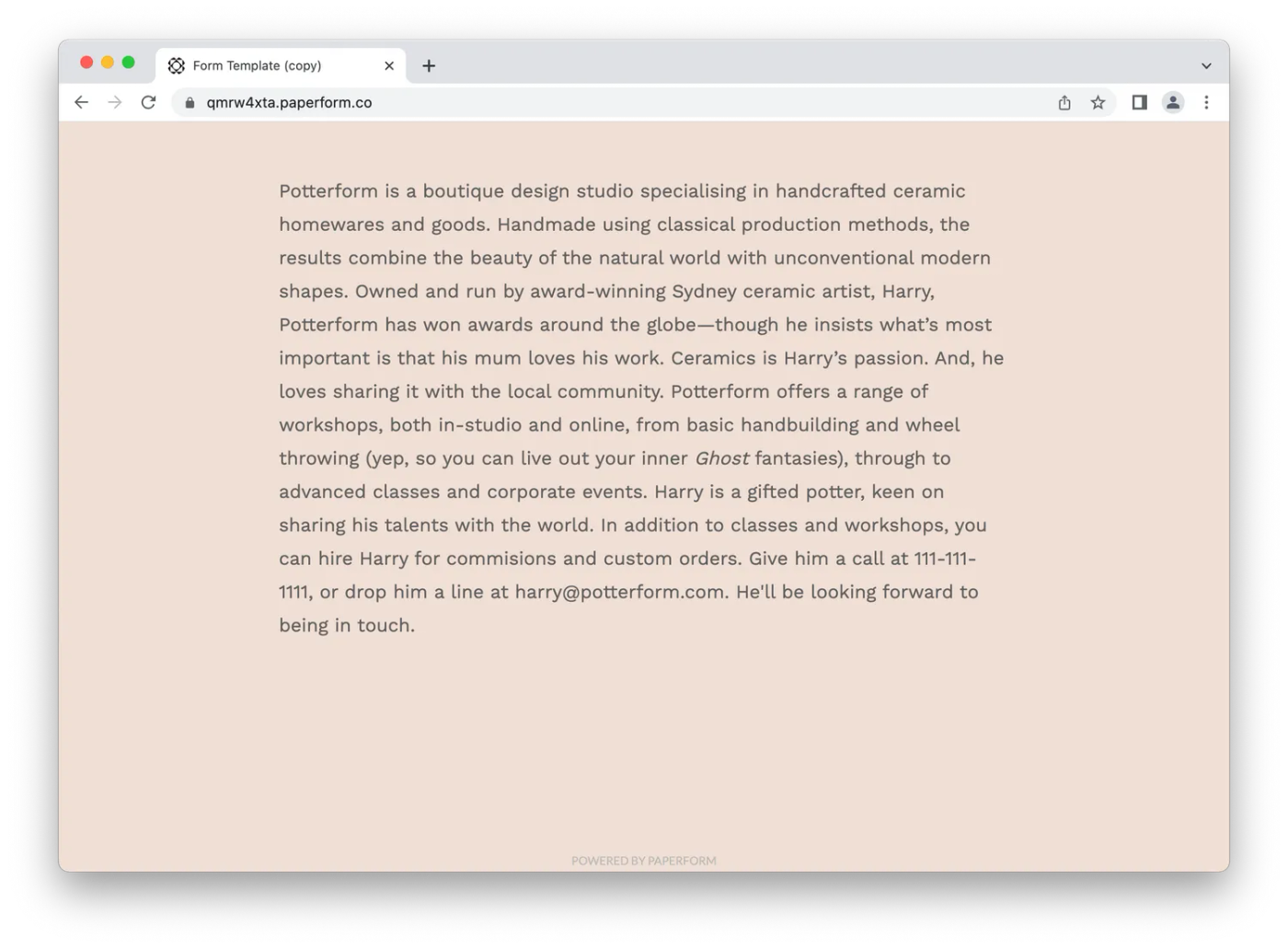
For our pottery business we're going to add a short piece of copy introducing customers to the service. Add a heading with bold font or a H2 and write your copy. When you're done, add another blank space followed by a line.
The page looks like this:
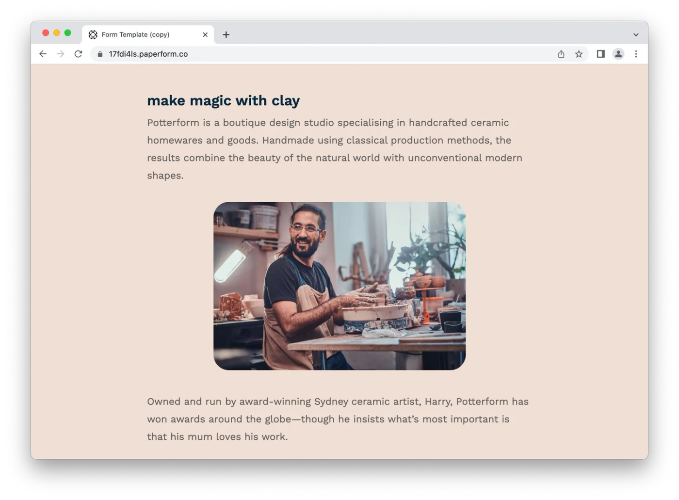
Not too shabby, hey? Now rinse and repeat. Add any sections you think make sense for your business - from an 'About Us' section to introducing your team, outlining a product or describing your services.
For our pottery site we're going to break things up with an image. We will use a relevant photo of Harry, our potter, doing what he does best.
One of the goals of this site is to give customers the information about our business they may need, so we'll now add a section with things like business hours and the store's address.
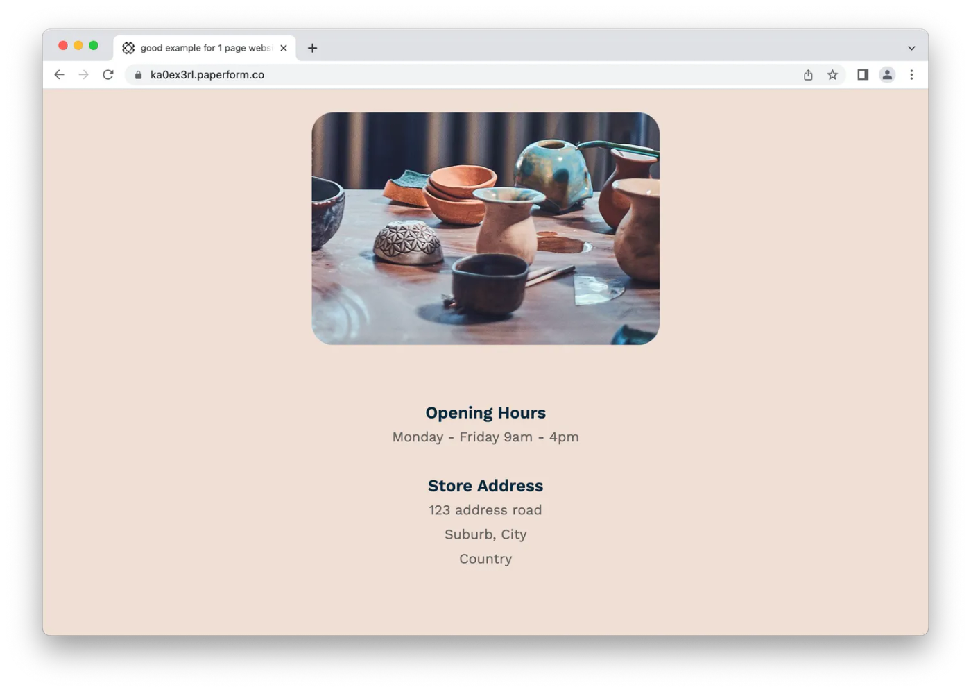
Notice how text is broken up with spaces and sub-headings? Not only does this help the page look elegant, it makes it easy for users to scan the page and find relevant information.
The next step for Potterform's one-page site is adding products to purchase. You can do this with our product question type. Use it to add products, adjust pricing and stock levels, and even apply SKUs to individual items.
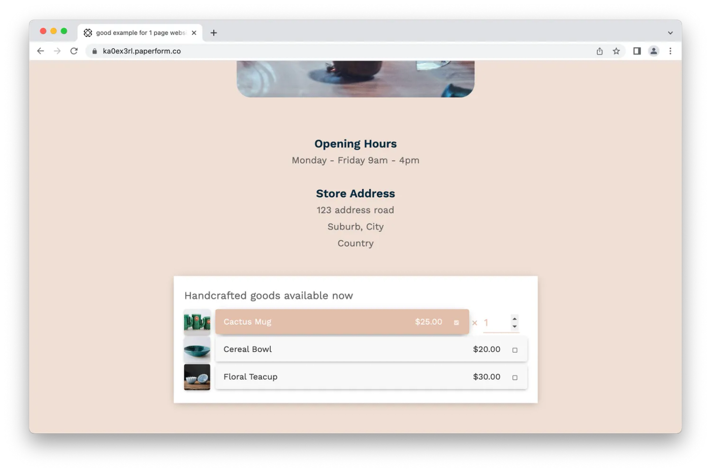
If you're running a product based service like this one, you could have your customers select pick up or delivery, and customise pricing based on their choices.
You can set up forms with conditional logic so the right fields appear based on the customer's response (ie., you don't need an address if they chose pick up). This keeps the page uncluttered and makes the process intuitive for visitors.
If you want your website to be able to accept payments, Paperform has you covered. With integrations with major gateways like Stripe, PayPal, Braintree and a bunch of others, getting paid is easy.
Link an account and use a multiple choice question to give users payment options. You'll be able to take orders, accept payments and manage inventory levels - all with Paperform. And with custom pricing rules you can shipping costs, discount products, offer discounts and even accept subscriptions.
You may need to spend some time adding more sections like testimonials, FAQs, or dedicated sections for product features. But that's it for Lotus & Co - all that's left to do is add a footer.
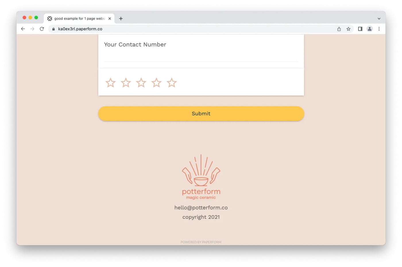
For the footer insert a smaller version of your logo with contact details and any links to your social media accounts. It should look something like this:
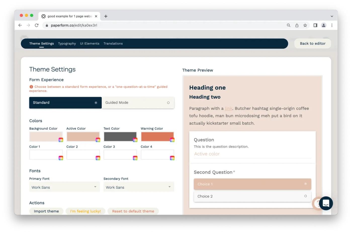
We've used a template for this website, but you can always alter it to add those final touches on the design. From the Theme menu, you can tweak the site to reflect your brand. Whether you want a fresh color scheme or a full overhaul of the background, fonts and entire UI, you can do it.
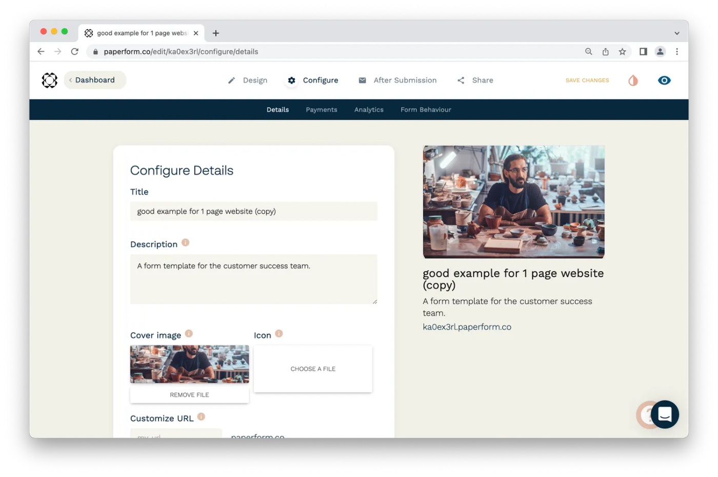
There's just one last step. Head to the Configure tab to adjust how your site will look when people share your link. Add a title, a description and a cover image - and don't forget to customize the URL to your liking.
Your snazzy new one-page website is ready to go! Share it among your clients, pin it to the top of your social media profiles, and sing about it from the nearest rooftop (if you choose to do the last option please wear appropriate safety gear).
With Paperform, you can create a beautiful one-page website with all the features your small business may need, from processing payments and managing inventory, to integrating with your favorite apps to automate processes like sending thank you emails or adding tasks in your CRM.
This is just one example of the kind of one page website you can make with Paperform. With a digital suite of tools this versatile, powerful, and easy to use, the only real limit is your imagination.
Over to you
Classic websites are still the apex predator when it comes to the online sphere, but one-page sites are an awesome alternative. Not only do they keep things simple for your customers, they keep it simple for you on the back-end.
Stick to a traditional site if you need a large online store, have lots of content, or have a dedicated blog. But if you’re after a more streamlined solution, a one-page website is the way to go.
You don't need to spend hours fiddling around with WordPress, or a heap of money on expensive web development tools, or your own personal developer. Just create a simple, elegant one-page website with Paperform.
Sound good? Get started today for free - no credit card required.