Plenty of research shows that first impressions really matter. And no, we’re not talking about getting the spinach out of your teeth before you strut into a blind date or a networking event. We’re talking about your online forms.
Your overall form design is the first thing people take in when they land on your form. A first impression that’s polished, aesthetically pleasing, and spinach-free (wink) encourages people to stick around and actually complete the form the way you want them to.
Needless to say, there’s a lot riding on your form design. But how do you make sure you’re doing it right?
In this guide, we’re dishing out all of the form design best practices you need to know to pull together an online form that represents your brand, engages your visitors, and most importantly, converts.
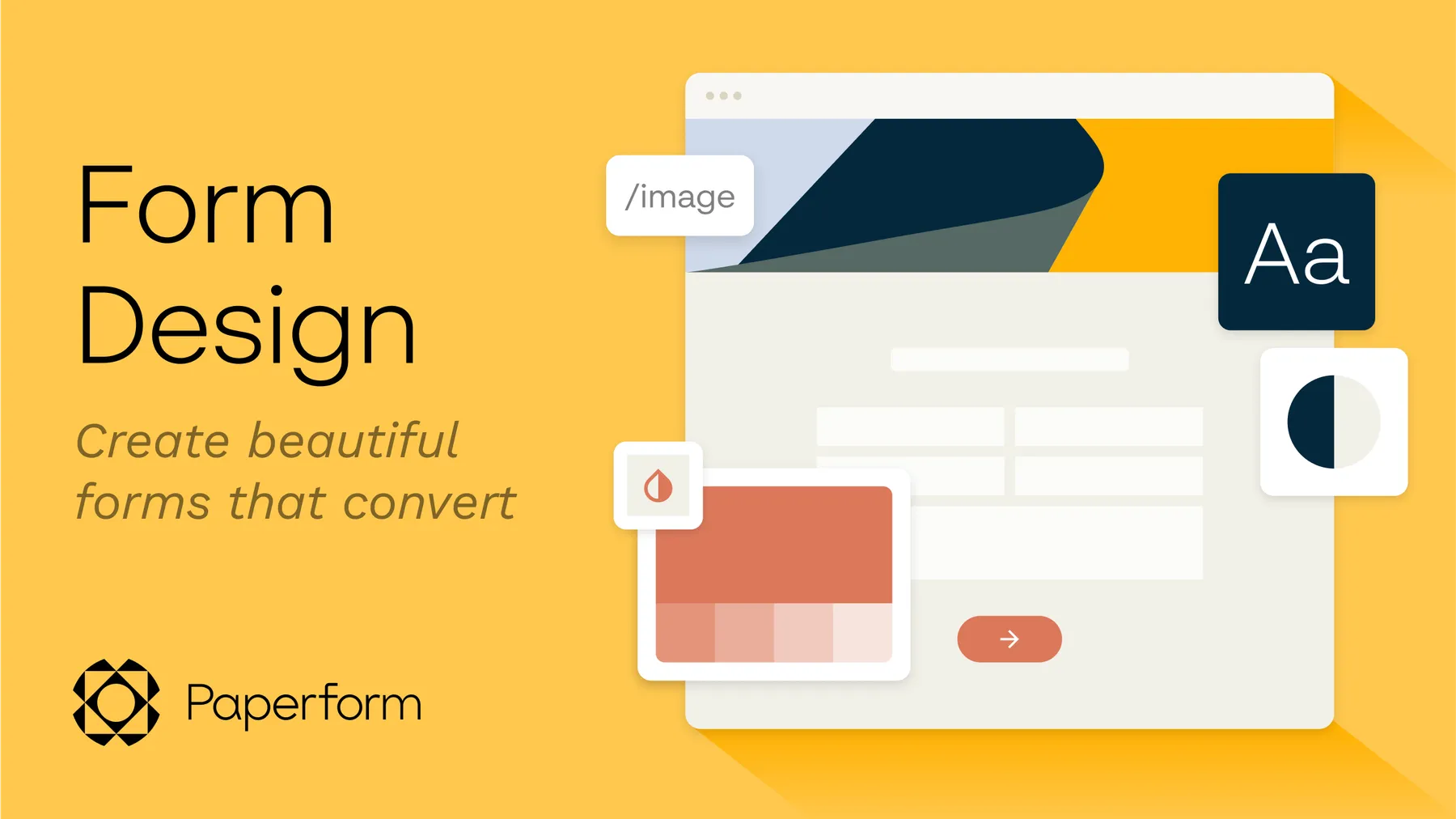
What is form design?
The name says it all: Form design is the process of laying out and building a form or questionnaire that people use to submit information to you.
On the surface, forms seem simple enough—it’s just some questions and answer fields, right? But there’s a lot that goes into adequate form design. When you consider the overall use and appearance of your form, you need to consider both:
- Functionality: How usable your form is. This includes things like the order and layout of the questions, where the labels are, where the buttons are, what questions are required, and more.
- Aesthetic: How visually appealing your form is. This includes things like colors, fonts, images, and other elements that give the form an overall visual identity.
It’s totally possible to design a form that’s functional but ugly. And it’s also possible to design a form that’s stunning but impossible to navigate. For your online form to perform the way you want it to, you need to hit both of the above aspects with your design: a form that’s both functional and attractive.
Why does form design matter?
Particularly for short or simple forms, it can be tempting to write off form design as unnecessary—something that’s only worth sinking time and energy into if you find yourself with a few extra hours.
However, neglecting your form design does your form (and your business) a major disservice. Your overall design is just as crucial to your form’s performance as the questions you ask. A well-designed form allows you to:
Improve the user experience
Even if you never have any direct contact or conversation, asking someone to fill out a form is an interaction with your customer. They’re having an experience not just with that form, but with your brand as a whole.
Investing attention into your form design allows you to ensure that experience is a good one, which is important when a whopping 86% of consumers admit they’ll leave a brand they trusted after as little as two poor customer experiences.
Boost form conversion rates
You don’t just want people to find your form—you want them to complete it. It’s easier said than done, with 81% of users admitting that they’ve abandoned an online form after starting to fill it out.
Effective form design can help keep them around, and there’s a surprising amount of psychology behind it. Things like colors and even fonts can elicit specific emotions and perceptions, all of which can help urge your visitors toward specific actions.
Bolster your brand
When someone lands on a form and it looks like a jumbled mess, what impression does that give of the business behind it? They’re sloppy. Inattentive. Unconcerned. All words you’d rather not have associated with your brand.
While an online form might not be as public or prominent as your website, it’s important to remember that, for some people, it could be their first or only interaction with your business. You want a form design that’s actually representative of your brand.
“On the other hand, badly-designed forms can leave users feeling frustrated,” explains Rizelle Maynigo, Visual Designer here at Paperform.
“More often than not, forms can be a final touch point that a user will make with your business—whether it’s sending an inquiry, signing up for your newsletter, or completing a checkout process—so you want to leave a positive impression.”
What is the typical form design process?
When you’re geared up and ready to design a form—whether it’s your first or 400th—what does that process actually look like?
That can vary depending on your form goals, timeline, and the different teams or stakeholders involved. But generally, if you’re really committing to high-quality form design, you’ll want to:
- Brainstorm what you need: What is the purpose of the form? Why do you need this information? What questions do you need to ask?
- Build your first draft: What question types do you need? What order should you put the questions in?
- Test and solicit feedback: What should you change? Work through the form yourself to catch any glitches or improvements, and share it with others to do the same.
- Improve and iterate: Review the suggested improvements and make strategic changes to your form.
Not every form will need every step. Something as simple as a subscribe form with two fields probably won’t require a ton of brainstorming and feedback. But a longer form—like a job application—warrants a little more thought and time.
20 form design best practices for polished and powerful forms
Sure, picking the right color or font is a part of form design—but there’s plenty more to consider too. In this section, we’re looking at 20 different form design tips to help you build a form that’s:
- Functional: It gets the information you need in a way that’s intuitive and painless for users.
- Beautiful: It’s polished and aesthetically pleasing.
- Effective: It converts well (meaning, people actually get all the way through to completing and submitting the form).
- Secure and compliant: It eases user’s fears about the security of any sensitive information and also complies with privacy regulations.
Let’s start with one of the most important aspects of your form: functionality.
Designing a functional form
1. Keep it short
Some forms will require more length than others. But in every circumstance, focus on conciseness and brevity to avoid overwhelming people with a seemingly never ending form. Include only questions and fields for the information you need most and skip the rest.
Our own data here at Paperform shows that shorter forms lead to better conversion rates. Another small experiment showed that removing just one form field can boost form conversion rates by as much as 26%.
2. Left-align questions and field labels
Your text alignment isn’t the place to get too clever. Keep all of your text left-aligned on your form. Doing so means all of the text starts on the same side of the form so your eye doesn’t have to scan for the beginning of each line the way it does with center or right-aligned text.
3. Put field labels on top of the fields
Keep your labels on top of the fields people need to fill in, rather than on the side or underneath. And make sure your labels are close enough to the actual form field that people aren't confused about what information goes where. These seemingly small changes make your form easier to read and complete.
4. Put questions in an intuitive order
Imagine a form that asks for your first name, then your preferred contact method, then your date of birth, then your last name, and then your email address. Confusing, right?
There’s a design concept called visual hierarchy that explains how our brains process the order of information on a page, and you can use this to organize your form in a logical way—like putting the most important questions near the top of the form.
5. Group similar questions
Grouping similar questions together is another way to use visual hierarchy. To do so, you organize your form into different sections.
“For example, think about a salon appointment form,” Rizelle explains. “You would have a section for customer details first, type of service, booking calendar, and maybe even a payment section for a deposit at the end.”
It’s a helpful way to organize information in a way that makes the form feel more intuitive and predictable to users. Check out the example below.
[TEMPLATE: maintenance-request-form]
6. Nudge people with “help text”
“Help text” is additional text you include with your questions to provide more information or details. This could be information about your business or even the required formatting for a birth date or a phone number.
These gentle and friendly reminders guide people along as they complete your form and can prevent them from having to deal with frustrating error messages when they try to submit their responses.
7. Include a progress bar
People want to know how long a form will take them to complete and using a progress bar is a straightforward way for them to glean exactly how much further they have to go before they reach the end of your form.
8. Use conditional logic
Unnecessary questions hinder the functionality of your form—not to mention the fact that they frustrate your users. Conditional logic changes how your form behaves based on specific actions and answers so people never even have to see questions that don’t apply to them.
9. Test your forms on mobile
Your form might look great on a desktop, but what about on mobile? Smaller devices come with smaller screen space and smaller keyboards, both of which can alter the appearance and functionality of your form. Test your forms on a range of devices to confirm they work correctly everywhere.
This is less of a concern if you look for an online form builder that’s mobile-friendly. Paperform’s responsive forms are built with mobile-first design, meaning your forms will automatically scale with any device.
[CTA: Build a form that works well everywhere. | Create with Paperform for free today. | Get started]
Designing a beautiful form
10. Use the right form builder
You don’t need to be a designer to pull together a beautiful online form—provided you use the right online form builder. Paperform makes it easy to customize the appearance of your form. Plus, there are hundreds of templates if you’d rather avoid starting with a blank canvas.
11. Be smart with color
Color is fun, but as the sample below demonstrates, using too much on your form can be a real eyesore and can even make it hard to look at and use.
Stick with mostly white space and black font and reserve your pops of color for important information like buttons, error messages, or other details you want to stand out.
And Rizelle advises to think about contrast for easy readability. “You want either light text on a dark background or vice versa,” she says. Notice how the example below, uses the Twitch brand colors, while also ensuring text is legible.
[TEMPLATE: twitch-moderator-application-form]
12. Incorporate visual and unexpected elements
Even if you’re diligent about limiting your questions, seeing a long line of prompts on a form can be overwhelming. Keep both the function and appearance of your form fresh by incorporating some different question types and unexpected elements. Slider questions are one great example.
But be careful not to go too overboard with design elements. “Keep it clear and simple,” says Rizelle. “When it comes to visuals, think about legibility and accessibility too.”
13. Leave enough blank space
The process of “designing” something might make you think you need to cram in as many clever touches as possible. But when it comes to design, less is usually more. When your form has adequate white space, it feels far more balanced and readable.
[CTA: Build a form that works well everywhere. | Create with Paperform for free today. | Get started]
Designing an effective form
14. Consider your form placement
You don’t just want a form that looks good—you want one that converts well. One of the first things to consider is your form placement. How easy is it for people to find and access?
Putting it above the fold (meaning, visible without any scrolling) is the best option. Research shows that, regardless of the type of device they’re on, visitors fill out forms more frequently when they’re placed above the fold. In fact, the average difference in how users treat content that’s above the fold versus below the fold is a whopping 85%.
15. Show your CTAs some love
Technically, your entire form is a call to action (CTA). You need people to enter their information and then actually submit the form.
Don’t let your “submit” button be an afterthought. The colors and language you use there can make a big difference. Here are a few tips:
- Use a bright color for your form “submit” button (red is particularly popular)
- Rather than sticking with general “submit” language, try out words and phrases that are more specific to your form like “sign up,” “subscribe,” or “talk to us"
- Use words like “now” or “today” with your CTA to instill a sense of urgency
16. Highlight form errors
If somebody took the time to complete your entire form but then was met with a generic “validation error” when they actually tried to submit it, do you think they’ll invest the extra elbow grease and detective work to find out how to get it to go through? Probably not.
“I recently had a bad experience where I was completing a checkout form and it wasn’t accepting my address details,” Rizelle shares. “But there was no indication what the error was. In my frustration, I abandoned the cart without completing the purchase.”
Don’t leave people guessing about what errors they need to fix. Call them out in-line on your form with bright text so they know exactly what they need to change to submit the form successfully.
[CTA: Build a form that works well everywhere. | Create with Paperform for free today. | Get started]
Designing a secure and compliant form
17. Find a compliant form builder
In many cases, your forms will request Personally Identifiable Information (PII). That means there are certain regulations you need to abide by when collecting and managing those personal details.
Skip the stress of wading through legal jargon and look for an online form builder that follows industry standards and best practices with regards to security and compliance.
18. Share why you need sensitive information
People are rightfully cautious about sharing personal information in an online form. So when you need to collect something that’s potentially sensitive—even something as simple as a phone number or email address—include a little information about why you need those details and what you’ll do with them. This is another great use for “help text” when building your form.
19. Link your privacy policy
Data protection and privacy laws can feel daunting and complex. To play it safe, include a link to your privacy policy with any form that requests PII so people can learn more about how you handle their information.
20. Use invisible CAPTCHAs
The last thing you want is to create a form and then receive a ton of bot submissions. A CAPTCHA (that stands for the mouthful Completely Automated Public Turing test to tell Computers and Humans Apart) is effective at reducing those.
But these little pop quizzes can also be annoying for real people who don’t want to have to “select all images with bicycles” to get their form to go through. In fact, one small study saw a 3.2% decline in conversions when using CAPTCHAs.
Paperform supports the use of “invisible” CAPTCHAs, which are a happy middleground. They don’t require everybody to prove they aren’t robots and instead monitor audience behavior to only ask people exhibiting suspicious behavior to confirm they’re human.
[CTA: Build a form that works well everywhere. | Create with Paperform for free today. | Get started]
Ace your form’s first impression
Form design might sound like the process of putting on some inconsequential, finishing touches. But in reality, design plays a major role in every important aspect of your form—its visual appeal, functionality, and conversion rate.
Needless to say, designing your form is a lot more than picking the perfect color or font. Get it right and you’ll end up with a form that looks great, works great, and makes the best first (or second…or third…) impression for your brand.
Looking for help?
Elevate your form's design by connecting with one of our Paperform Certified Experts. They'll transform your ideas into visually stunning, custom forms that enhance your brand identity — no heavy-lifting required.