All Solutions
Explore all the solutions you can create with Paperform: surveys, quizzes, tests, payment forms, scheduling forms, and a whole lot more.
See all solutions


Connect with over 2,000 popular apps and software to improve productivity and automate workflows
See all integrationsSolutions
All Solutions
Explore all the solutions you can create with Paperform: surveys, quizzes, tests, payment forms, scheduling forms, and a whole lot more.
See all solutionsIntegrations
Connect with over 2,000 popular apps and software to improve productivity and automate workflows
See all integrationsResources
Event Landing Pages: Everything You Need to Know to Drive Sales & Sign-ups

You’re about to host your next event and want to get people to show up. The date’s set, the services and speakers are booked, and you’ve settled on the ideal backdrop for Zoom that makes you look fun, yet distinguished.
But how do you get people through the doors—virtual or otherwise? One of the best ways to do so is with an event landing page. They provide vital information to visitors while allowing you to build hype, capture emails and ultimately convert interested parties into attendees.
Landing pages are an integral part of event marketing. So, in this post, we’ll cover the best practices to follow when creating one of your own, and show off a few real-world examples to use as inspiration.
What is an event landing page?
A landing page is a standalone web page designed to lead visitors towards a single, specific action. This can be anything from joining your mailing list to downloading an ebook, or, in the case of an event landing page, signing up to attend your fabulous event.
Where your website homepage is built to fulfil a whole bunch of goals—explaining what your business does and selling your products (among a dozen other things)—event landing pages have the sole purpose of marketing your event.
“A caveman should be able to glance at it and immediately grunt back what you offer.”
— Donald Miller, CEO of marketing company StoryBrand
This specificity makes them powerful tools for conversions. When a visitor “lands” on the page (hence the name), usually from an ad or social media post, it’s up to this page to encourage them to go from interested visitors to event attendees.
conference registration form
The anatomy of event landing pages
There is an anatomy to all the best landing pages. While it’s easy to get bogged down in the specifics, there are two main things you need to concentrate on:
- Explaining the details of the event
- Promoting the **benefits** event attendees will receive
The best event landing pages don’t reinvent the wheel—they’re simple, targeted to the event and its audience, and punctuated by one big, shiny call-to-action (CTA).
Landing pages are split into two sections, above and below the fold. These are newspaper terms, but we use them when talking about web pages to refer to content you can see before and after you scroll.
Try to keep above the fold clean, engaging and limited to a short summary. Below the fold is the place to add further details and descriptions, as well as FAQs, sponsors or other information you think might be handy for potential attendees.
Here’s a short breakdown of what your landing page can include. Use it as a checklist to make sure you’re ticking all the right boxes.
Topic: What event are you promoting? Include a prominent headline that clearly sums up what the event is about.
Key details: The essentials. When and where the event is taking place, any relevant pricing, whether there’s a specific app needed to attend a webinar or attendance instructions for in-person expos.
Speakers: Who is speaking/performing and what do they bring to your event. Expertise? Entertainment? Make sure to feature any guests and outline their relevance.
Branding: You want to make sure people know this is your event. Add high-quality visuals with your company branding and explain what makes you an authority on the topic.
Call-to-Action: This is where folks can register for your event. It’s the entire point of your landing page! Make it unmissable.
Social Proof: Got a collection of happy customer testimonials to share? If you’ve run an event before it’s a good idea to share social proof to prove your events are worth attending.
Social media sharing: There’s no better way to spread awareness about your event than having interested folks share it with their friends and colleagues on social media. Add share buttons to make this process easy on visitors.
Just be careful not to stuff too much on the page. It’s not an event website, it’s an event landing page. And above all else, the key to the perfect event landing page is simplicity.
event registration form
Best practices for event landing pages
So we’ve covered the essential details to include on your page. But the outline is just the start—here are a few best practices to consider to boost your conversion rates and give your page the biggest chance of success.
1. Understand your audience
Defining who the target audience is for your upcoming event is the most important question you face when hosting, well, anything. Identify your potential attendees, then tailor your marketing to them.
Let’s say you’re a cool new startup selling pet clothing. You’ve decided to record a webinar on how millennials can dress up their cats. It would make complete sense for you to insert a cat GIF on your landing page to spice things up.
However, if you were a more traditional B2B eCommerce business, including a cat GIF in your event landing page would make about as much sense as a monkey piloting an aeroplane. You need to match the messaging to your audience.
Market research helps this process. This will give you an idea of your audience's demographics, so you can adjust your messaging and voice accordingly. If this isn’t your first rodeo, you can also refer back to what worked (or didn’t) in past events.
event evaluation form
2. Make it pretty
Alright, “pretty” might be a bit subjective. But you should at least have a basic understanding of design principles before putting your event landing page design together.
The ideal page should balance clear messaging while maintaining an aesthetic that reflects your brand. The importance of brand awareness can’t be overstated—ensure your landing page matches your branding so customers can instantly recognise your business.
A few quick tips:
- Choosing an exciting hero image (large banner or header image)
- Use snappy headings
- Keep the font accessible
- Don’t use conflicting colours
- Split up text with relevant visuals (e.g. videos, images or other graphics)
There’s no need to reinvent the wheel. SaaS content marketing agency Animalz managed to build an event landing page for their webinars that reflects their brand while keeping the design nice and basic.
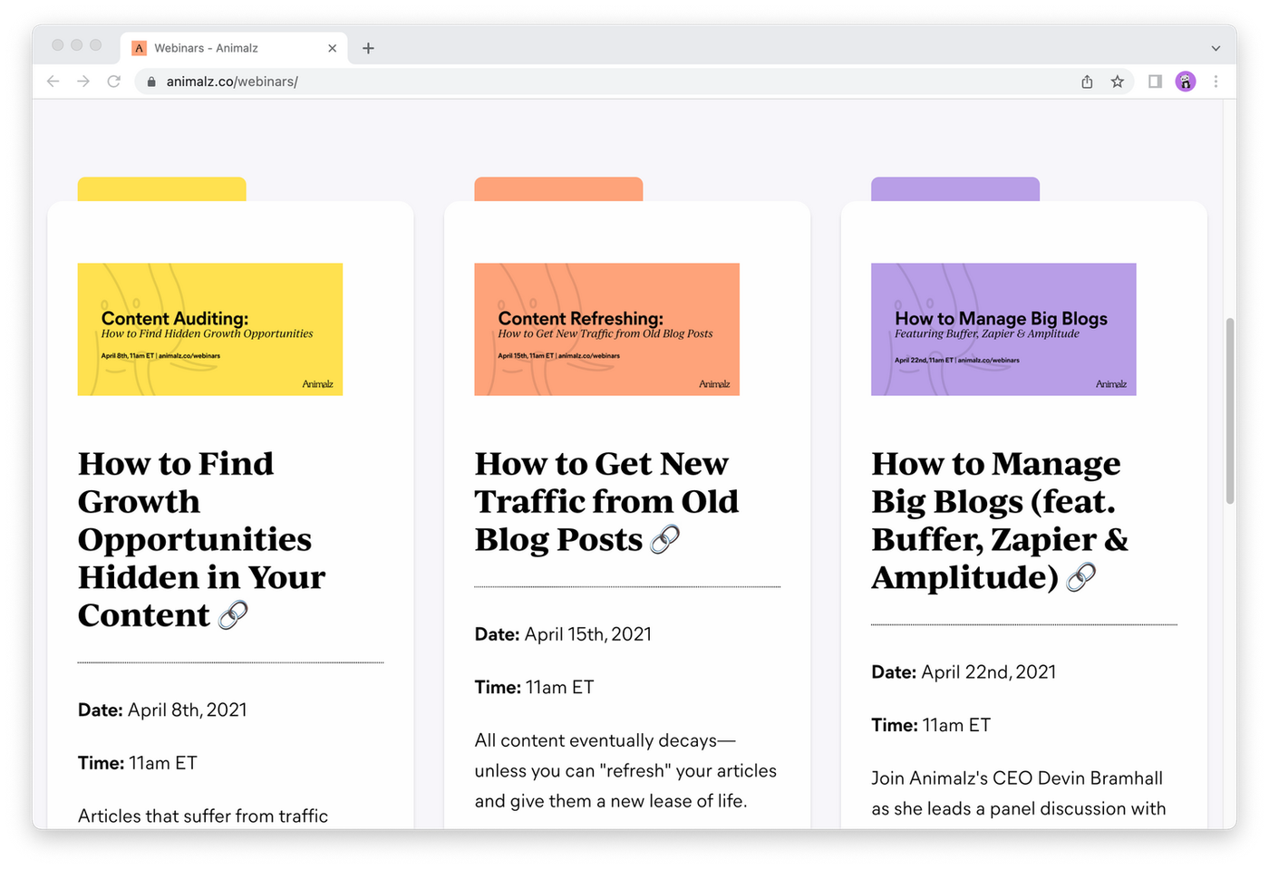 (Image Source: Animalz)
We’ve all seen advertisements that look like something Bill Gates put together in the early days of Microsoft. When in doubt, better to go simple than to swarm the page with too many colours and loud visuals.
3. Ensure your form is consistent across all devices
Almost 55% of all website traffic around the globe comes from mobile devices. That means that your landing page has to be optimised for mobile use—if it isn’t you’re placing a barrier between your visitors and their registration.
Most folks involved in the digital marketing biz know how important mobile-friendly design is. But not every website and landing page on the market puts the same emphasis on it. That’s why it’s crucial to choose a platform that looks after it for you.
At Paperform, all our landing pages are automatically optimised for mobile devices with no extra tinkering on your behalf. Whether folks visit from a battered iPhone 6 or a high-powered gaming rig, they get the same lightning fast, intuitive experience.
single page website form
4. Aim for clarity
Make what you want your visitors to do very obvious. A landing page isn’t the time to bury the lede or hide your CTA button among multiple graphics. Visitors should be able to sum up all the information on the page (plus what you want them to do) in a matter of seconds.
Let’s say you’re building an event registration landing page. Your goal is to provide context, outline relevant information and then invite people to register for an in-person (COVID-safe) meetup.
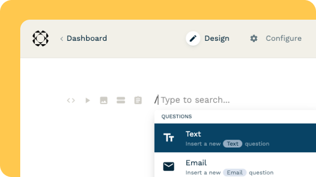
You could use Paperform’s free-text editor to add a catchy headline, sum up the relevant details and insert flashy visuals to make the page pop. Then, use slash commands to choose from over 20+ question types and build a quick registration form.
online meetup form
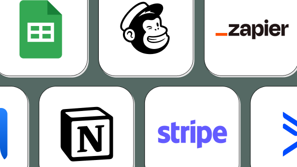
Want to sell tickets? We support payment from top gateways like PayPal, Square and Stripe. All you’ve got to do is connect the relevant account and watch the cash flow. For a truly dynamic experience, use conditional logic for a landing page that adapts based on respondent answers.
5. Promote your page
To adapt the old idiom—if an event landing page exists and no one is around to see it, does it really exist at all? Once you’ve created your page, it’s up to you to make well and truly sure that potential attendees know about it.
Event marketers should be making the most of every tool available, including:
Social Media: Advertise to suit your audience. Art gallery openings will probably have the most social engagement on Instagram, whereas business conferences will be more relevant on LinkedIn.
Email Marketing: Make use of those mailing lists to contact people that you know are already interested in your business.
Google AdWords: Google AdWords allows you to make sure that when someone searches your event name or other chosen keywords, they’ll end up on your landing page.
Word Of Mouth: Word of mouth marketing is one of the most powerful (and difficult to get) forms of marketing out there. Generate this by encouraging attendees to share your event, or by offering discounts or swag to the people who do.
Your marketing campaign should implement several of these strategies to be as effective as possible. Get this right and you’ll be swimming in event attendees like Scrooge McDuck in his lake of gold coins.
6. Craft copy carefully
Your landing page needs to be sharp and to the point. Think Hemingway rather than Dickens. It should be written like an ad (which it is). Short, sweet, persuasive. Everything needs to drive visitors towards your CTA.
Avoid typos and awkward sentences at all costs. Read, reread and read again—folks might excuse mistakes in a 3,000-word blog post, but even the tiniest error can give leads second thoughts about spending money or handing over personal information.
Don't forget your CTA either. Most sign up buttons tend to be dull, but you can get better results by adding a few words to combat the visitor's objection to clicking. We love this example from Harry Dry from Harry's Marketing Examples:
Another simple CTA trick:
— Marketing Examples (@GoodMarketingHQ) January 21, 2021
Add a few words to your button to handle the user's biggest objection to clicking. pic.twitter.com/QoI2TosgFX
conference registration form
7. Follow up after submission
You don’t just wash your hands of things once someone’s signed up. Try to build relationships with new registrants and keep them engaged.
Some examples include:
- Building anticipation with promotional emails
- Sending relevant details to prepare (e.g. a video webinar link)
- Encouraging people to share the event on social media
- Promoting your products
- Offering exclusive deals to attendees
Remember the golden rule: there shouldn’t be radio silence between someone signing up and the day of the big event. Just don't overdo it—too many promotional emails and you’ll risk turning folks off altogether.
5 great event landing page examples
Now that you know how to put an event landing page together, let’s look at some examples of actual events that got it right.
1. The World Bank's — Gender Data for Decision Making
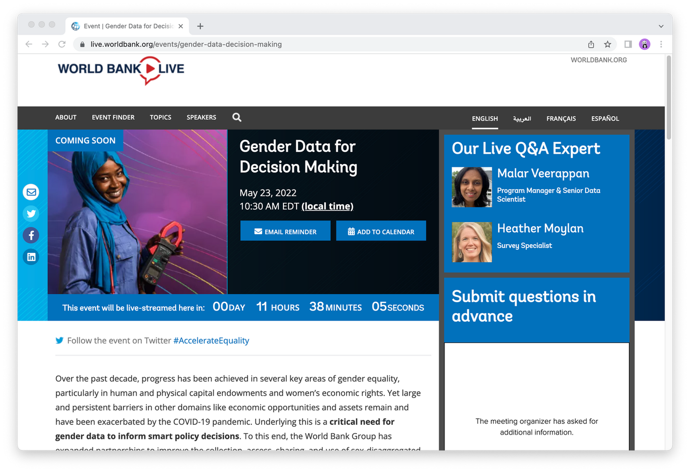 (Image Source: The World Bank Group)
Why it works:
- Eye-catching visuals
- Social hashtag integration
- Important info below the fold
The landing page for the World Bank Group's Gender Data for Decision Making event is simple and effective. The image summarises the general theme, and the relevant information—time, date, experts, and countdown—are at the top of the page.
There’s more information below the fold, but prospective attendees have all they need in one spot. Visitors can scroll to see more context, learn more about the speakers, and watch recordings from the #AccelerateEquality event series, that this is part of.
2. Agents of Hybrid's 'Unboxing the Hybrid Experience' event
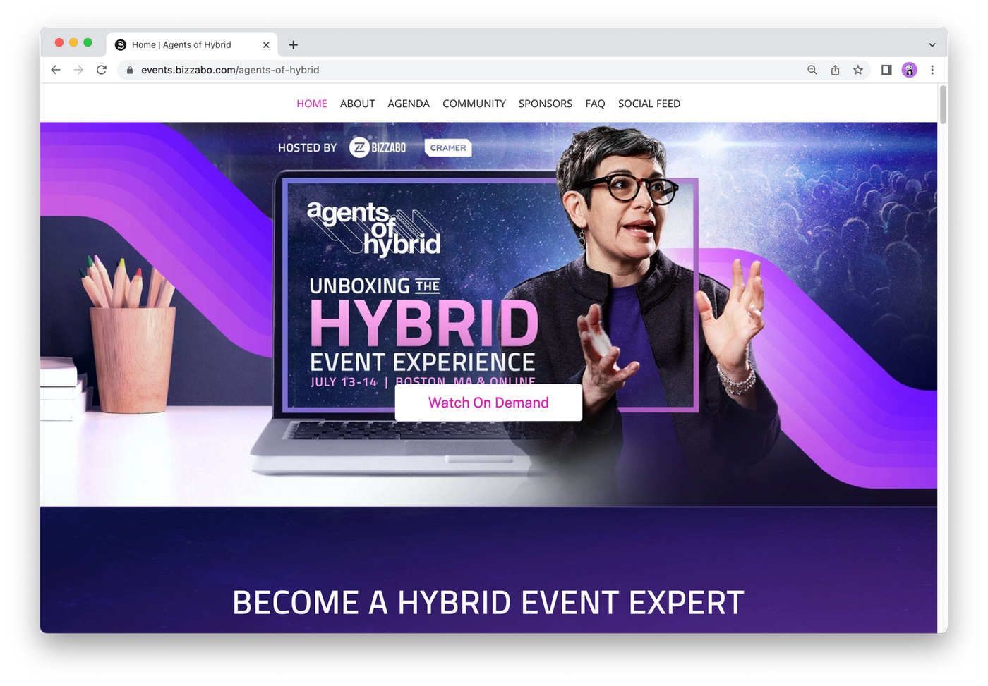 (Image Source: Agents of Hybrid)
Why it works:
- Exciting hero image
- Clear registration button
- Consistent branding
Here’s another landing page with exciting visuals. This one conveys the idea of incorporating an in-person event into an online format. The font placement deliberately frames the image and the white registration button stands out against the purple background.
Once again, below the fold, Agents of Hybrid provides a couple short paragraphs about the event and a series of headshots and information about presenters, for added context. Take note of the consistent branding throughout.
3. Drift’s RevGrowth Virtual Summit
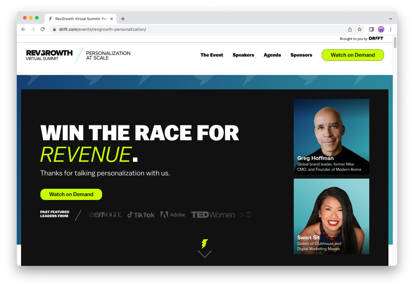 (Image Source: Drift)
Why it works:
- Intuitive layout
- Comprehensive social proof
- Crystal clear CTA
Drift’s RevGrowth Virtual Summit page is like the Swiss Army Knife of event landing pages—it’s got it all. Clear headlines, catchy copy, social proof and a CTA you couldn’t miss with your eyes closed. If you want to pick one example to base your page off, this is the one.
The countdown at the top is a nifty trick. Adding a time limit is an age-old marketing trick used to build excitement and encourage folks to register in case they miss out. Nothing like FOMO to get people to click that CTA and sign up for your virtual event.
4. Slack's ‘How To Use Slack’ Webinar
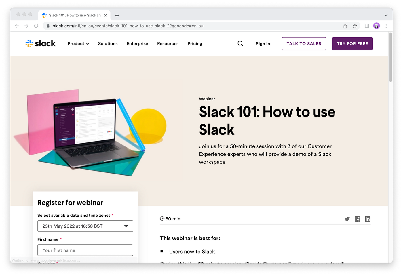 (Image Source: Slack)
Why it works:
- Simple and clear
- Outlines benefits
- Consistent with brand
Remember what we said about simple being best? Slack’s Slack 101: How to use Slack is a fantastic example of this philosophy. In particular, note how they outline who would benefit from the event, what they should expect to learn and how long it’ll run for.
It’s not shown in the screenshot above, but there’s also a further ‘Things You’ll Learn’ box and headshots of guest speakers and their role within Slack to add authority—who better to tell you how to use Slack than the folks who make it?
5. JavaScript Conference Hawaii
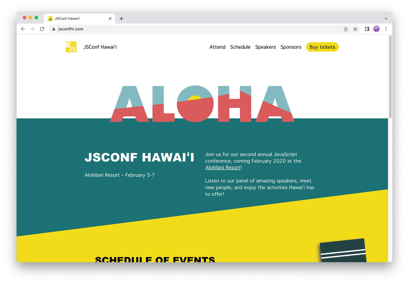 (Image Source: JSConf Hawai'i)
Why it works:
- Bright colours
- Beautiful, fun design
- Clear information
Sometimes your event landing page can be a reflection of the event itself. That’s exactly what JavaScript Conference Hawaii achieve with its bright, sunny and evocative page. Can’t you just see yourself laying out on a beach in Honolulu gorging on a poke bowl?
Beyond the design, there’s a clear ‘Buy Tickets’ button on the top right of the page. Usually, we wouldn’t recommend this as the sole CTA, but here it works. The copy in the centre of the page does a great job summing up the event, with more details further down the page, alongside an email opt-in.
seminar registration form
Over to you
Event landing pages are the best way to invite your visitors to register for your event. They are often the first exposure people have to your event and are the key to it being a success—so it’s important to make them count.
With the right event landing page, you can maximise your attendance numbers and make sure that come the big day, your virtual or in-person event goes off without a hitch.
Why not choose Paperform as your landing page builder? With our versatile free-text editor you can make gorgeous, user-friendly landing pages without breaking the bank (or using any code).
Need a hand? Pick from our collection of landing page templates to kickstart your creativity. Get started today with our 14-day free trial—no credit card required.
Writer
Deepak (Dee) Shukla, the dynamic founder of Pearl Lemon, built the leading SEO agency in London by l...
Here is the ultimate list of online form builders, what they do best, their pricing, and examples to...
When Luiz Sifuentes lost the platform powering his entire web design business, he rebuilt smarter—wi...
All of our product updates and big company news for Paperform and Papersign from Oct 24 - May 25 to ...