
All Solutions
Explore all the solutions you can create with Paperform: surveys, quizzes, tests, payment forms, scheduling forms, and a whole lot more.
See all solutions


Connect with over 2,000 popular apps and software to improve productivity and automate workflows
See all integrationsProducts
Solutions
All Solutions

Explore all the solutions you can create with Paperform: surveys, quizzes, tests, payment forms, scheduling forms, and a whole lot more.
See all solutionsIntegrations

Connect with over 2,000 popular apps and software to improve productivity and automate workflows
See all integrationsResources
Jotform Alternatives: Jotform vs Wufoo vs Paperform
While form builders all share a similar purpose, JotForm and it’s top alternatives—Wufoo and Paperfom—all provide distinct experiences. By comparing and contrasting the differences in each of these tools, you can find which is the right form builder for you.
With that in mind, we’ve taken a look at how JotForm stacks up against its popular competitors. In this guide we cover everything from features and user experience to pricing, customisation options, payment processing and more.
We’ve also created some helpful videos to show you how popular functions work within each tool. Looking for something specific? Use our navigation menu below to discover the features that matter most to you.
Jotform vs Wufoo vs Paperform: Quick Feature Comparison
| JotForm | Wufoo | Paperform | |
|---|---|---|---|
| Best For | Creating simple responsive forms. | Creating forms and surveys with advanced analytics. | Creating fast and visually beautiful branded forms. |
| GetApp Rating | 4.6 | 4.5 | 4.9 |
| GetApp Customer Support Rating | 4.3 | 4.3 | 4.9 |
| Guided Mode Experience | Yes | No | Yes |
See more... | |||
Pricing
| Jotform | Wufoo | Paperform | |
|---|---|---|---|
| Free trial | No | No | Yes |
| Free version with limited features | Yes | Yes | No |
| Starting price/month (billed monthly) | $29 | $19 | $15 |
| Starting price/month (billed annually) | $24 | $14.08 | $20 |
| Sign up | Sign up | Try it free for 7 days (no CC details required) |
Jotform vs Wufoo vs Paperform: A Detailed Breakdown
Ease of use
Jotform
JotForm has a drag-and-drop interface. That means that to add new fields to your forms, you select them in the left sidebar, and drag them into your forms.
The “Form Elements” panel on the left of the screen is split into three sections: “Basic”, “Payments”, and “Widgets”. Seeing there are dozens of options in each category, finding the right elements can be time consuming and a bit overwhelming.
JotForm allows users to edit question features, form colours, themes, and backgrounds. These features are scattered between the left and right sidebars, while the individual question fields can be edited using the ‘Question Properties’ icon that pops up beside them when clicked.
JotForm’s drag-and-drop form creation experience is far from perfect. But it’s the standard way form builders used to be built, and has been unchanged for more than a decade, so lots of people will find it familiar (if not a bit outdated).
Wufoo
Wufoo has a minimalistic interface that’s easy to get used to. The form editor combines drag-and-drop and in-line elements, to provide a relatively straightforward form creation experience.
But there are a few elements that take some getting used to. For example, with the field-adding feature, newly added fields automatically get pushed to the bottom of the form, requiring you to scroll down to find them. This isn’t such a big deal for short forms, but quickly becomes frustrating with longer forms that need restructuring with every new field you add.
It’s also worth mentioning Wufoo’s interface: it’s old-fashioned. From a functional standpoint, the icons and interface are quite small, to the point where they are barely readable on larger and higher-resolution screens.
This, alongside some accessibility issues, make it difficult to recommend using Wufoo as your go-to software for creating forms and landing pages.
Paperform
Paperform is built from the ground up to be a breeze for anyone to use. Thanks to our free-text interface, building forms and landing pages is as easy as editing an online document. There’s no learning curve whatsoever— just click or type anywhere to add logos and images, embed videos, configure products and insert more than 25 question fields.
This also means your forms don’t have to be edited within the confines of sidebars and menus on the left and right of screen. Instead, you can change the settings for each individual form field in the contextual “Configure” menu that pops up when a field is selected.
While Paperform is not a drag-and-drop form builder, questions and form elements can still be rearranged using a simple drag-and-drop motion. Want to speed things up? You can select whole groups of elements and move them at once, or transform text with lightning-fast slash commands.
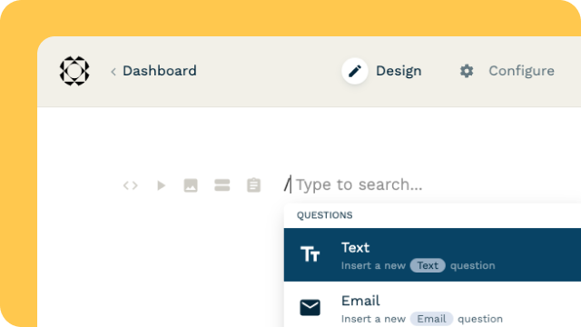
Simply type "/" in the editor to quickly create questions and insert content. There are even “Quick Questions” shortcuts—commonly used form fields with pre-configured details—to make the process even more intuitive.
Customization
Jotform
JotForm forms can be customized using the Form Designer menu that appears on the right-hand side of the form editor. Here you can choose pre-designed colour themes or select individual colours for text and backgrounds.
Like most form builders you can add elements like images, logos and videos (though placement options are limited.) You can also change the size and colour of your font. Just keep in mind that these features are accessed through a separate menu within the ‘Themes’ sidebar, and open as a separate page, making it a slightly disjointed experience.
In addition, there’s a ‘Layout’ tab, that lets you switch between the standard experience (all questions on one page), and what JotForm refers to as the “Card Form” experience (one question per page). If you choose to create a Card Form, the form-building interface changes too— you’ll now see “Next” and “Previous” buttons below each block.
During the design process you might notice a coloured box behind your form. That’s not a bug. It is a part of JotForm’s design and can’t be removed. The only way to get rid of it is by making the form background the same colour. This isn’t an ideal work around, especially if you want to use brand colours or have an image as a background.
Wufoo
Wufoo also offers a decent level of customisation. Users can customise colours, typography, buttons and logos. However, the process works a little differently than JotForm or Paperform.
Instead of applying custom themes and designs to a particular form, Wufoo asks users to design themes in a separate ‘Theme Designer’. The themes can then be applied to any number of forms. While this is a handy feature if you have lots of identical forms to create, it makes customisation a bit of a drag if you’re not editing forms at scale.
Adding images and videos to your Wufoo forms can be tricky too. There’s no feature to help you do this in a simple way—you have to add HTML code for any image or video you want to insert in your form. Also keep in mind the header with the ‘Wufoo’ logo can only be removed (or your own logo added) once you upgrade to one of their paid plans.
Paperform
Unlike other form builders, making Paperforms doesn’t feel like a chore. There are no distracting menus or restrictions to what you can do. Just head to the ‘Themes’ menu and get creative— it is the one-stop shop for all your customisation needs, whether you want to tweak colours, logos, typography, buttons, UI elements or just anything else. The only limit is your imagination— there is even an option for translating your forms into multiple languages.
And unlike JotForm you don’t need any workarounds to get the form background you want. You can use any colour or image you desire, or even use videos from YouTube and Vimeo. Want a coloured box behind the form after all? You can add or remove it as you wish.
You don’t need HTML to add images or embed videos either. Just click and add them anywhere on the page. Paperform also integrates with Unsplash and GIPHY, making it easy to search and insert visuals without switching tabs and leaving the app.
If you do want to add a bit of your own code that’s fine too—you can also insert JS scripts, HTML and CSS into your forms for that extra special touch.
While themes and form features are simple to edit on a form-by-form basis, Paperform also has a similar feature to Wufoo that allows you to import themes. This makes it lightning-fast to build multiple forms with an identical design.
A standout feature of the Paperform theme editor is the ability to preview how your selections will look on your actual form. This saves you the hassle of having to go back and check how a certain font, colour or button might look after each change.
Paperform also has a guided mode feature which you can think of as an alternative to JotForm’s Card Forms. It’s easy to switch between standard mode and the one question at a time Guided Mode experience from the ‘Theme’ menu at any time. Unlike JotForm, Paperform doesn’t reload the page every time you switch modes, making the editing process faster and more fluid.
Learning support
Jotform
JotForm has a support forum where users can browse through questions asked by other users or make their own queries. Questions are publicly answered by JotForm’s support team.
Live Chat: No
Youtube Tutorials: Yes
Wufoo
Wufoo has a help center where users can access answers to common questions and queries. For individual support or questions, you have to email their team. According to their website, you can expect a response within 2 business days.
Live Chat: No
Youtube Tutorials: Yes
Paperform
Paperform also has a help center where users can get answers to common questions. Unlike JotForm and Wufoo, Paperform offers live chat support from real humans, which means you will receive tailored responses to individual queries within minutes.
Live Chat: Yes
Youtube Tutorials: Yes
Template Library
Jotform
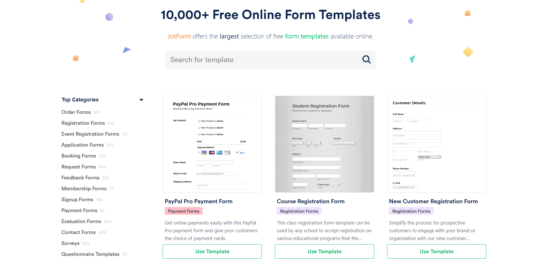
JotForm offers the widest range of templates of the three tools, with more than 10,000 pages available for you to use. The downside is that most templates are quite generic and dull when it comes to style and design. While they don’t reinvent the wheel, they’re useful to speed up the process and give you ideas for questions you might ask.
Wufoo
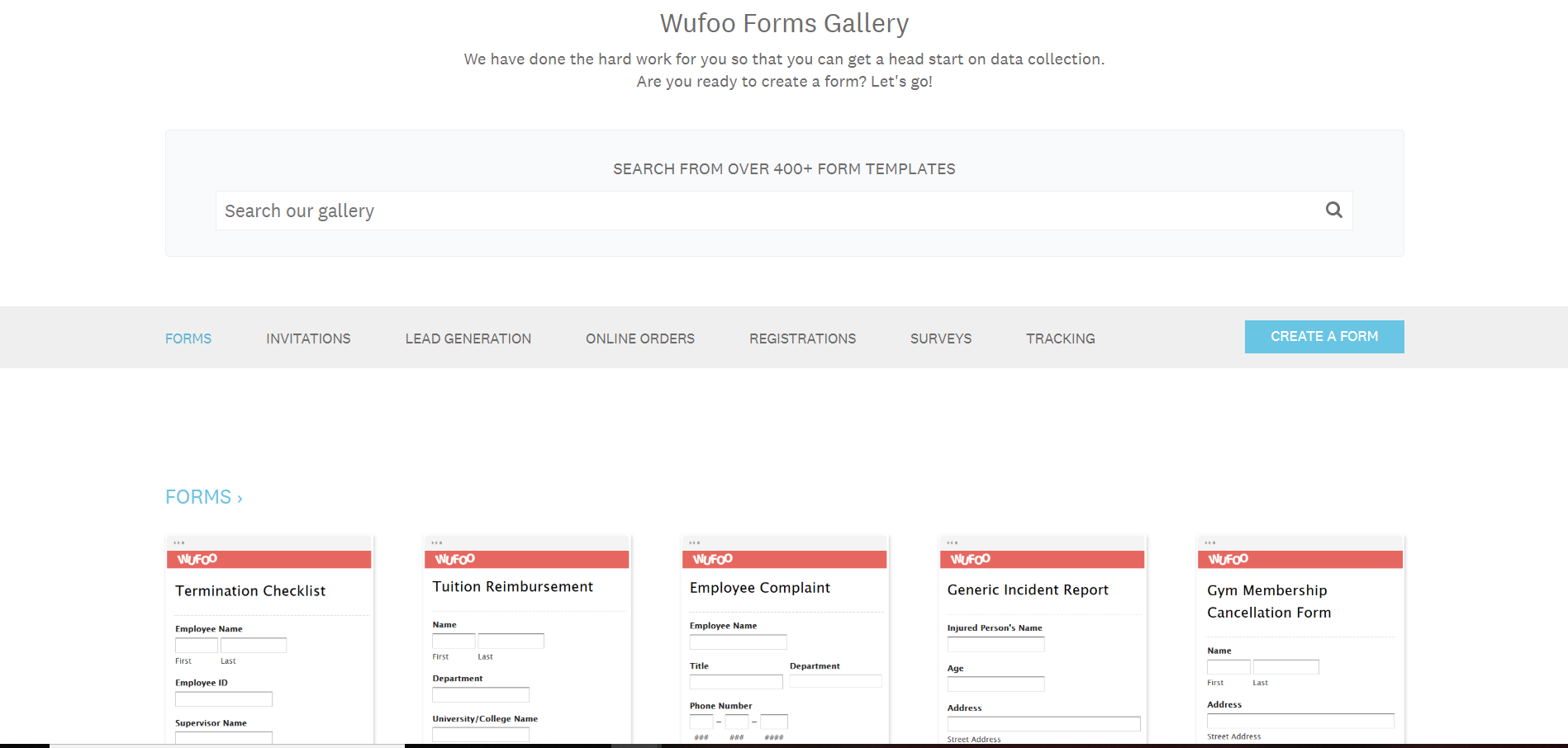
Wufoo offers 400+ templates to choose from and customise. While there’s a good range of form types, it’s interesting to note that all of Wufoo’s templates look… well, exactly the same. That makes them less than ideal if you’re looking to speed up the design process or get inspiration for your own forms.
Paperform
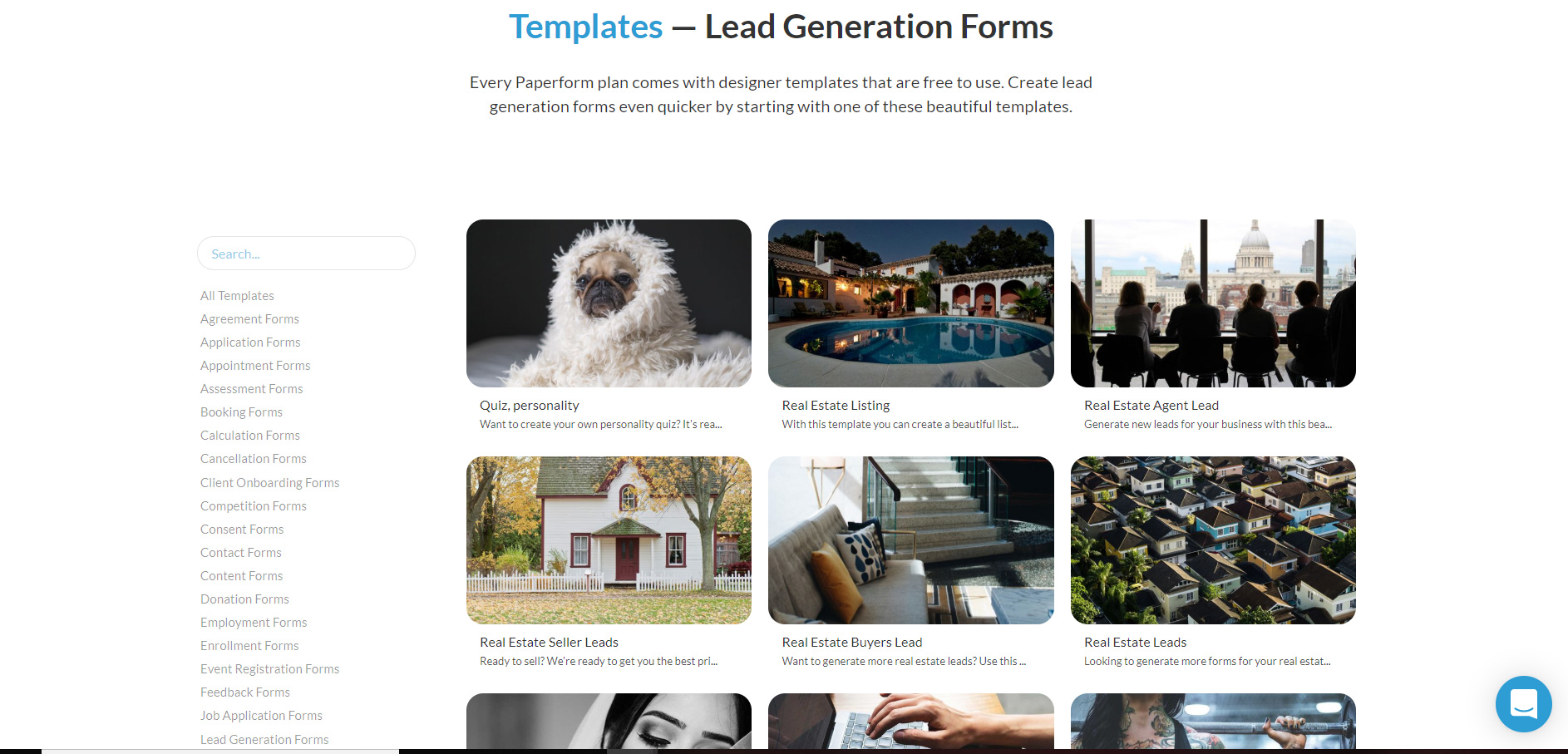
Paperform offers a second-largest library of form templates, with 500+ unique pages to choose from. The templates cover most types of forms and use-cases, and unlike JotForm and Wufoo, they all have custom designs, making it simpler to create a beautiful form, fast.
Payment Features
| JotForm | Wufoo | Paperform | |
|---|---|---|---|
| Payment Integrations | 35+ payment integrations, including: PayPal, Stripe, Authorize.Net, eCheck.Net, Braintree, Square, Chargify. | Square, Authorize.Net, PayPal, Stripe, USAePay, Braintree, Freshbooks & Chargify | Direct integrations with Stripe, PayPal, Square, Braintree. |
| Payment & eCommerce features | Automated responses: Yes Receipt generation: Yes Tax addition: Yes Subscriptions:Yes Invoices: Yes Quotes: Yes Coupons: Yes | Automated responses: Yes Receipt generation: Yes Tax addition: No Subscriptions:Yes Invoices: Yes Quotes: Yes Coupons: Yes | Automated responses: Yes Receipt generation: Yes Tax addition: Yes Subscriptions:Yes Invoices: Yes Quotes: Yes Coupons: Yes |
Advanced Form Features
Pagination
Jotform
Pagination with JotForm is very straightforward. Just click on the ‘Add New Page Here’ button below any section to add a new page or step to your form. The only problem is that this button can be difficult to locate depending on the form theme you use.
Another minor issue is that the ‘Submit’ button has to be manually removed from the first page and added to the last. It’s also impossible to change the order of the ‘Back’ and ‘Submit’ buttons on the last page.
Wufoo
Similarly to Paperform, Wufoo uses a ‘Page Break’ feature that can be dragged and dropped anywhere within the page to create a new page or step to your form. Just keep in mind that any page you create needs to have a title.
Paperform
Dividing your form into pages and sections is incredibly easy with Paperform. You can simply click wherever you want to create a new page and select the ‘Add break’ icon that pops up.
Paperform offers something unique to our platform—the ability to add a cover page. As seen in the video above, you can use an image and your brand name (or anything you want) as a cover page to give your form a more branded look. You don’t need to manually add or remove any buttons to make it work either.
When Guided Mode is turned on, the pagination in Paperform works and appears differently from the standard form experience. All content (text, images, or videos) displays on its own page, even when placed before a break. This is because in the one question at a time format, each question appears on its own page with no other content.
Question Logic
Jotform
To set up question logic in JotForm, you need to navigate to the ‘Conditions’ menu under the ‘Settings’ tab. The logic builder is relatively straightforward, allowing you to construct complex conditions using the IF/STATE/VALUE blocks.
Wufoo
Wufoo redirects users to a Rule Builder that works almost identically to the JotForm conditions menu. Overall, it’s very straightforward to set up basic conditions for your form fields.
Paperform
Paperform understands logic can be intimidating. That’s why our platform takes a super simple approach to setting up question logic. Rather than redirecting users to a separate menu, we let you define conditions for individual questions and even entire groups of questions. The process is visual to make it as intuitive as possible. You can also set up multiple conditions for questions, as seen in the video above.
Success Pages & Redirects
Jotform
JotForm’s default success page is pretty basic. Luckily, it’s highly customisable—you can edit fonts, change colours and add images without too much fuss. Unfortunately the themes and formatting you put together for your form aren’t automatically applied to success pages, so you will have to format each success page manually.
Success pages and redirects can be customised based on how respondents answer a particular question. You’ll find this feature hidden away in the ‘Conditions’ menu.
Wufoo
Wufoo’s success pages and redirects work in a similar way to JotForm. You can make tweaks to the messaging of your ‘Confirmation Page’ from the left-hand side ‘Confirmation Options’ menu, or choose to redirect respondents to a link instead.
Unlike both JotForm and Paperform, the visual elements of Wufoo’s success pages are a pain to format. The only way to customise the page is by manually adding HTML yourself— a nightmare if you’re not confident handling code.
Wufoo can, however, show unique success pages based on responses through the ‘Rule Builder’. Just be aware that to build success pages you’ll need to upgrade to a paid plan.
Paperform
Big surprise—Paperform’s success pages are highly customisable. Using the ‘Success Pages & Redirects’ menu in the form editor, you can set up personalised success pages or redirect users to the page of your choice.
You can also easily set up conditional success pages and redirects, meaning folks see a unique page based on how they answered certain questions. It makes the process more personalised and dynamic for your respondents.
The best part? Success pages match the formatting style of the rest of your form by default, so there’s no extra editing work needed on your end.
Analytics
| JotForm | Wufoo | Paperform | |
|---|---|---|---|
| Form Analysis Features | Form views: Yes Form submissions: Yes Partial submissions: Yes Completion Rate: Yes Sales Figures: Yes Export & Print Responses: Yes Save & Resume Later: Yes | Form views: Yes Form submissions: Yes Partial submissions: No Completion Rate: Yes Sales Figures: Yes Export & Print Responses: Yes Save & Resume Later: No | Form views:Yes Form submissions: Yes Partial submissions: Yes Completion Rate: Yes Sales Figures: Yes Export & Print Responses: Yes Save & Resume Later: Yes |
| Analytics Integrations | 27 Integrations including Google Analytics, Facebook, Chartbeat and Yandex Metrica. | Google Analytics | Built-in Analytics, Google Analytics, Facebook Pixel or custom analytics scripts. |
Made up your mind?
| Jotform | Wufoo | Paperform |
|---|---|---|
| Sign up | Sign up | Try it free for 7 days (no CC details required) |