Okay, time for a little confession. We here at Paperform are data nerds. After all, we’re in the landing form business, and landing forms collect data.
Because we love data so much, we decided to do a deep dive into all the forms that have been created with Paperform to answer some key questions (and bust some myths) about form creation. Read on to see our findings:
1. Additional pages increase drop-off rates
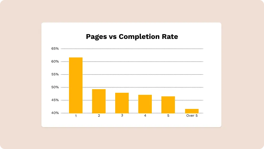
Out of the 7,193 forms we analyzed, 5,956 were single-page forms. These had a completion rate of 62%.
You would think that adding a second page to a form wouldn’t be a big deal, but it turns out that additional pages result in a significant drop-off.

- Adding a second page caused the completion rate to drop by more than 10%, down to 49.66%.
- At four pages, the completion rate falls to 48.32%
- More than five pages cause the completion rate to plummet to an abysmal 41.87%.
Key takeaways
Single-page forms and landing pages result in more completions/conversions than forms with multiple pages.
The more work required to complete a form, the lower the overall conversion rate will be. Every additional field creates more cognitive friction (i.e. it requires more mental energy), which decreases the odds that your respondent will complete the form.
Industry data backs this up as well. There is significant research regarding the length of ecommerce checkout processes, which also involves multiple pages.
In a study by The Baynard Institute, they found that 26% of users abandoned ecommerce transactions because the process was either too long or too complicated. Requiring shoppers to fill out too many fields resulted in them becoming frustrated or confused and abandoning the process altogether.
Experts generally agree that while pagination can be helpful in some contexts, it's strongly dependent on how the pagination is executed, and how much cognitive friction it introduces.
Landing pages and forms should only ask for as much information as necessary. That “as necessary” part will change depending on the industry. In order to get higher quality leads, you may need to include more fields, but you shouldn’t add fields if they don’t serve that end.
[CTA]
2. Requiring payment decreases completion rates
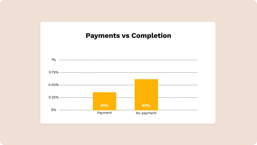
Of the 691 forms that did require payment, the average completion rate was 41.4%. In some ways, this is exactly what you would expect to find.
Any time selling is involved, the conversion rate is going to be lower. People are generally more inclined to do things that don’t cost money.

However, we suspect there may be more at work here than simple payment vs. non-payment. Numerous factors can influence conversion rates on payment pages, including:
- Clarity of offer: Many payment pages simply aren’t clear on the benefits of the product being sold. They get bogged down in the technical details of the product instead of focusing on how the product will actually benefit the customer. The result is a significantly lower conversion rate.
- Information-rich checkout pages: If an online checkout page only includes the most basic information, it can cause customers to be concerned that they may have put the wrong items in their cart. Then they may abandon the cart altogether.
- Security concerns: 17% of surveyed consumers who abandoned an online shopping cart did so for payment security reasons. By using various “trust badges”, showing that both your site and payment gateways are secure, you can assure potential customers that their information is safe with you.
💡 Bottom Line: Requiring payment can cause a decrease in conversion rate if you don’t take care. Avoid the decrease by implementing proven conversion rate optimization methods on product pages and during the checkout process.
3. Not asking for personal details boosts completion rates
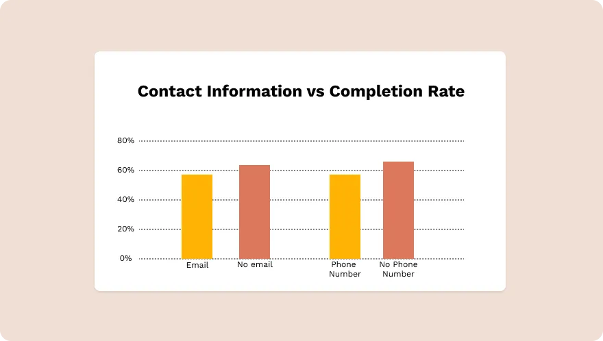
Of the 7,193 forms, 6,998 required an email address with a completion rate of 59.24%. The 194 that didn’t require an email address had a completion rate of 62.31%.
3,032 forms required a phone number, and 4,160 didn’t. The completion rate for those requiring a phone number was 55.07%, while the completion rate for those not requiring a number was 62.43%.

Both statistics point to an issue that marketers are increasingly confronting: people really care about their privacy.
With high-profile data breaches such as the Cambridge Analytica scandal at Facebook and the Equifax hack, people are increasingly concerned about giving out private information.
They’re concerned that if they give you their phone number, you’re going to relentlessly harass them with spam calls, or if they provide their email address, they’re going to be inundated with emails from deported Saudi princes who need your help recovering their fortunes. This is backed up by data from Zuko Analytics which shows that the phone number field is consistently one of the biggest causes of form abandonment across the web.
[NEWSLETTER]
So how do you ease these fears? Here are several relatively simple solutions:
- Don’t require a phone number unless you absolutely need it.
- Be explicit about how you will be using the information you collect.
- Make it clear that you won’t ever sell anyone’s private information.
- Create a privacy policy page and link to it on your landing page.
Your goal is simple: assure visitors that you will use their information responsibly and ethically. Put their minds at ease that you won’t bombard them with spam calls or emails.
💡 Bottom Line: Only require as much contact information as absolutely necessary. Be absolutely clear about how you will be using that contact info.
Less is more
The one thing that unites all these findings is that, generally speaking, less is more. In other words, the less you require from people, the greater the completion rates will be on any type of survey or form.
Don’t add more than one page unless you absolutely need it. Don’t try to get people’s contact information unless you have to have it. Don’t go overboard on trying to sell the technical details of a product when you should be focusing on the benefits.
You get the point. You’ll have the greatest success when you give visitors what they need, no more, no less.
Now that you know what makes for a great form, it’s time to build them. Try Paperform for free for 7 days—no credit card required.
