
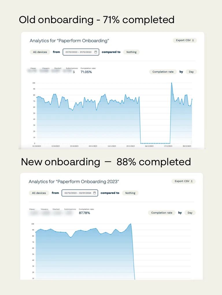
In the realm of digital marketing and SaaS growth, it's a never-ending quest to optimize and improve. At Paperform we've recently made some changes to our user onboarding form, leading to a remarkable 24% boost in conversion rates from 71% to a whopping 88%.
Let me walk you through our journey and the learnings that might just come in handy for your forms too.
The Old Way: Too Much, Too Soon
Our old onboarding form had remained largely untouched for a few years. It was pretty straightforward, with a few use-case related questions, and asking for various business-related details - think number of employees, location, etc. Questions were presented in groups over several pages.
What we Changed
We took a bold step - we stopped asking for some of the business specifics. Instead, we introduced a more engaging element: a question about what other apps users would like to connect with Paperform. This shift towards a user-centric approach was not just about reducing the number of fields, but about entering a dialogue with our users.
Guided Mode: A Guiding Light for Better Conversion
Then came the ace up our sleeve: the 'Guided Mode'. This nifty feature transformed the form-filling experience, presenting questions one at a time and guiding the respondent through the process. It turned out to be more than just a cosmetic change.
So, What Did We Learn?
- Guided Mode Works Wonders: Especially for short surveys or quizzes with less than 10 questions. It's not just about the aesthetics; it’s about creating a journey for the user.
- Too Much Business Talk Can Be a Turn-Off: Yes, we’re in the business software arena, but inundating early evaluators with too many business-related questions can be a deterrent.
- Mutual Value Creation is Key: People are more responsive to questions that clearly tie into the value they’ll derive from your product. It's a two-way street - your form should not only gather data but also showcase how this information will enhance the user's experience.
In the fast-paced world of digital performance marketing and SaaS, it's easy to get caught up in what we think we need to know from our users. Our experience at Paperform has shown that sometimes, less is more, and user engagement is everything. So, before you add another field to your form, ask yourself: Is this for us or for them? Remember, every field, every question, is a step in your user's journey. Make it count.