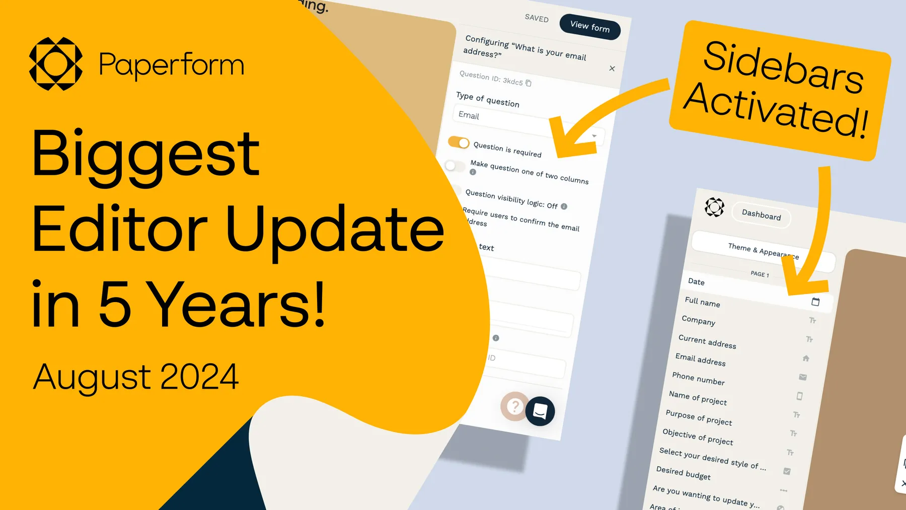
We’re pretty darn excited to release a refreshed, more intuitive editing experience for Paperform that will make creating and editing forms faster and easier!
Our customers are using Paperform to make longer, more powerful, and more complex solutions than ever before, and we have been paying careful attention to how the product can support your needs.
The previous editor was easy and intuitive to use, but thanks to your feedback, we saw a clear opportunity to make Paperform a better experience for all.
If you've got 10 minutes, here is our updated introduction video where you can get a look at the new updates in action.
Otherwise, here’s what’s changed.
1. Paperform gets sidebars
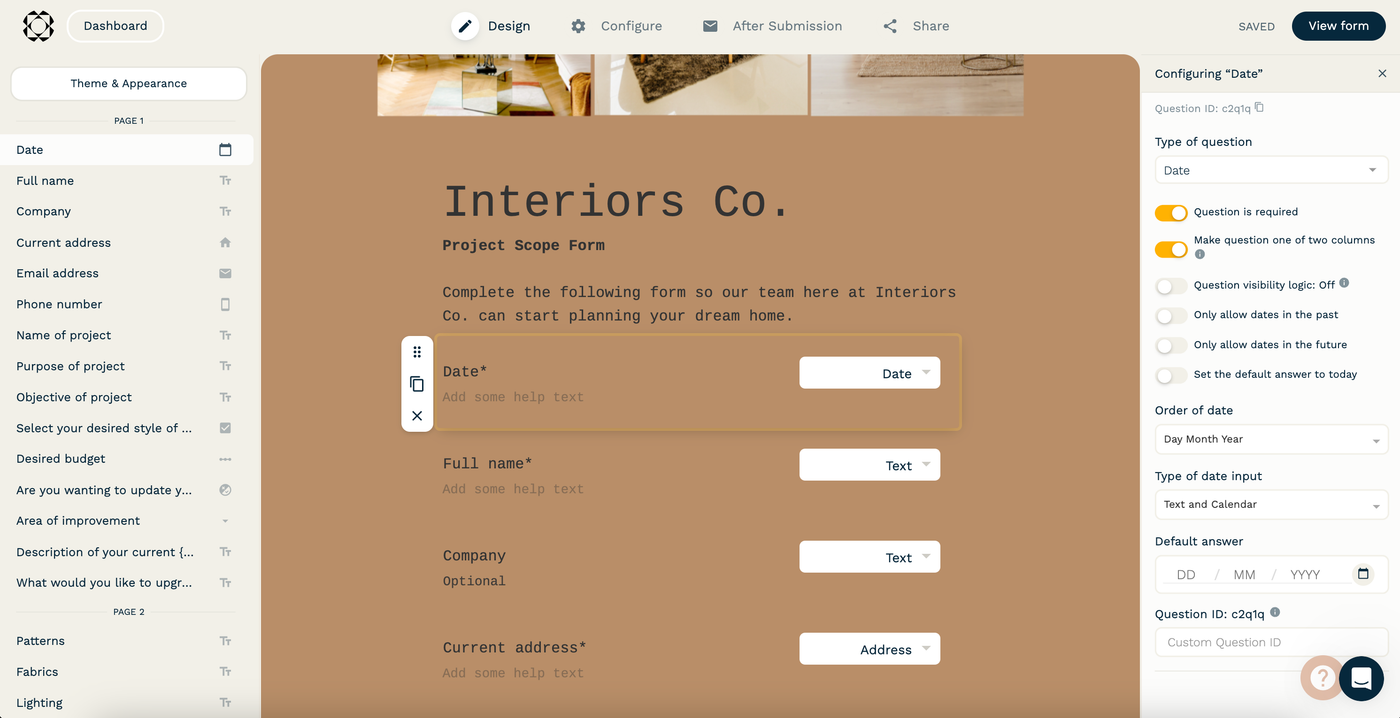
Forms are now centered in the middle of the page with columns on either side, and we’ve moved editing functionality into these sidebars to reduce the effort to create and make changes. It also means you can see your changes on the form while you edit. While we love the aesthetic simplicity of having the editor take up the full page, there was a whole lot of space available to use for improving the experience.
Read on to see how we’ve put these spaces to use!
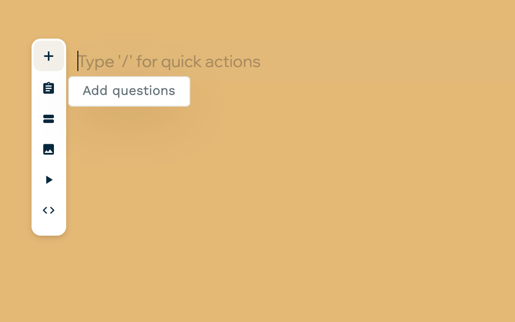
2. Condensed dropdown for adding questions
We condensed down the on-screen menu into a vertical list to declutter, and get out of your way so you can create without distraction. More people are now comfortable using “/” Slash Commands to add content to their forms (type / in the editor if you haven’t tried it!).
3. Question configuration is now automatically available to the right
Now you can easily see your question config in detail while you edit, eliminating unnecessary back and forth with configuration and getting your forms live faster! And it’ll only appear when you select a question to give you space to breathe.
In our previous editor, to access the question configuration you had to click on a settings icon, and the configuration would appear in a popup. This popup would take over the screen, and required scrolling to see and make changes to the question’s setup. Navigating question configuration required clicking out of the popup, scrolling to the desired question, and clicking the settings icon there.
The new question configuration appears any time you click into a question, and has been overhauled to be more compact so that you can see more configuration without having to scroll at all.
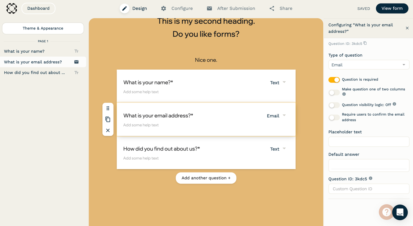
4. Focus question
When you click into a question, the configuration for that question opens on the right, and the focus question is highlighted. Buttons to move, duplicate or delete the question are now to the left of the focussed question.

5. Quick navigation on the left
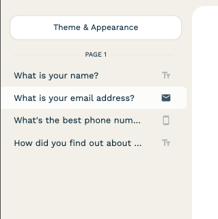
Get your bearings fast and stay focused with a question/field overview.
Once you have questions on your form, Theming & Appearance and question navigation will appear on the left. This gives you a condensed view of what questions are on the form, and which question is in focus. You can click on the questions or the page names to scroll to the question and focus in on it.
This is particularly handy for not getting lost on larger forms!
6. Live Theme Preview
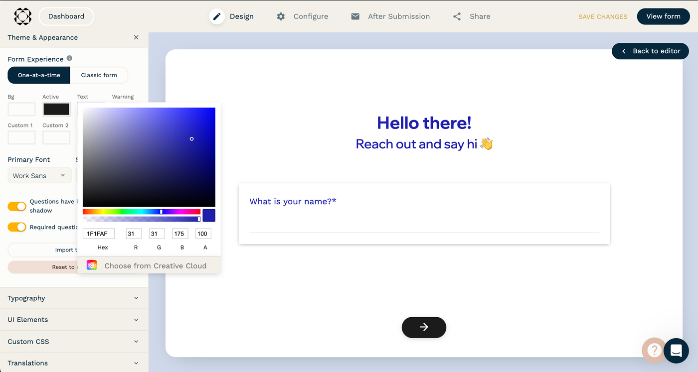
All the rich theming functionality you know and love, but now with a live preview of the theme as it’s applied to your form! See your brand take shape dynamically on your forms, and move faster with better creative decision making, especially for features like Custom CSS.
The button to theme the form has moved from the top right of the editor, to the top of the left sidebar.
7. Try themes before you apply them
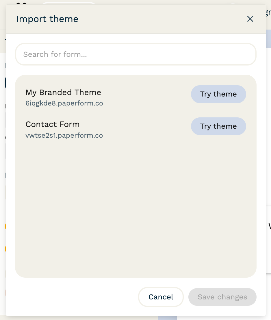
You can import themes from other forms, and try them out in the live preview before you apply them. This makes it easy to find the right look for your form without accidentally overriding your current theme.
8. Dedicated popups for complex setup
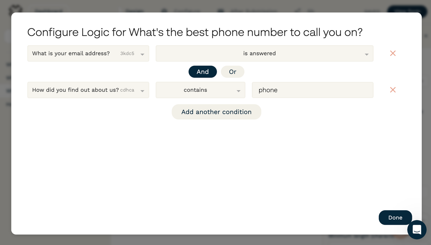
Some of the more powerful and complex areas of form configuration like setting up Visibility Logic, Calculations, or configuring Products now have a full screen popup experience, so that you can have a clearer view of what changes are being made.
We’re so excited to get this release into your hands! We totally understand that big changes like this may come as a shock, or even be frustrating for people that have used Paperform for a very long time, but we hope that you’ll give the new experience a real chance.
Have a play, and let us know what you think any time at support@paperform.co or in the chat on site.
We have loads more exciting improvements coming to forms very soon! Stay tuned!

