Form
Design
A comprehensive guide on why good form design is critical to user experience.


Table of Contents
Forms Matter
Online forms are about as old as the Internet. Whether you're creating a profile on Facebook, booking an appointment at a salon, ordering a pair of pants from ASOS, or signing up for a Netflix subscription, you're likely to encounter a form or two in the process. Online forms have become so synchronous with our presence on the internet, that we simply accept them as the status quo; rarely questioning or even noticing their existence.
And it's not hard to see why. After all, the actions listed above all have one thing in common: they require the collection of data that is crucial to the completion of the activity itself. Just as a Facebook profile would be rendered useless without first asking for the name of its owner, an ASOS purchase could not be finalised without the customers' credit card details. A universal need to collect information has made online forms more vital than ever - without us even realising it.
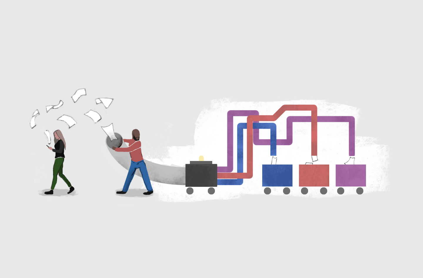
Forms sound simple enough in concept, but the science behind them is anything but. Truth is, form design has a larger impact on our online activity than we give it credit for - and as a result, it has a direct impact on everything from sales and conversions to retention, trust, and loyalty for businesses.
Ecommerce
Forms are the foundation of the ecommerce industry. We use forms to search for products, submit our orders, and to pay for goods.
When it comes to ecommerce, online forms can define the entire customer experience, thereby influencing whether customers will complete a purchase and return for another.
Business: Clients & Teams
At the heart of every business's success is capturing information, making sense of it, and putting it to use. From client onboarding forms to feedback surveys, forms are a method of communication with your audience.
Without forms, smooth operations for teams are almost impossible. Taking a vacation? Your manager would ask you to fill out a leave form. Applying for a job? You'd likely be asked to attach your CV to an application form. Using a task-manager app? If you think about it, the very function of such apps requires you to complete a bunch of form fields in order to create a task.
Here at Paperform, online forms are an irreplaceable part of running our business.
Programs, Bookings & Events
Getting people organised is no mean feat. Whether you're planning a conference, coordinating a class, or booking an appointment or delivery, you need to gauge interest and capture the who, what, and when of your attendees.
But registration forms, booking forms, and event forms are also a two-way street; they need to provide rich details about what an attendee is in for, as well as automatically send off that all-important confirmation email. And to top it off, these forms will often need to collect a one-off or recurring payment upon submission. There are a lot of moving parts here, and if they are brought together properly, you'll not only be able to avoid hiccups in planning, but also raise your attendance rates.
Research
Questionnaires, surveys, and polls are all excellent ways to gather both quantitative and qualitative data, and ultimately make sense of the world. Whatever that burning question is - Who are my users? What are their pain-points? What personality type are you? Do you prefer cake or pie? How many children do you have? - asking well will help you get quality information and invaluable insights.
Social Networking
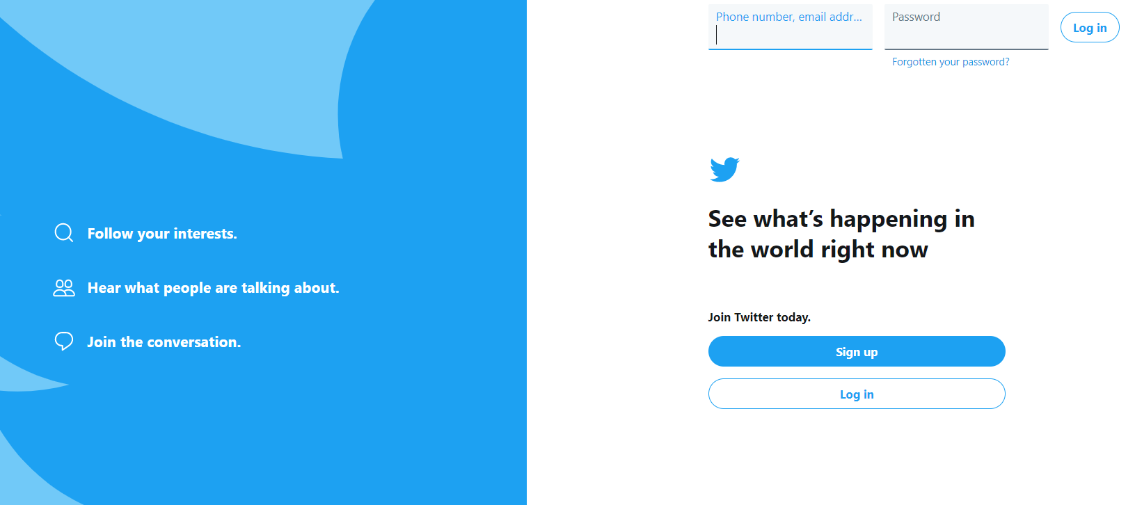
All social networks start with one form — the sign-up form. The sign-up page is arguably the most important web page that Facebook or Twitter have ever designed as it has a direct impact on the number of people who decide to join the platform. By looking at how the sign-up pages of the largest platforms out there have changed over time, we can trace the history of the web and the evolution of web design as a whole.
One of the most interesting forms that I've seen is Gmail's sign in form. It's great, because at the first step they only ask you to enter an email address. And only at the second step, if you have an account, you're asked for a password. If you don't have an account, you're asked to create one. That form is so easy and intuitive because it only asks one thing at every step, directing you based on your answers.
Why Read This eBook?
Since you're reading this ebook, you are most likely among the people who are shaping the web. At some point you must have built a web page or an online form, and if you haven't, you most likely will have to at some point. Our mission here is to help you create forms that perform better for you and your business.
Better Forms For Responders
A large part of this ebook is about designing forms that people will enjoy interacting with. We'll dive into the psychology that motivates people to complete forms, and the factors that could be preventing you from achieving the conversion rates you desire. Above all, we'll help you create forms that provide the best possible experience for your respondents.
Better Forms For Creators
An aspect of online forms that is often overlooked is the management of data itself - which is ironic considering data collection is the primary goal of any form. You can create the most beautiful form in the world, but if it fails to provide you with the data you need in exactly the place where you need it, it won't help you achieve the goals you set for it in the first place.
Designing a form is about more than creating something visually appealing. The internal architecture of your form, specifically the automation of your data collection, storage and usage processes, plays a big role in its success. We'll dive into the strategies that will help you manage your collected data in a more efficient, scalable, and affordable way.
Better Forms For All Purposes
As more businesses invest in their online presence, design has to do more than simply enhance a form's experience, it has to represent brand. At Paperform we've seen a significant number of traditional businesses bringing their existing presence (and with it their forms) into the digital realm; that number is growing rapidly. We've realised that it's not enough to primarily facilitate tech businesses, we've also got to better facilitate this transition. It's not enough to empower companies to create engaging online lead forms, quizzes, and surveys, we must also champion the re-creation of registration forms, client intake forms, mortgage calculators, design scopes, bookings forms, and more, all with brand presence in mind.
Online Forms: The Good, The Bad, And The Ugly
In 2008, Jared Spool wrote a famous foreword in which he described how the redesign of a single form led to a 45% increase in purchases and $300 million dollar boost in revenue for the company in question.
Spool added that the original form placed on the ecommerce platform had two buttons ("Login" and "Register"), prompting the shoppers to sign up in order to complete the purchase. Once the registration was made optional, with the "Register" button replaced by "Continue" — the number of successful purchases increased dramatically.
Asking too many nice to have questions, disabling or hiding buttons, relying too much on icons without explanatory text and using too much Javascript are just some of the common factors that can carry a good form into the un-completable territory.
A lot of websites of airline companies have really bad forms. Because their systems and forms are so outdated, so many aggregators popped up in recent years. Their main advantage is essentially good design.
This "User Interface" web app paints a clear picture of what happens when forms are designed poorly. Within a few minutes, it'll make you suffer through the worst possible scenarios of filling out a form online: misleading or missing labels, impossible to close pop-up windows, confusing password rules and more.
Just as a poor form can break your business, a good form can help it reach new heights of growth, sales and leads. In this ebook, we're going to help you discern the good from the bad and ultimately create forms that even the most impatient of users would be happy to complete.
Summary
In the past, most traditional businesses literally built their brand with physical stores or offices - visitors would see your offering and brand through window displays or neon signs before stepping in, engaging, and offering up their information or making a purchase. As these businesses move their presence online, that process is switched on its head. There's no guarantee someone will land on your website homepage and fully engage with your brand before they encounter your form.
This means that forms can't be purely administrational - they must be placed within a context; and not just the immediate context of the form's purpose, but also a brand's general context. If you want people to trust you enough to engage, to give up information, to believe in the quality of your product and buy it, you have to let your brand shine through. When you create forms that are part of your wider narrative and that are compelling, you'll see results.
The Psychology Of Forms
While getting a form up and running could be an easy 2-minute job, creating a form that actually motivates your respondents to share the right information with you is a whole other ball game. Truth is, filling out a form is almost always an investment for the respondent - an investment of time and sometimes even money. With our attention span as humans getting shorter with every passing year, creating forms that drive quality responses is harder than it seems. The extent to which you're able to successfully draw out information from your respondents depends largely on the quality of the form itself. You've got to understand how people behave generally, who your particular audience is, and then craft a form that appeals to them and imbues trust.
Your Respondents

In order to design better forms, you first need to get to know your audience. It's impossible for you to establish that all-important trust unless you can understand the motivations, fears, goals, and perspectives of the people you're hoping to reach.
Before creating your form, ask yourself the following questions:
- How are the respondents going to discover your online forms?
- Do your respondents already know who you are or what your company is doing?
- What incentivises the respondents to give up their information?
It's crucial to identify the right target audience to design anything, not just online forms. All great designs begin with understanding the people we are designing for.
There are a few things I'd recommend anyone to do when researching your target users. First of all, check your Google Analytics data. Google Analytics provides gender and demographic data that we can use to understand our customers.
As a second step, create a survey to study the psychographic qualities of your users or customers, like their motivations, behavior and interests.
Finally, visualize your audience by creating personas. It might be a simple one-page document that represents a typical persona-user, and summarizes all of your findings. Visualizing personas is really useful when working with cross-functional team members.
Start by finding out who's actually visiting your web pages. Then compare your findings with what kind of audience you'd actually like to get to visit your website — your ideal customer personas. If the two don't really match, you might start optimizing for the demographics that make most sense from the business perspective, your real target customers.
The most important question to determine is the level of familiarity that this target audience has with the thing you're designing.
For example, when we're designing something for Vectornator, our target audience are professional designers. We are expecting that most of the designers who are going to be using the app are familiar with at least one or two other pieces of graphic design software. That's why we skip the basic onboarding and tutorials — because we expect the user to have a bit of knowledge about the design.
If you're working on a product that already exists, then you can leverage analytics to determine your design approach and your tone. But if it's a new product, then you need to figure out what your ideal customer personas are. Make sure those are honest and objective. I'd recommend creating job stories over the typical user-stories, since I believe those eliminate the imaginary personas much better, focusing more on the goals of your forms.
In my team we often go out on the streets and places where our users might be. We also happen to be building our own tool for unmoderated testing, so I'm lucky enough to be working at a place where we get to use that as much as we want.
Say, for example, that we have a project with a specific audience. We would recruit people in that target group and invite them to unmoderated test scripts that we've set up. They go through the tests on their own, and are encouraged to voice their opinion regardless of whether it is positive or negative.
How People Fill Out Online Forms
There are some universal principles that guide how people react to online forms. While knowing these patterns is helpful regardless of who your audience is, it's even more useful to consider how these behavioral principles are going to apply to your particular audience.
As mentioned, one important consideration in form creation is whether or not your respondents already know you or your brand. If they do, they are more likely to complete the form, do it faster, and even provide more detailed responses. According to PwC's Global Consumer Insights Survey (2018) which surveyed over 22,000 people, 35% ranked "trust in the brand" as one of their top three factors in choosing to purchase from a retailer.
Another important variable is how technically-savvy your respondents are. Generally speaking, if they've had less exposure to digital devices, they're more careful when filling out forms.
Tech-savvy people pay attention to things like validation, for example if the validation is delayed or behaves glitchy, that would most likely raise the alarm and ruin trust, because they'd understand that something is wrong at the back-end.
Another example is email validation. If it's too strict, or doesn't allow plus signs, it would most likely strongly discourage the respondents from continuing to fill out the form.
A study by The Baynard Institute found that 26% of users abandoned ecommerce transactions because the process was either too long or too complicated.
Can you predict which device your respondents might use to access your online forms? If they use mobile devices, even if the form is beautiful and responsive, their attention span might be shorter.
Based on these factors, in their book Forms that Work: Designing Web Forms for Usability, Caroline Jarrett and Gerry Gaffney divided all the form-respondents into three groups: Readers, Rushers, and Refusers.
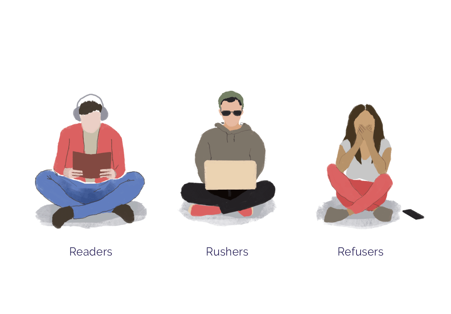
Readers:
Readers read forms carefully. If your respondents are older and less tech-savvy, or if your forms are rather complex, they are likely to carefully read all the information and descriptions. Be aware of that when designing your forms — don't overcomplicate things unnecessarily.
Rushers:
Rushers, as the name says, are going to fill out your form as fast as possible, spending little time to read the labels and descriptions. Rushers love forms that are intuitive, broken into logical sections and don't have too much text and media on them.
Refusers:
Some people don't want to fill out your forms. They are either not the people that you're looking for, or your forms just didn't persuade them for some reason.
Your mission is to minimize the number of refusers. Here are some quick tips to do exactly that:
- Make the purpose of the form obvious - this usually means taking time to craft the perfect title.
- Break down your content into clear sections, so your respondents won't be overwhelmed by too much information at once.
- Tell them what's in it for them! If it's not obvious, emphasize what incentive or reward there may be for completing this form.
- Watch who you're targeting - Don't share your forms through distribution channels that you suspect will get high bounce rates.
- If it's only "nice to have" information, delete the question, or at least don't make it mandatory. One big example here is phone numbers - forcing a respondent to give you their phone number can have a massive negative impact on their likelihood to submit the form.
Your Forms
Understanding your respondents is vital, but it's equally important to build accessible and intuitive forms. Some other rules of human psychology come in handy for that. In particular, you need to understand how people perceive forms visually, consume information, and why timing matters.
Picking The Right Time
It's important to pick the right time to ask questions. Think of your forms as a dialogue with your respondents.
If they're not familiar with you or your brand, at the very beginning you should introduce yourself. Then, unless the form is meant to be anonymous, you'd probably want to know their names as well.
Next, think about what general information you might need to know about your respondents. Try asking for only those details that you definitely need.
When building certain kinds of forms, like sign-up forms, the first step is to eliminate all the fields that aren't a necessity. The second step is figuring out which fields are needed in your form, but at a later stage.
Asking The Right Questions
Not all questions are created equal. It's important to balance your forms. Don't ask too many hard or time-consuming questions in a row. Instead, try pairing them with quick and easy ones. It's a good idea to use a progress bar to show your respondents that they're moving through the form.
Length Of Your Forms
Both convention and data dictate that the shorter a form is, the more likely it is to have a high completion rate. Every additional field on a landing page creates more cognitive friction, which then decreases the odds that a person will complete the form.
We were shocked to discover that there weren't any research-backed insights to share on the subject specific to form creation. So, we deep dove into the data available to us at Paperform. After painstakingly wading through a sample data set of four thousand forms, generally we found that the more fields you have, the lower the completion rates.
However, not every form is destined (or even qualified) to be short in nature. Take medical history forms for example. Their very function is to collect as much information about a patient's medical history as possible. In such cases, there are a few psychological cues you can use to improve completion rates:
- Progress bars
- "X of X completed"
- Incentives for completion
Having worked closely with psychology students (who generally need respondents for their numerous surveys and studies), I found that including visual elements like GIFs and funny images before or after each question dramatically increased engagement.
In order to calculate the ideal length for your form, ask yourself the following questions:
- How well do your respondents know you? Do they trust your brand?
- Are your respondents tech-savvy enough to handle long and complex forms?
- How much time and effort are your forms going to take them?
- What is the incentive to complete the form?
- Are your forms well-structured?
Building Trust

One of the key factors in shaping the success of your forms is the level of trust you're able to establish with your respondents. Building that trust is closely tied with a variety of psychological factors that impact the respondent's propensity to respond in an open way.
Building trust is all about being honest and conveying that honesty. If submitting the form means expressing consent to something, or there are any terms that need to be accepted, be upfront about it — don't put tiny text at the bottom of the form.
Be informal and conversational, it's easier to connect with users on a personal level that way.
When it comes to building trust, getting the messaging right — picking the right words, avoiding typos, polishing off the grammar — is very important.
It's helpful to include a legal notice about the company or an individual behind the form, even if it's not required by the legislation of your country.
When sharing online surveys, we reach a lot of people, including people we don't know. In order to get the right information from them, it's important to establish trust.
Including a welcoming message on the first page of your survey, explaining who's behind it, what the survey is all about and how the information would be used can make a world of difference.
Include a logo or branded image in your forms to quickly build trust and credibility. Also make sure to include any necessary terms & conditions for the respondent to agree to.
It also helps to include an estimate for the amount of time it might take to complete your form. For example, if you include a disclaimer like "it will take you approximately 3 minutes to complete this form" towards the start of the form, you're less likely to have your form abandoned due to mismatched expectations.
Trust is really important, especially when it comes to payment and ecommerce forms. To build trust you can show that your forms are compliant to international standards, display the logos of payment providers, gateways, or third-party security firms. Visual cues like email validation, overall appearance, and the messaging of your forms are also all very important.
Summary
It's easy to get carried away with creating a form as quickly as possible and ticking another task off your, no doubt, long to-do list. Creating a form that is going to not only see high engagement, but also gather meaningful responses takes forethought. Remember that your respondents don't have your context - you have to know your audience and guide them through the form in a way that clearly shows them who you are and what you're asking of them.
Taking the time to nail your target audience and appealing to them accordingly will do more than just get results; as you start to see people engage with your forms you'll quickly gain better insights into how those forms can be better optimised.
Form Structure
When it comes to crafting smoother experiences for respondents, few things matter as much as the overall structure of your forms. In order to provide a great experience, your forms should be ordered in a manner that is not only logical to you, but also intuitive for your respondents to navigate through.
What do you stand to lose with a poorly structured form? A lot more than you think. The journey you create with your form can ultimately make or break its completion rate, especially if your audience is just getting to know you.
Grouping Content
While we've established that having longer forms doesn't necessarily guarantee poor completion rates, it can have that effect if accompanied by a confusing form structure. If your forms have more than four questions, it's crucial to split your questions and elements into groups.
You should always group your content contextually. For example, make sure all the fields that are asking for contact information are grouped on one page. Same goes for other similar question fields.
It's been proven that setting and accomplishing small goals can cause a spike in dopamine, encouraging the brain to keep repeating the associated behaviour.
Forms with multiple steps are often referred to as multi-step forms. These forms have been shown to outperform single-step forms when they contain more than four input fields. One case study by Conversion Fanatics found that a streamlined multi-step form on a landing page saw an increase in conversions of 52.9%. HubSpot argues that registration and order forms "almost always" see improvement when split up into multiple steps.
Some industries, like education or banking, often cannot escape the need to have long, complicated forms - purely due to the kinds of functions they're trying to fulfill.
Having worked extensively with schools, I found it most effective to split longer forms (like quizzes and tests) into categories and pages. This immediately made them easier to navigate for respondents.
Single vs Multiple Page Forms
Multi-step forms aren't the same thing as multiple page forms. A step may be a page, or it could be a series of questions grouped together with other content in-between.
When analyzing 4040 forms, we found that adding a second page to a form caused the average completion rate to drop by more than 15%, from 82% to 66%, and that rates failed to rise above 65% for forms with more than two pages.
So which gets the best results, multiple or single page forms? There's no blanket answer here - it simply depends on the type of form you're creating. Is your form from an industry that relies heavily on visuals for conversions? It's probably best to have multiple steps on one page. Are you creating a form that is highly conversational like a lead-gen survey? Pagination will better facilitate a conversational feel. Are you creating an eCommerce form? In that case, a "one thing per page" approach as outlined by Adam Silver in Smashing Magazine is tried and tested.
5 Tips For Multi-Step Forms
- Do you want to know the names of your respondents and any other personal data? Turn this into the first section of your form (provided the number of questions doesn't exceed four).
- How challenging and time-consuming are the rest of your form questions? If they require a lot of effort, consider presenting on one page each.
- Consider the context of each individual question. Are there any questions that closely relate to one another? Group them together.
- If you have a set of questions that have contextual material in common (for example, they're all related to a particular visual, like a video), present both the video and the related questions on one separate page.
- Use visibility logic to make only relevant content appear in digestible stages.
When trying to decide between a one-page vs. multi-page form, consider the wider context of the form. For example, when creating forms for downloading items like eBooks, it's usually better to show all the fields at once, so respondents can see exactly what they need to do.
On the other hand, with registration and sign-up forms, it's better to be minimalistic and take it one step at a time.
Multi-page forms also allow you to leverage conditional logic. Depending on previous responses, certain pages or questions might show or hide.
Choosing The Right Input Fields
Aside from the order of your questions, it's also important to consider the format in which they're asked. Choosing the right type of input field for each question has a huge impact on the quality of the information you collect. Below are some of the most common types of form fields, and how best to use them.
Text fields allow your respondents to insert free-text as a response. This field is very universal and works well for collecting both short snippets and longer responses.
Email fields are text-fields specifically designed to collect emails. These fields help verify that the respondent has provided an email address in the correct format.
URL fields collect links. It's useful to have them identified and classified as URLs automatically for reporting and analysis.
Yes/No fields are ideal for asking yes or no questions.
Address fields are better off not being simple text fields, as they require the collection of a few separate data points like Street Name, Zip Code and/or City.
Address fields can make a huge difference in terms of user-experience. Incorporating address fields that auto-fill addresses based on ZIP codes, street names or numbers can be transformative for your form's completion rate.
Country fields allow respondents to choose a country from a dropdown list.
Date fields usually have a pre-formatted field or calendar to enter a date into.
Date fields have to be as flexible as possible. Don't make the respondents have to go through a pop-up calendar to find the right date. You might use the dashes format instead.
Multiple Choice fields allow your audience to choose one or a few options from a selection of predefined options.
Dropdown fields ask your audience to choose one (or sometimes more) options from a list of options, and are usually searchable.
Time fields are designed specifically to let your respondents select a particular time.
Scale fields display a range of answer options across a scale that can help respondents express their attitude towards something.
Required Fields
According to web conventions, an asterisk placed next to a question usually indicates that it is imperative for the respondent to answer the question in order to submit the form.
This is particularly important for personally identifiable information - like phone numbers, email addresses and physical addresses. People require a lot of trust to give away this kind of information, so if you don't really need it, don't mark it as required.
Anyone designing a form should really think twice before marking a question as required. If you have too many required fields, it can act as a powerful deterrent that directly impacts the number of people who finish completing your form.
Writing Question Titles
The main goal of question titles is to help your respondents understand the exact information they're required to provide. Keeping question titles as clear and succinct as possible will help remove any friction from the completion process.
Not all questions require a full sentence. Sometimes, short titles like "First Name" or "Email" work best. In other instances, a full question like "What is your name?" will be more appropriate.
Providing Clear Instructions
Some instructions or descriptions accompanying form fields are required for legal reasons, but most are written to provide clarifications that make the form easier to digest for respondents. A common problem with instructions is that people tend to either write too many, or use confusing language. Try to cut any unnecessary instructions from your forms.
Picking The Right Words
When writing titles and instructions, it's also important to use the right words. Avoid words which may come across as negative, aggressive, or pushy.
Instead, choose a tone and voice that will make your respondents feel safe and calm. Be friendly, encouraging, and express gratitude as much as possible.
The voice and tone of your forms are very important. Many online forms out there feel very technical. The labels, the placeholders and the error messages all speak the engineering language.
In my experience, both looking at the analytics and talking to users, most people prefer feeling like they're interacting with a person instead of a machine.
The whole idea is about making your forms feel human. Include instructions in your forms that sound personal, balance the short questions with longer ones.
Summary
To nail the right structure for your form, ensure you empathise with your intended respondent. Think about what structure will create a genuine and human experience, especially what experience would be most likely to keep respondents engaged. Once you've considered this, you'll be able to make the right choices when creating your form.
Form Appearance
We hate to be superficial, though admittedly not quite as much as we hate unattractive web design. As it turns out, we're not alone - 75% of consumers admit to making judgements about a company's credibility based on the appearance of their website.
And while forms may seem like a minor element within the wider context of your webpage, they also happen to be the point at which you require the most from your customers, the point at which you expect them to respond.
As long as you stick to all the best practices of form design, your form's experience will satisfy even the most demanding respondents. But reducing cognitive friction is only part of the solution; your forms must motivate your respondents to engage. That's where your form's appearance comes into play.

A Note on Naming Forms
Think of the title of your form as the subject line of an email. If respondents can't immediately comprehend your form's purpose, they're unlikely to trust it. A general rule of thumb is to keep your form titles as simple as possible. For example, if you're creating a registration form, make sure to include the word "registration", "register" or "sign up" in the title.
Theming and Brand
Do your forms look generic? Do they have the same background, layout, or typography as millions of forms out there? Do your forms feel truly yours? If they are not consistent with your unique branding, they fail to establish a meaningful connection with your respondents.
1. Know your brand
Before creating your forms, try to determine whether there's a consistent style across your other web pages and materials. The elements of a digital style-guide might include:
- Your logo, with guidelines for appropriate sizing and positioning.
- Brand colours, with explicit instructions on which colours are supposed to be used in which situations.
- Typography, which is generally a font or a group of fonts.
- Messaging, ideally listing out the words and phrases which are supposed to be used when talking about you or your brand.
- Graphics: the particular shapes or visuals which represent the brand.
Brand consistency matters, and not just when it comes to online forms. Professional designers use components and entire design systems to maintain brand. Non-designers, on the other hand, might use google sheets to keep track of their brand assets (like colours, logos or visuals).
2. Understand your form's purpose within the context of brand
When it comes to creating your form, determine what you are trying to achieve with your web form as part of your brand's narrative. What is your brand story, and how does this web form fit into that broader narrative?
3. Plan your form's visual layout, copy, and questions to be a journey that culminates in action.
Use your visuals to create momentum - spur your users on with emotive visuals of your brand and product, all the while capturing data.

Compelling Visuals
There's a substantial amount of evidence that shows that our decisions are primarily driven by emotion. Research by McCombs has shown that consumers will first purchase based on emotion and then manipulate their logic to justify their decision. Antonio Damasio's research shows that without emotions, our ability to make decisions is stunted.
Images & Video
Humans are visual creatures: it's been proven that 65% of all people are visual learners. MIT neuroscientists discovered that the brain can identify images seen for as little as 13 milliseconds.
Design a cover image for your form. When your form is embedded or linked anywhere on the web, it's really important to get form clicks. The cover image should be really interesting and catchy.
The Right Visuals for the Job
Adding any old graph or photo won't increase conversions. A study by SMITH has shown there are eight distinctive emotions that drive purchase decisions: (in order of prevalence) Needs Validation, Decision Anxiety, I'm Special, Got to be First, Know-It-All, Buy And Be Done, Want Some Fun, and Avoid Remorse.
Choosing Colors
Selecting the right colours for your web forms is no magic — it's actually pure science. The colour-wheel theory goes back to the mid-1660s and Sir Isaac Newton, who discovered the visible spectrum of light and mapped it out.
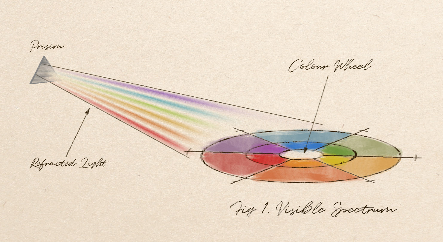
In modern web design, we mostly use the RGB colour-wheel (red, green and blue). Keep these colour combinations in mind when selecting your palette:
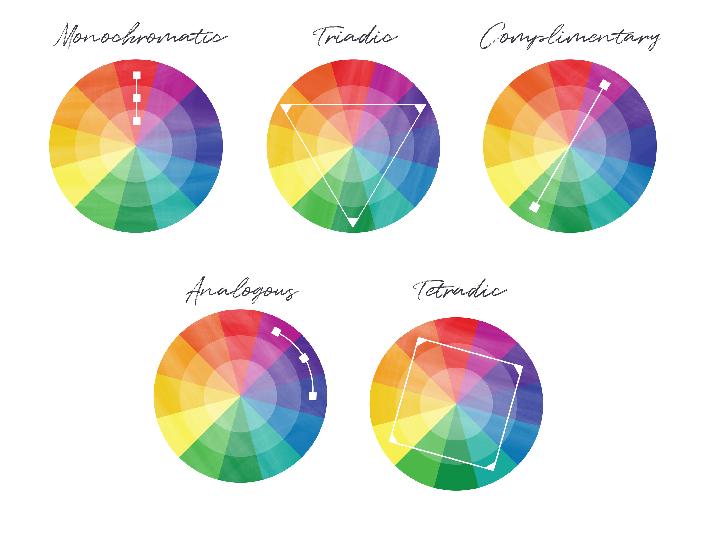
Complementary are the colours located across from each other on the wheel. These colours look very bright and contrasting.
Monochromatic colours are the tones or shades of any single hue on the colour wheel.
Analogous colours are the neighbors on the wheel. These might be a good choice for online forms.
Triadic colour palettes feature three colours evenly spaced on the colour wheel. Tetradic schemes follow the same principle, but with four colours.
If you're designing a form for your company, I'd definitely recommend using the dominant colours already present in the company's assets. Same goes for the typeface.
If it's a new business, try drawing on current trends. Services like ColourHunt might help you choose combinations of colours that go well together.
Typography
Your web forms are essentially made up of sentences, words, and letters. But the same letters can look and feel different — and the difference is in the typography. There are five basic classes of typefaces: serif, sans serif, script, monospaced, and display.
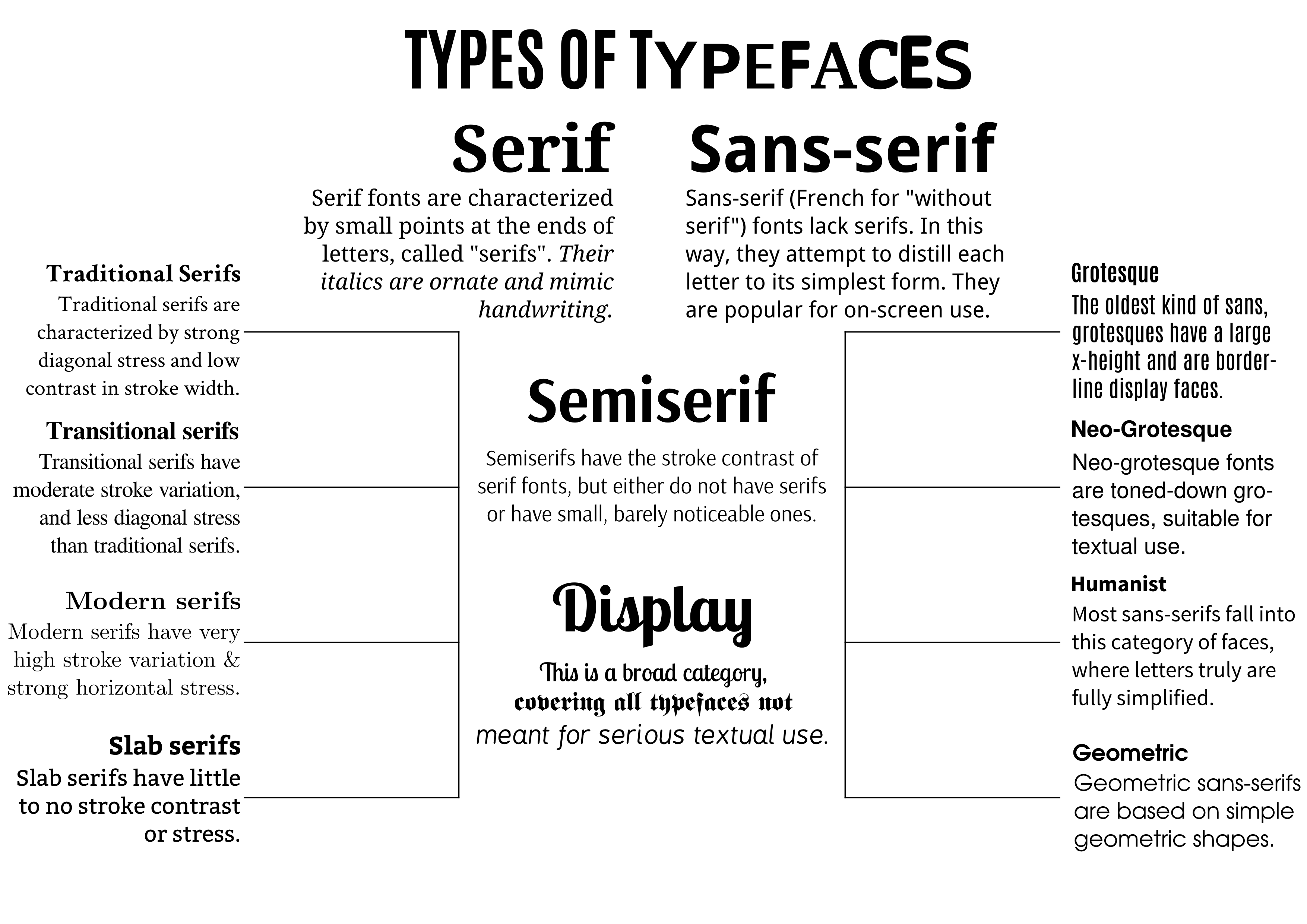
Serif typefaces have small lines on the strokes of the characters. Sans serif typefaces do not have these details. Both are widely used for headings and regular text.
Display and script typefaces are usually used specifically for headlines. Monospaced fonts are named such because each character occupies the same amount of horizontal width.
Most modern form creators will allow you to customize the styles of each text tag:
- H1 tags are usually used for the headings and titles.
- H2 tags serve a similar purpose, used for sub-headings or concise descriptions.
- Paragraph text is usually used for a form's general copy.
- Question title and question description text types allow you to clearly differentiate your form questions from the descriptions.
Google Fonts provide a great catalogue of open-source fonts — it's a great place to experiment and search for inspiration.
Go with standard fonts like Roboto, Helvetica, or San Francisco — those are definitely readable since big tech companies are relying on those for their own materials.
The header font might be different from the paragraphs or questions. For example, the header might be Times New Roman, and the font of the form questions might be Helvetica.
Definitely stay away from Comic Sans or Noteworthy, as well as other either redundant or unprofessional fonts.
Navigation
If your forms have multiple pages, you need to have clear and simple navigation. Today, there are three widely used navigation elements:
- Buttons: this type of navigation shows only variations of "previous" and "next" buttons. The catch is that respondents have no idea how many pages exist in total.
- Page Numbers: this navigation style displays a number for each page. While more efficient, it may increase the cognitive load for longer forms.
- The Progress Bar: this is an elegant compromise between buttons and page numbers. It's visual, quick, and also shows how many pages respondents still have ahead of them.
The right navigation style depends on the length of your form. If your form is a few pages long, the progress bar would work best. But if it's like 20 pages, buttons might work out better, otherwise your respondents would be discouraged from the start.
Calls To Action - The "Submit" Button
When it comes to form design, a call to action (CTA) is a button that prompts an action — like submitting a form or completing a purchase. As a rule of thumb, your form should have only one clear call to action. Ellie Mirman, VP of Marketing at Toast, found that one powerful CTA alongside strong copy improved click rates by 371% and sales by a staggering 1617%.
The wording of your CTA should be punchy, powerful, and affirming. Don't include so-called "destructive" CTAs, like "Clear Your Form" buttons. Many respondents find such buttons confusing, click on them accidentally, and lose any progress they've made.
Success Pages
Success pages are also referred to as "Thank You" pages. These are pages shown immediately after a form is submitted, and used to thank your respondents and/or provide additional information.
Generally speaking, success pages should thank the respondent for their time, summarise any important information, and set expectations of what is to come next.
Here are some rules of thumb for specific use-cases:
eCommerce: either include a summary of the order and purchase, or clearly state where the order summary will be sent.
Registration: include a summary of the respondent's selections for the event or program.
Bookings: display a summary of an appointment or booking made on a form.
Surveys/Quizzes/Questionnaires: success pages provide an opportunity to share unique results with your audience. Use logic to tailor meaningful answers and insights.
Not for Profit: thank your donors, volunteers, and contributors, and affirm the contribution they have made.
Accessibility
As much as the appearance of your form matters, this shouldn't come at the expense of accessibility. When accessibility is overlooked and your respondents' experience is impacted, then other aspects of forms design cease to matter.
In my opinion, when it comes to appearance, it's important to make forms accessible. When designing online forms, we have to think about all the potential respondents. For example, colour-blind users might not see the colour red on a form indicating that a password has been incorrectly entered. We have to take care of such users by adding a small cross icon, as an additional clue.
Accessibility is really important, not just for online forms but for everything on the web. Whenever you're displaying any status messages, do not rely only on colours, also show icons and clear text.
Make sure your forms don't contain any steps that might be problematic to some users. For example, avoid "Captcha" or questions that depend only on images and have no descriptions.
Designing eCommerce Forms: Checklist For Success
Outline the data you need from respondents. When it comes to designing checkout forms, less is truly more. The Baymard Institute found the design and flow of checkouts to be the sole cause for users abandoning their carts and accounted for abandonment rates of 69.57%, so keep your checkout forms as short as possible.
- How to keep forms brief: Work backwards by identifying the data you really need in order to complete orders.
- Make use of optional questions: Add "nice-to-have" questions with a clearly marked "optional" label next to them.
Keep question titles simple. Lean into your respondents' instincts and expectations by maintaining simple question titles like "First Name" and "Last Name".
- Placement of question titles: Remember to place question titles next to the answer field, as opposed to writing them on top of the answer field as a placeholder.
Divide questions into stages. There are 4 key stages: contact information, shipping information, payment information and a summary.
- Using multi-step checkout: If you have more than 4 form fields, it's best to divide the checkout process into separate pages. Splitting longer forms into multiple stages has been shown to have a 14% higher completion rate.
- Progress bars: Splitting the experience into separate pages gives you the opportunity to include a progress bar.
- Use clear titles and headings: This ensures the user knows exactly why they're being asked for personal information.
- Establish a visual hierarchy: Give users control over their actions by ordering stages mindfully.
Eliminate registration steps from the checkout process. Being forced to register for an account is a leading reason behind shopping cart abandonment. Give your customers the option to register once they've completed checkout.
Include an auto-complete address field. Your form can auto-complete a customer's address as they begin to type it, helping users complete forms up to 30% faster.
Be transparent about fees. Over 60% of shoppers abandon their carts due to unexpected shipping costs. Include a cost summary on each page to ensure the total cost is clear to the customer.
Use a single-column design. Multi-column form layouts are prone to misinterpretation. Single-column forms have a logical flow which has been proven to decrease completion time.
Include trust seals on the payment page. Adding trust seals can boost conversions by up to 137%. Top performing trust badges include Norton, PayPal, Verisign, Better Business Bureau, McAfee, and TRUSTe.
Choose the right colours for your checkout form. Use high contrast colours between your background and your buttons and text. Some studies have found that colours like red, orange and blue perform best for CTAs.
Designing Registration Forms: Checklist For Success
Understand the goal of your registration form. All registration forms have one overarching goal: to drive as many registrations as possible. The registration process needs to be designed to attract the maximum number of form completions.
Only ask for what you need. Write down all the information you absolutely need and only ask for this information. Don't believe us? Expedia lost $12 million per year by asking one additional question in their registration form.
- How many fields should you use? A study found that forms with 4 fields receive 160% more conversions.
- Exceptions to the rule: An event registration form might need to be more extensive for dietary requirements, seating preferences, or payment details.
Give your audience a reason to register. By displaying the benefits of becoming a user right next to the form fields, you provide a strong motivation for respondents to quickly complete the process.
Use the right input fields. For example, using a dropdown field for 'Gender' questions is likely tedious. A smoother alternative would be to use radio buttons. Some designers argue that dropdown fields should always be a last resort.
Split long registration forms into stages. Take AirBnB's registration experience for hosts as an example. Their 3-step registration process guides the user through crucial questions, with questions getting progressively harder with each stage.
- Use progress bars: Research found that people prefer having progress indicators.
- Use contrasting colours for buttons: High contrast buttons can help guide respondents through a long form with ease.
Avoid using Captchas. Captcha boxes can cause a drop in signups by up to 30%. Using an automated spam detection service might be a better alternative.
Remember to A/B test colour schemes. 90% of initial assessments about websites are based on colour alone.
Place your brand front and centre. Use colours consistently (as they increase brand recognition by 80%) and design a registration form that is representative of your existing brand.
Allow for social logins. With 92% of internet users abandoning websites when they can't remember their passwords, this is a crucial factor to consider. A study found that 86% of users claim that registering for a new website bothers them, while 77% encourage the use of social logins.
Designing Surveys: Checklist For Success
Define the objective of your survey. The objective should encapsulate the purpose of your survey and reflect the information you are trying to capture with it.
- How to write an objective: Write a one-sentence statement about the overall goal of your survey. For example: "I want to understand the key factors that are leading invitees to not attend my events."
Identify your target audience. Once you've established what you want to achieve, determine exactly who you need to get that data from.
- How to define your target audience: Your target audience can be identified based on a variety of demographic or behavioural factors.
Ask the right questions. A poorly designed survey can quickly turn eager participants into non-responders.
Be mindful of how you phrase your questions. It's crucial for survey questions to be straightforward, uncomplicated and concise.
- Do use additional help text that further explains more complex questions.
- Don't use highly technical words unless relevant to your audience.
- Don't ask leading questions or put your own opinion within the question.
- Don't ask two questions in one. For example, "How would you rate the quality of our staff and venue?" asks respondents to rate two things in one question.
Choose the right question type: There are two types of survey questions:
- Open-ended questions: Free-form questions that allow custom text-based responses. Use them sparsely; the sweet spot is 3-5 open-ended questions in long surveys according to Explorance.
- Closed-ended questions: Questions that provide predefined options. Use them when conducting surveys with more than 1000 respondents, or when your audience might not be particularly interested.
Be mindful of the length of your survey. The ideal number of questions depends on difficulty and audience investment. Use this survey length calculator to determine how long it would take to complete your survey.
Be aware of biases. When your survey responses are affected by bias, the data you receive is of a lower quality. Here's a breakdown of the different kinds of response bias.
Map out your visual elements. Poor visual survey design yields low response rates and can even lead to biased responses.
Choose the right colour scheme. Consistency across questions and pages is key. Consider the emotional impact of different colours.
Determine the right level of branding. In some cases, strong visual branding can directly impact responses and evoke biased responses. In other cases, it can reinforce reliability.
Prioritise legibility. Maximise legibility by increasing text size and using sans-serif fonts like Arial, Helvetica and Verdana. For long passages, consider serif fonts like Georgia and Garamond.
Optimize for mobile devices. Approximately 30-40% of all online surveys are taken on a mobile device.
Manage expectations and provide quick feedback.
- Welcome screen: Should signal to respondents that they're in the right place, and is a good place to set the overall tone and let respondents know how long it will take.
- Error messages: Can help respondents who might be stuck. Providing specific information decreases the likelihood of them abandoning the survey.
Make your survey accessible. Don't rely on colour alone to convey meaning. Clearly label important elements and make sure all images have alternative text.
Do a test run! Once your survey is ready, make sure to do a test run before distributing it. This is crucial for catching any design or flow issues you might have missed.
Thank you contributors
Apart from Paperform's in house form experts, we reached out to the design community at large to gain insights into what makes a good form great. A special thank you to the following contributors and their companies, and thanks to Robert-Jan van Beek for his work in designing and illustrating this eBook.
Simon is a digital design generalist based in Amsterdam. He works as an Interaction Designer at UserTesting, where he puts his heart into making good user flows and friendly interactions. Having experience both with frontend development and with design, he really enjoys working in that sweetspot where those two meet.
Yvon Huang is a UX designer at Sketch, working remotely in Taiwan. She also is a UX design mentor at Designlab, helping young designers grow. Prior to the current position she worked as a passionate product designer at Codementor and KKBOX. She is also active in several entrepreneur communities and was the 2017 scholar and venture pitch winner of MIT global Bootcamp.
Darshan is a Senior Product Designer at GraphCMS and the Maker of Product Disrupt. He has worked with companies of all sizes in different domains from countries like India, USA, UK, UAE, Canada, Germany and Australia. He enjoys traveling, writing, taking pictures and telling stories.
Sebastian Friedrich is a Creative Technologist at Signavio, an emerging vendor for B2B SaaS solutions enabling Digital transformation. He is in charge of bridging the gap between developers, designers, and product managers to make the design system of the company grow and boost product development.
Ralph Theodori is an experienced Design Director from Aleppo Syria. Passionate about product and vision development, he is behind many projects across Software, Filmography, Virtual Reality and Design such as Levitation Design Philosophy, Vectornator 2.0, and Vectornator Pro for Mac.
Freelance Interaction & Brand Designer with a passion for building exciting products.
Xingyang Tang loves digital product design and likes a variety of ways through which ideas can be communicated in the digital world. He helps create solutions that bring exceptional user experience to Mockplus.